Friday, December 4, 2015

Loose Watercolour Pheasant by Andrew Geeson

I mentioned watching a watercolour tutorial, by Andrew Geeson recently. This youtube video, is not that tutorial, but it shows the wonderful medium that is watercolour painting, through a skilled hand. I love the poultry theme too.

Runs for nearly 13 minutes, and has beautiful music as background.

Enjoy!


If you're interested in watching other free, Andrew Geeson watercolour videos, visit this link. Or you can visit his website, here.


Tuesday, December 1, 2015

New studio

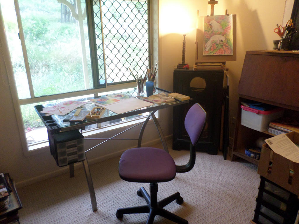
It's been a long time coming, but I finally etched out a permanent place for my art supplies and creative space. Thanks to an early Christmas present from my husband, I was able to set up and get to work on some new experimental pieces today.


 New art desk


I've had my eye on an art table for a while, and similar designs to the one above, normally retail for around the $200 mark, on sale! This one came up at ALDI recently, for $99. My husband searched all the stores in town, only to discover they were sold out. But his final attempt at a rural ALDI store however, saw him buying the absolutely last one! I feel incredibly fortunate.

Not so fortunate, putting it together, however - as I had to drill larger holes for some of the screws. My patience paid off in the end, when I finally got to sit at my new pivoting, glass table.


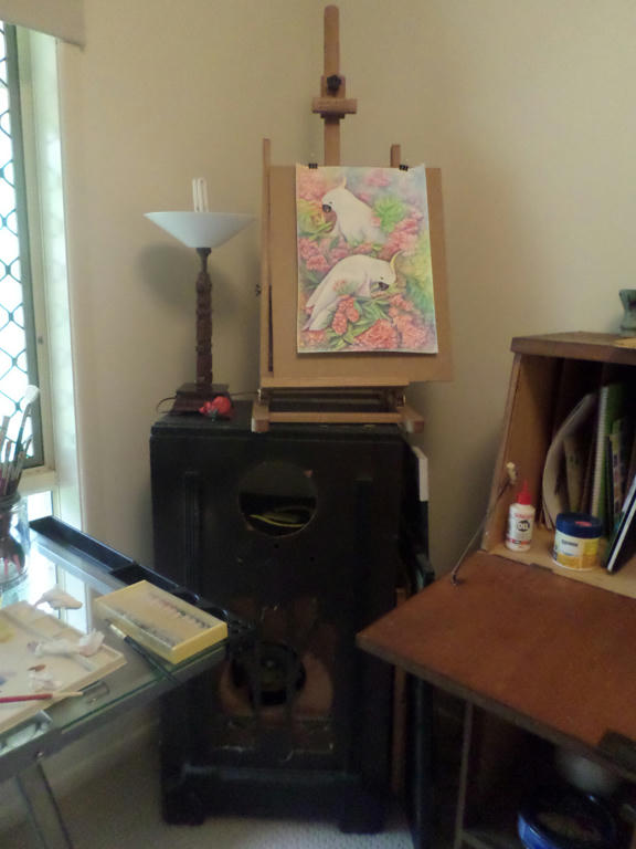
Old but still useful


The rest of the furniture however, are all cheap finds from days gone by. This is an old wireless stero. Its tall enough to hold my easel (another free find) and shares the same space with a lamp, for those overcast days like today. The lamp was also a gift from a relative. I might do something more with the wireless stereo, given that its empty, but for now it will do, as is.


Not my painting on top


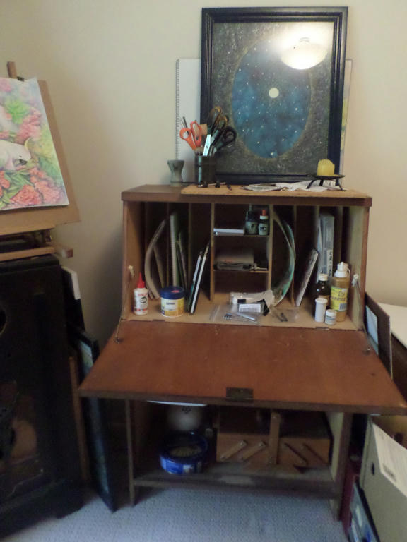
I'm not sure what they call these desks - mail desks, postman's desks or something, but it was a second-hand find, for under $10. I can put the more vulnerable art supplies up top, and close the door, so they're safely out of reach of our toddler. I'm sharing this room with some of my husband's book collection, and collectable toys from his youth. While it may be a shared space, there's still plenty of room for me!

We had to do some room changes recently, when our toddler needed his own bedroom. I have wanted an area I can drag my art supplies out to work on, without taking over the eating areas in the house. So it was a great day, to finally get my watercolour paints out, and do some experimenting.


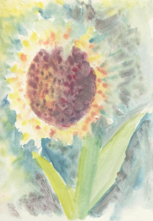
 Sunflower


I tried wet on wet techniques, with cheap, dry, watercolours pots, and quickly discovered they didn't disperse in the water properly. My watercolour pencils do a better job. So these cheap pots, are best used on dry paper only. I wanted to demonstrate this piece to show how ineffective they are with wet on wet. Because even when they touched the water, the pigment didn't want to bleed out and merge the colours, so I got a very stippled effect like using acrylics.


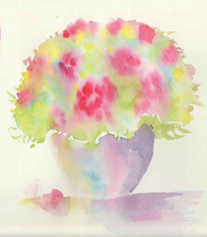
Bouquet in pot


So I got out some tube watercolour paints instead. They were given to me a long time ago, by a person who had no use for them any more. They were surprisingly, still in good working order! My inspiration came from an art tutorial, by Andrew Geeson, with wet on wet, watercolour techniques.

If you do a google search, you will find some free demonstrations on youtube, by Andrew Geeson. I watched the tutorial yesterday, and did my best to recall the steps - but I know I've left out techniques, like negative painting to highlight different areas. I wanted to go easy today however, and just have fun with it.


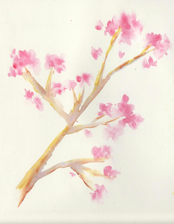
Loose, cherry blossom


I loved the effects of the flowers so much, I was inspired to experiment with a cherry blossom branch, next. I didn't have any reference picture, so it wasn't complicated. I like the delicate effect however, which didn't require too much concentration. When you haven't been doing art for a while, its best to ease yourself back into it - especially when using a new medium.

I've used watercolour pencils before, but watercolour paints are more fluid and an entirely different medium to control. So this is all new to me.


Still thoughts


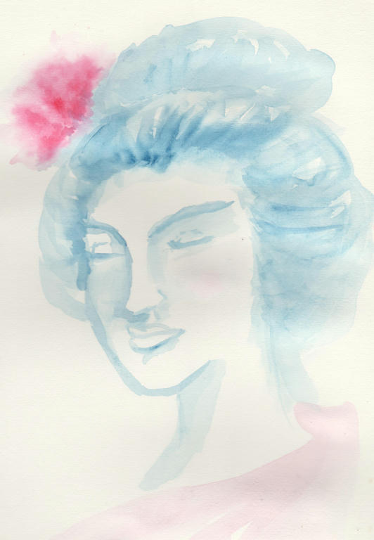
My final piece was based on my Geisha, but wasn't intended to be one. I used my original sketch as inspiration, but let the watercolour paints decide what form she took. I sketched with the brush and used only two colours - changing the tone of the blue, by adding more or less water.

It's quite a subtle piece, which my scanner did its best to replicate, but looks more washed out than it actually is. I like it, because the soft colours and simple pallet, give it a calming effect.

I have to say, a lot of this was done, thanks to my husband's persistence at hunting down a table, and many free art supplies, given to me over the years. Even the watercolour paper I used today, was gifted to me, by the same artist. They decided to concentrate on different mediums, so gave the watercolour supplies to someone who would use them. I've kept them for years, but finally braved the wet on wet, techniques, for the first time today.

I had heaps of fun too!


Wednesday, November 4, 2015

A man's style

My husband was the first to bring this to my attention, but apparently not a lot is made of men's fashion. Well, not as prominent in the minds of society, as women's fashion is. It's the poorer cousin, twice removed.

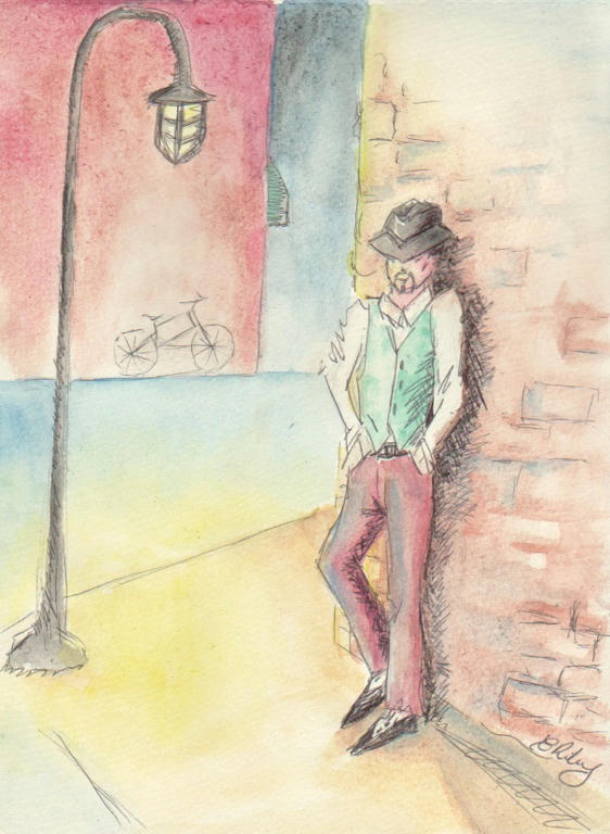
So when I read an art tutorial recently, which said to just let loose with your creativity, and do whatever comes to your mind (no photo reference material) I thought of a man's style.

What does male fashion look like to him? Is it about the clothes, or is it about the way he feels in said clothes. This is the story behind my random picture that I drew with pen and watercolour, recently.


Black pen and watercolour


It's meant to be a calm repose, isolated, yet in a public space. It was not meant to be super realistic, and I deliberately didn't fuss over the details. Normally I could spend an hour, just drawing the picture, but instead it took me an hour to sketch, pen and paint, while also having to distract a toddler.

I like the finished picture. It works for me as an experiment in a man's fashion sense. Because it's both a little bit stylish, but also not fussy either.

I also enjoyed, playing with perspective on the page.


Monday, October 26, 2015

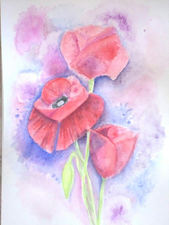
Poppies

So I decided to throw myself into some more experimentation with my Inktense pencils. I wanted to play around with them and learn something about my style.

Apparently, I'm all about the details! I told myself to loosen up, but I always got pulled into the details. If you want to work with colour, to see what they can do on a page however, you really need to let go of lines and work in blocks, instead.

The subject I decided upon was poppies, because poppies have loose petals, which are paper-thin and translucent. So they became my inspiration to loosen up. Of course, who can resist the delicious red of Flanders poppy?


Trio of poppies


I had to use a lot more water direct to the paper, and take the colour from the tip of my pencil. This allowed me to put down colour, without getting too caught in details, like a pencil would. But I even managaged to make the poppies, take the slight resemblance of roses, didn't I?

Because, guess what - roses are tight and controlled, which is more to my style. It's funny the things you learn, when you're in the process of experimenting.


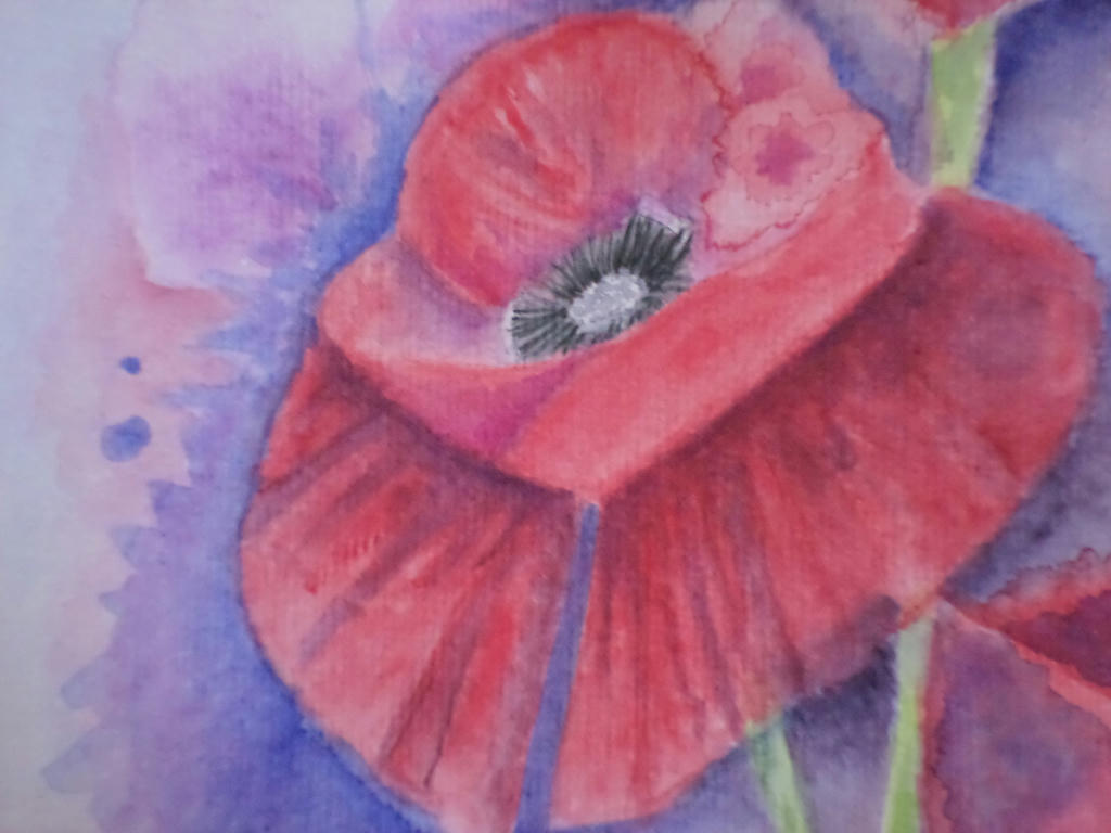
Close up


The main flower was open, so I gave it the most details. In the first under-painting layer, I managed to make a colour bloom, which I decided to make part of the flower. If I covered it up, I would lose the spontaneity and the effects of experimentation. This was a learning piece for me, rather than conceiving it to be a completed work.


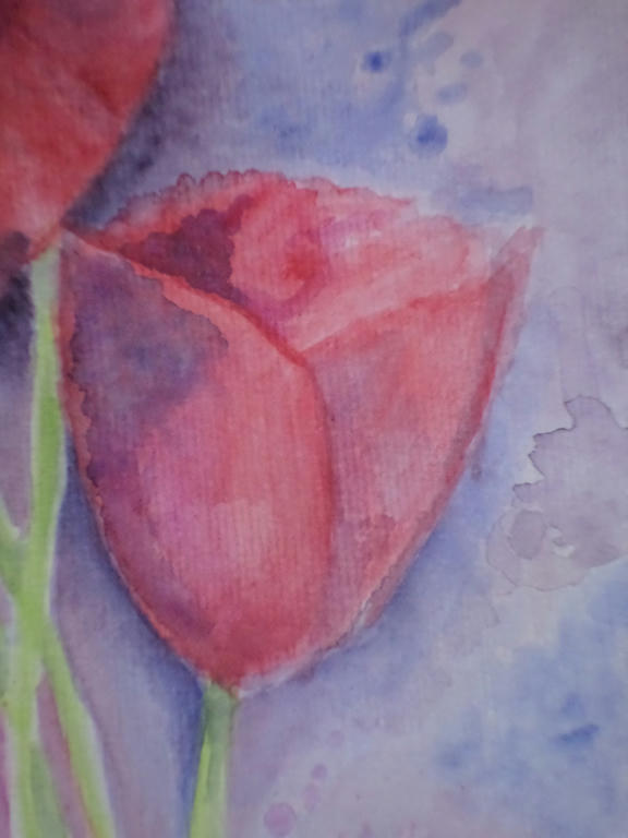
Smallest bloom


In the smallest flower, I kept the colour application in blocks, rather than going for gradients of shading. This was part of my loosening up strategy. The more I forced myself away from the details, the more I got to experiment with colour application.

What I learned was to mix some of the background colour (blue) into the red, in order to make purple shading for the petals. I could have selected a purple from my 72 piece set, but by choosing the same blue as I used in the background, it tied the flower to the background. If you notice in the lower left corner, I used some of the red in the blue of the background too.

It made a very warm purple, which I used to bring the stems of the flowers forward, into the picture.

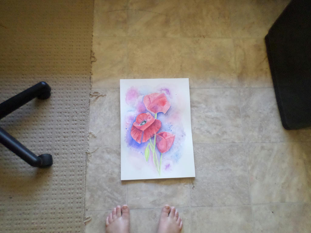
Distance


Forgive my fraying carpet, which I keep under the office chair, but I wanted to demonstrate what the picture looks like from a distance.

That gorgeous blue, really did lift out the red of the centre flower, which is what I wanted - but it does dominate the picture, so your eye doesn't naturally flow to the rest of the blooms.

There is probably more I could do to this picture, like adding that strong blue as background, to the top bloom. However, I don't want to appease my details-dominant style when I'm trying to break away from it. I will move onto something else. I think I will also use half the size paper, I am currently. This will be more economical on my resources, as I'm experimenting.


Monday, September 7, 2015

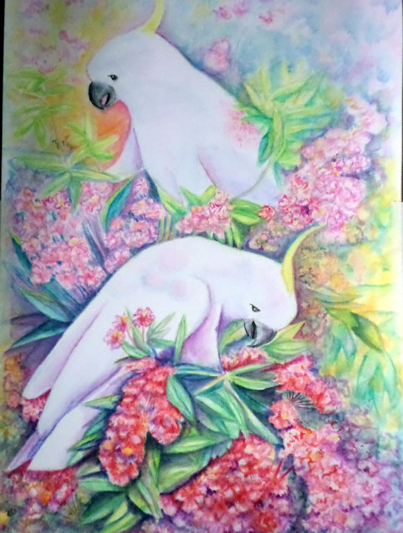
Cockatoo - new medium

I've been carefully working on an old piece, as I'm not entirely sure how to treat it. I'm not even using the reference photo any more. I figured I've got nothing to lose and everything to gain, by continuing to experiment.


This is the original Cockatoo picture, I worked in watercolour pencil. The white of the Cockatoo, was difficult to contrast colours with, to make them stand out. I wasn't happy with the yellow-orange, dominating the picture, with nothing to bring harmony.

When I received my new 72 piece, Inktense pencil set, however, I started to rework the picture and develop something different.


I haven't really altered much of the top half - that's still watercolour pencil (mostly), but the lower section I used the Inktense pencils. These are permanent, so unlike watercolour pencils, I cannot remove colour after it dries. It forces me to apply little changes, rather than big ones that could potentially ruin the piece.

I'm bringing more green/blue into the yellow and even in the blooms, for shadow effect. These were the harmonising colours I needed, to tie the piece together.

I'm using "Chilli Red" and "Mauve" as the primary, bloom colours, which contrasts vividly against the white of the Cockatoos.

The plan is to gradually work through the middle and up to the top. It may take me another year or two, to finish, lol. I like being able to put it down, completely forget about it and then revisit when I have the time again. I have it on display in a living area, so I can walk past and see what catches my eye - in a good way or bad.


Thursday, August 6, 2015

Inktense Geisha

 
Unfinished - see end for final

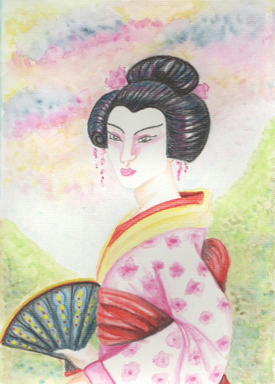
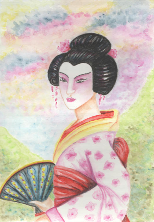
I am revisiting an old subject of mine - a Geisha. Nothing new in the subject matter, except perhaps she has a full Kimono now, but I wanted to share a new technique I have discovered with Inktense pencils.

If you remember in my former attempt to use Inktense pencils, I noted the difference to them in regards to watercolour pencils. I wasn't sure if I liked how different they were to use, but now I have tried them again (with some youtube inspiration) I think I have discovered their new potential.


The technique with the pencils are covered in the first 5 minutes of this video. The rest you can watch for pure enjoyment of making your own cards. I had also watched other videos which showed different techniques, but it would be painstaking to list them all.

I always struggled with application of the water or how thick to apply the pencil. I am getting more comfortable with alternating between both, rather than having one preferred method.


The difference between the top image and the last, is the addition of heavier shading. Good in some ways, bad in others. I know I still have a lot to experiment with these pencils. Maybe even the style of how I illustrate?

The pencils lend themselves more to animation than realism. More 2D than 3D. Or perhaps it has to do with the fact, I only have 10 pencils? I have ordered the 72 pack recently, when it went on sale, in hopes I can obtain a greater range of colour grades. But to be honest, I need to experiment with personal technique, more, as well.

While I think its a bright, happy picture, it also looks very flat. I haven't obtained the depth I was hoping for, with the addition of heavier shading.

Just more reason, to play around with different styles, subjects and techniques.

Monday, August 3, 2015

Single Owl

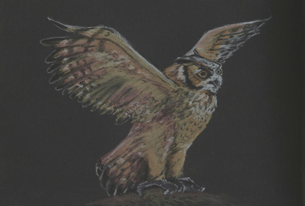
I have really missed this space, while I've been busy with life. It's often been in the back of my mind. So I was happy to take some time away today, and tinker a little more with my charcoal pencil set.


Ready to fly


I took one of the owls I drew in my former black charcoal sketch, and spent some time, giving it some more recognisable features.

There were lots of fantastic pictures I found on the internet, of this particular owl, but I didn't want to copy any of them directly. So I took different features from different images, to create my own stance. It probably makes it look more unnatural this way, but its my creative process, and I want to do different things.

I tend to be a realist when I create, and I want to take steps away from that hard format, to be a little more fluid with my creativity. It's the only way I'm going to develop a style which is uniquely my own.

Sunday, May 10, 2015

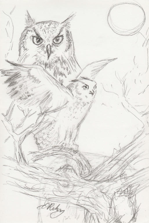
Playing with charcoal

So the weather is getting cooler, so I'm staying inside more. Then I start to get some ideas in my head, and out comes the charcoal and paper...


The lower section looks a little confused, because I had another owl I didn't like. So I threw in an old gnarled tree.

Tuesday, March 10, 2015

Cockatoo background


I've worked a little more on the background to make the Cockatoos stand out. I'm still not entirely happy with it, but its more vivid at least. I may work on it some more, but will probably leave a little more time between updates.

And hopefully I'll have made some new pictures in the meantime!

Monday, February 16, 2015

Cockatoo background


So I've worked a little more on my picture. I like the new colourful background, but I'm also missing the loss of the white paper. I feel like I've gone overboard with colour again, as I feared I would!

It's not finished, but I may give it a few days to think about my next move.

Sunday, February 15, 2015

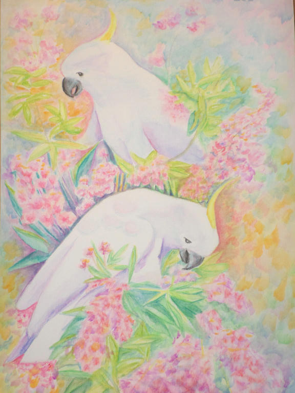
Cockatoos

After finding a wonderful picture online, of a bunch of cockatoos feeding, I decided to select only two birds from opposite sides of the tree to represent. While I love the cockatoos, it was mostly for the NSW Christmas bush in bloom I wanted to capture...


Forgive the darkness of the photo. As the cockatoos aren't surrounded by foliage yet, it's difficult to see their definition. I'm using watercolour pencil and its still a work in progress.

I like the sparsity of this portrait so far, having all that white space, and yet I know it needs a lot more colour added too. I'm experimenting with colour, choosing lavender for the shading of the cockatoos, and trying to incorporate magenta as much as possible, in both the flowers and shading of the foliage (to come).

I'm worried I'll stuff it up, so I'm going as gently with the colour application as possible. Any new work is approached with much thought, because I could easily drown it with flat colour with little ability to lift it - as I learned with my bush creek landscape portrait.

It's a very peaceful piece to work on.

Tuesday, February 10, 2015

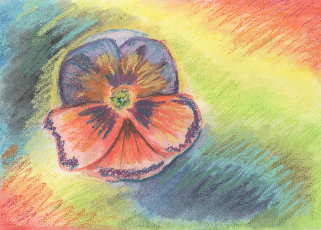
Random flower

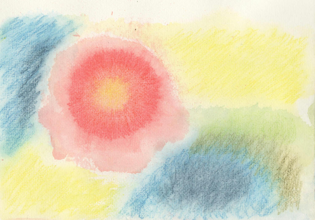
Every day is not a masterpiece day, especially when it comes to experimenting! I've been pushing myself outside my comfort zone lately, looking for different ways to use my mediums. I had purchased a Derwent spritzer bottle, which I have seen used with watercolour previously.

I tried it with my Inktense pencils to see what effects I could create.


I started by drawing a disk with multiple colours (yellow, orange and red) then once I spritzed the ink with water, I moved the paper around to create a random flower shape. I did the background colours after it dried, in a similar fashion. I thought the random flower shape, looked a little like a hibiscus, but wanted to do a more dramatic flower instead.

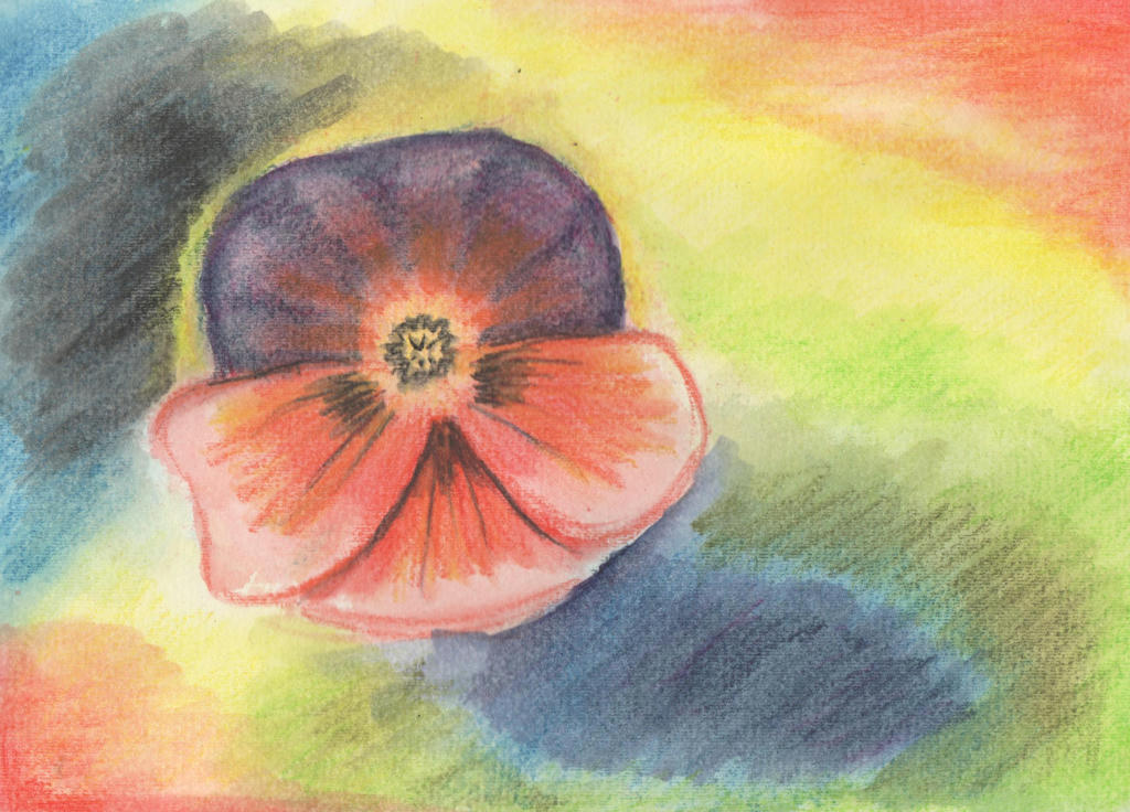
Cue the humble Pansy... 


I went over the original washed Inktense pencils, with more Inktense pencil and activated it with my water brush. I lost all that lovely randomness though. Such a shame. I started to wonder if I should've just done the hibiscus instead?

This was all in the name of experimentation however, so I went in with another medium over the top - soft pastels. I attempted a random over-painting with my strokes, to create a sense of movement in the picture.


Definitely not a masterpiece but the learning process was appreciated. Even if I don't like the final product, I do like the random strokes and can see how it contributes to movement - instead of just a pansy plonked on the page. You've got to try these new ideas out and rather than throw them in the bin, I can share my experience instead.

Perhaps it will inspire someone to try something different? It doesn't have to be perfect, just tried!

It was also good to test my water spritzer out, to see if it has a place in my kit. Like everything, it needs more practice, but its a quick way to get water on the page nonetheless. There's a video tutorial demonstrating the spritzer, using Artbar and Inktense blocks. I only have the pencils though.

Anyway, enjoy!


Bouquet

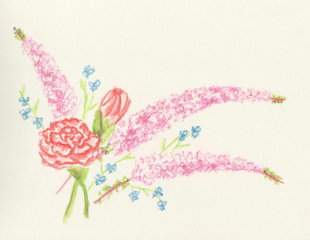
So it was our 12 year wedding anniversary this week (17 years together) and Dave gave me a delicate bouquet of flowers to celebrate. They were wonderfully received, but before they started withering, as all cut flowers eventually do, I thought to capture them in ink.


Intense pencils to be precise. I'm not sure what the long sprays of pink flowers are, but I do know the rest are red-tipped carnations and some blue wandering jew from our garden. I added them in to get a nice contrast in flower size and colour.

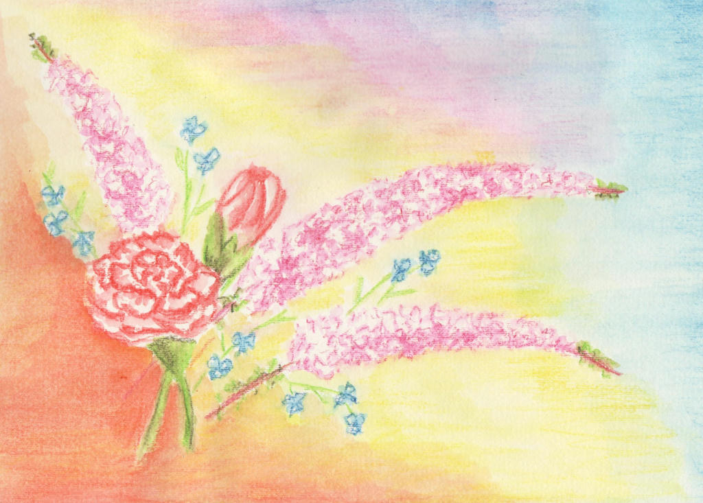
I liked it, but then I also thought it was a little boring too. After reading this article  (its really good) about painting flowers, I decided to tackle the negative space in the background. And here's what happened...


I ruined it. Inktense pencils are great for fine detailed work, but terrible for large areas. It dries really quickly, and by the time you get your brush loaded with water again (I used my new water brush) it starts to dry and you can't blend it back together, like you can with watercolour pencils. So the background looked splotchy.

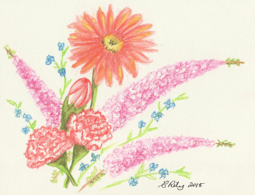
I decided to tackle the picture again. It was going to be a reminder of our wedding anniversary, after all. This time however, I was going to stick with the Inktense pencils for the detailed work, and tinker with the flower arrangement (per the article) to make better use of the negative spaces in the background.


I added an extra carnation (the magic of threes) and held my breathe while adding the big gerbera daisy, last. The daisy was in the bouquet my husband gave me, but they were red (like the red-tipped carnations) and I didn't want to drown the picture in reds. I liked the tangerine in the background I used before , so added it to the gerbra instead.

I think the lone daisy complements the arrangement nicely. By keeping it simple and working on the flower arrangement, I doesn't need a fancy background.

This is also another contribution to the February challenge.

PS: which arrangement do you like the most?

Saturday, February 7, 2015

Watercolour pencil tutorial

I'm always on the lookout for videos which help me understand a medium better. I have my own way of using watercolour pencils, but always find it interesting to see how others do it too. If you're looking for a place to start with watercolour pencils, or perhaps want to pick up some new tips, this video is a good place to start.

Be inspired, but also remember to experiment your own way too.


Friday, February 6, 2015

To put a point on it


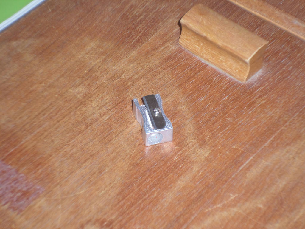
I love my various sets of pencils - watercolour, charcoal and the humble graphite! But one thing I discovered is that my pencils don't like sharpeners very much.

Not. At. All.


This has been the case, ever since owning my first pencils at primary school. My greatest irritation was having one side of the pencil perfectly sharpened, while another decided it would remain wood. It didn't matter how many times I put the pencil in the sharpener differently, that one irritating section of wood, wouldn't go down!


So I'd end up with a point I could use, but would inevitably snap within the pencil shaft, because the wood didn't support the lead, evenly, all the way around. The lead would pop out again - leaving me with no alternative but to battle with the sharpener once more. Sharpen. Snap. Sharpen. Repeat. Have you ever experienced this particular dilemma?

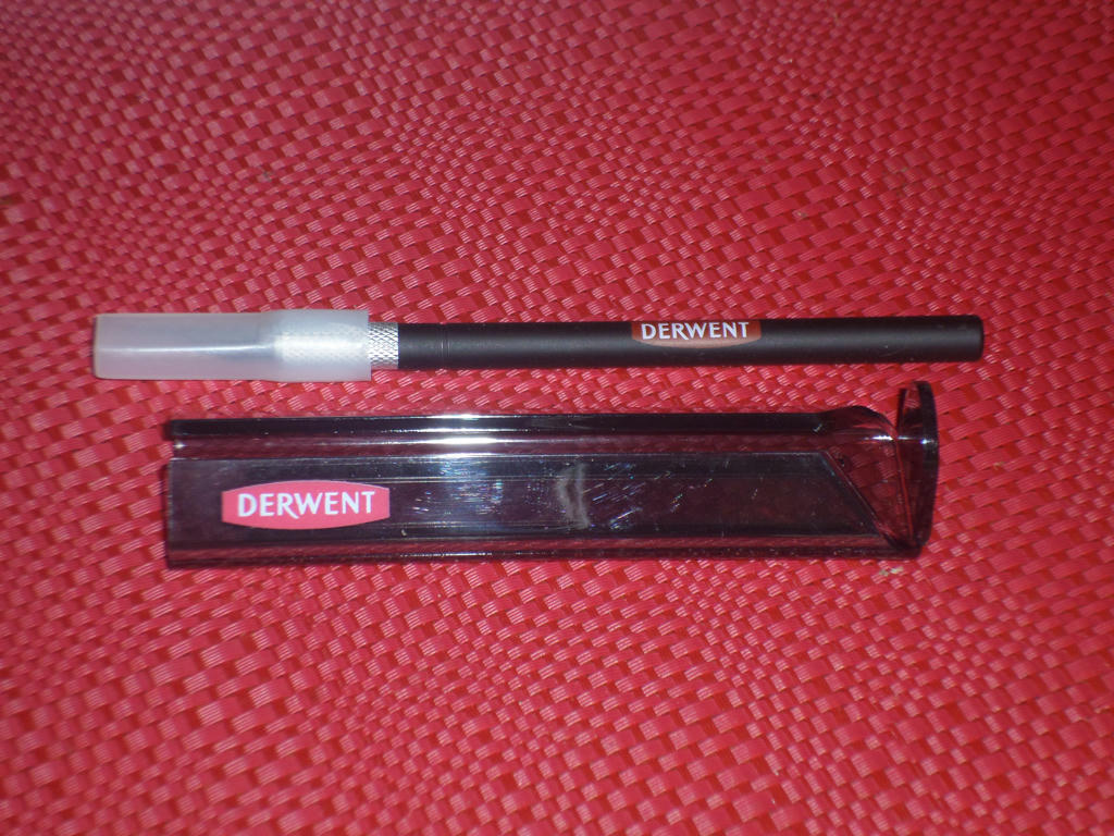
So someone (*cough* Derwent) invented something so simple, its much easier for me to get the best point on my pencils, time after time. It's called the Derwent sharpening stand. You can buy it separately, but it's most often sold with a craft knife.


I have yet to find another like it on the market, and I've been looking! If it appears I'm only plugging "Derwent", its because its the only one I've seen available commercially. And because of the Australia Day, public holiday recently, I had to wait four extra days for my stand to arrive in the post.

If you're interested, here's are a few places I've seen it being sold online in Australia:

Larry Post- stand and knife set
Art Online - stand and knife set
Artistic Den - stand only but free postage no matter how many items are purchased

I've bought items from all the places above, and found them to arrive in good condition, without any need to contact them back with complaints. I'm not paid to put up the links above, I just spent a lot of time looking for places I could buy art supplies from online and these ones I've had good experiences with,


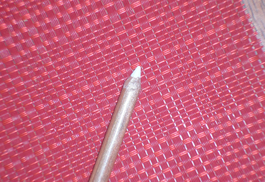
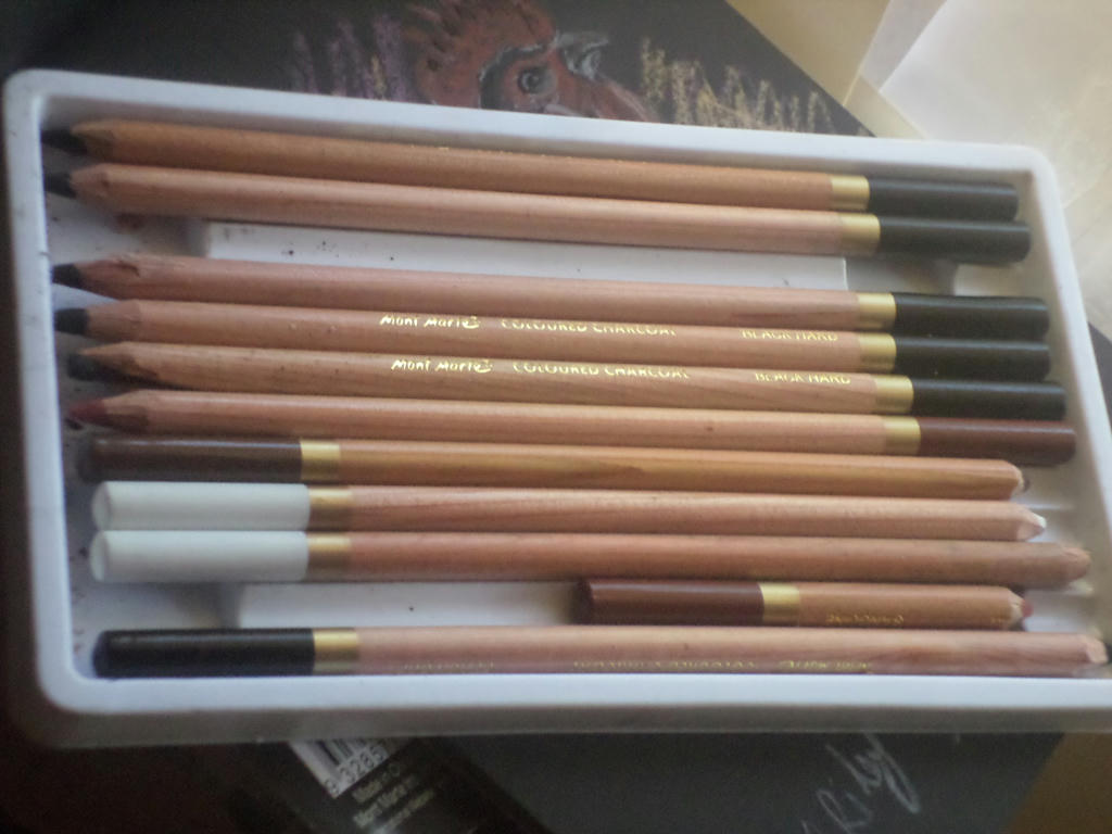
So does the sharpening stand work or not? I'll let you be the judge with one of my Mont Marte charcoal pencils, not to be confused with my Derwent ones.


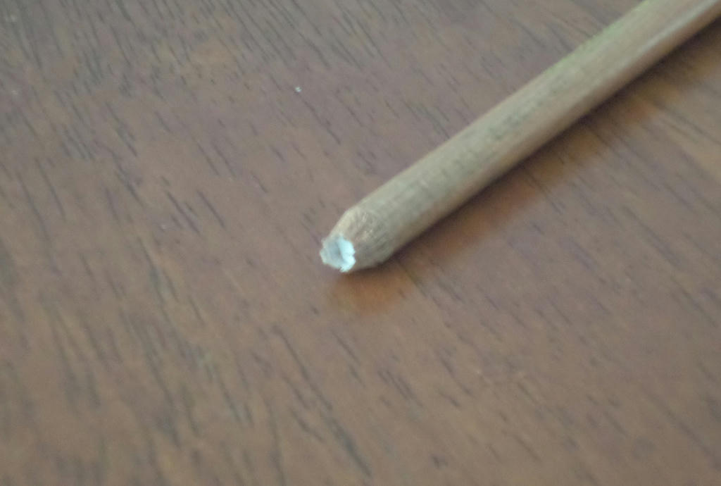
As a comparison, look at what my pencil sharpener did. You can see its cracked the lead inside the pencil, and when the wood resisted the sharpener, it also broke a large chunk of wood off and split it down the length of the pencil. I won't sharpen this one for this tutorial (its too damaged) but I'll use the white one in the upper image instead.


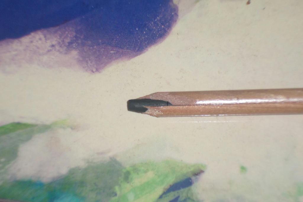
This is what it looked like after using the razor and sharpening stand. You need to be patient sharpening your pencils, its not achieved in twenty-seconds like you may be lucky doing with a sharpener. Because it gives more control, it only making the cuts which are necessary and is much kinder on the wood and lead. I used this rather roughly afterwards, with no snapping lead as I had experienced previously.


I tried sharpening my Mont Marte pencils with just a razor, but without the stand keeping the pencil at the perfect angle, allowing me to be gentler with my cuts - and the buffer to press the lead up against, I found the pressure placed on the lead just made it crack also. So the longevity of my pencils, even the cheapies, are much more inclined to go the distance with this new sharpening stand.

Here is a quick video tutorial if you wanted to see one in action too...


I hope this helps others with their sharpening dilemmas. I'm very happy to have far better control over the sharpening process, and thus being kinder on my pencils.


Thursday, February 5, 2015

Pink frangipani

Even though it's summer growing season, I don't have a lot of things flowering except weeds. I decided to capture an image of one particular flower in season at the moment though. It's a well known favourite of the tropics - the frangipani. This is also one of the pictures I'm submitting for the February botanical challenge on The Daily Art Tattler.


This particular specimen I've written about on another blog. But briefly it was from a cutting of a friend of my mother. It was brought all the way from Thailand as a gift from her husband. Her name was Stella, so I am calling this picture "Stella". She sadly died of cancer but her memory still lives on.

This is also the first time I have worked with soft pastels. I didn't really like them at first - they were too gritty and the colour didn't want to stick to the paper. But I eventually got into a rhythm with smudging. Of the set of 50 I purchased (cheap) it came with no black or white. I could have really used the white.

I also had to introduce some of my charcoal tinted pencils, just to get into the nooks and crannies the pastels couldn't fit. I can see why people who work in pastels, also purchase the pastel pencils.

I actually want to hang this in the kitchen, but first I have to find a square frame!


Artist reveal

I'm in the middle of a picture I hope to reveal tomorrow, but in the meantime I wanted to do a shout-out, to Food n Stuff, who has put up a new page on her blog.

It showcases some of her older work, but also gives a taste of what's still to come!

It's nerve-wracking, dusting off the cobwebs and getting back into art - but its also very worth it too. So hurrah to another artist, prepared to air their talent in a whole new way!


Monday, February 2, 2015

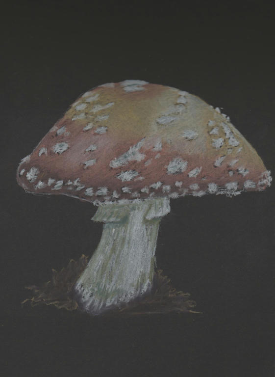
Mushroom


I'm not sure if its a mushroom or a toadstool, but I'm calling it a mushroom because it looks like one to me. The picture came from a free photo resource here. Always click on the image to make sure its free - it will say so!
This was done in my new tinted charcoal pencils (Derwent) and small black pad. It was a lot of fun and the pencils, easy to work with. Charcoal always blends so well.


Saturday, January 31, 2015

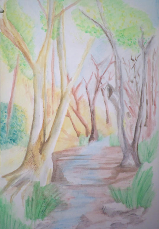
Bush creek final

We have settled into our first week of high school and in the past few days, I've also finished the online course, "Making money making art". While there was a bunch of information I learned which will come in handy - I also recognised what kind of artist I didn't want to become.

I didn't want to become someone who ONLY sees money as incentive to create art. Neither did I want to put my life on hold to make it all about my art either. When I look back at these past few weeks - how hectic they've been, with very little room for making art, I recognise that I have a pretty amazing life! The art is the bonus when I can fit it in, but I have some wonderful people to share my life with in the meantime.
I can see my creative life and family, marrying nicely, without there needing to be a downside.


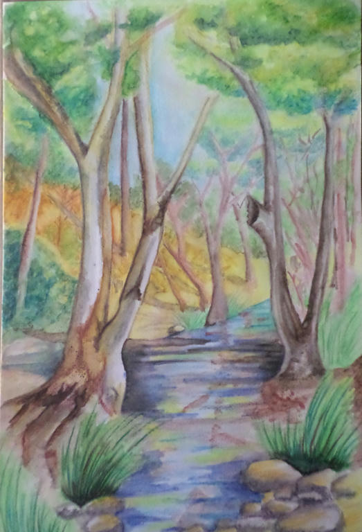
I have managed to squeeze in some time to complete my watercolour picture though. It was a very patient process, which in hindsight I enjoyed. I got some feedback from my mum when she came to visit, to spread the blue around the rest of the scenery - which I did in the tree leaves, about the middle canopy of the front two trees. Making it slightly darker added depth, but also linked the blue up with the water.

My mum even suggested I break the banks (so to speak) and let the water spill behind the tree, to break the bottleneck happening in the middle. I was surprised how these little changes made a significant difference. While I couldn't lift the heavy blue from the water, I could spread it around the scenery to soften the water's intensity.


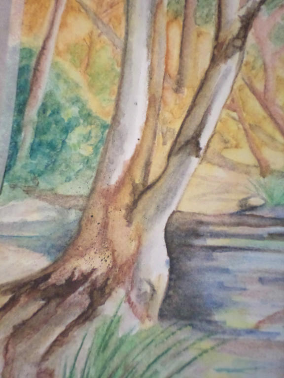
Thanks to Linda's youtube suggestion, I even learned some new techniques for improving the bark on the trees. The "vein" technique the artist used in the video to make flower petals and leaves, I used to make the bark. I was very pleased with the results. I even did some more splattering.

While I don't believe I saved this picture completely, I'm happy that I saved it from the bin! I learned a lot from experimenting with how the water reacted to the colour, even with pencils.

I still have a lot to learn with this medium, but the greatest lesson I'm taking away from this exercise, is not to give up. Plodding along is what I do best anyway. Thanks to others who also shared their feedback here, and it was Linda especially who kept me at this picture. I was going to give up on it, but you said not to - so I found a way to make it work a little better. So thank you Linda.


Sunday, January 25, 2015

Bush creek

After my watercolour pencils dried, I worked a little more on my bush scene to add more depth. Like the pendulum swings both ways however, I took it in the opposite direction of not enough details into too much detail! The reason I am sharing this is for my own benefit. I need to record the errors, to highlight where I need to change.


Too much dark blue was added to the water. It was meant as a (small) contrast to the water, instead it changed the water colour completely. Use less darks next time, and build them up gradually. Some of that dark blue in the water, was meant to be the shadows of some of the trees - so I might be able to add greater contrast, by adding a darker brown (selectively) for the tree shadows.

I've also used too much brown in the landscape, with not enough variation between the closest trees and those furthest away. The closest trees should be the darkest, with the most shadow, but those in the distance seem to have more of that quality. 

So in my attempt to add more detail, I just added more darker colours over the lighter ones, with the same lack of variation I had before. Frustrating, but still a learning process for next time.

Is there anything others would like to highlight, which needs addressing too?


UPDATED to add a link, demonstrating how to achieve atmospheric perspective.


Water brush

I received a new Derwent water brush a few weeks ago, but have been madly preparing for school starting next week. Today I got a chance to experiment a little with it, and my watercolour pencils. Before I get to that however, here's a youtube video demonstrating what kind of brushes I'm talking about.


I've purchased a few inexpensive accessories from the Derwent range, and I find them to be well made and do what they claim to. I'm not paid for this endorsement, by the way, just sharing my experience - because I hate spending money on stuff that doesn't work! I'll share how my other goodies work when I get a chance to use them.


This is an attempt at a bush scene with a small creek. Some things work but a lot of it doesn't. Not to worry - it was just an experiment to see how the water brush worked as I needed a large section of pencil to blend. I'm happy with how the brush performs - its very economical on water and I'm not constantly dipping a brush into a pot. I prefer using it to a traditional brush with my water colour pencils now.

There's a small splattering of watercolour on the closet tree, I was able to do that with the water brush too, straight off the watercolour pencil - flicking it off the tip.

I may yet save this picture once my pencils dry and I can add more detail. I like the feel of the picture, but I can tell I'm still very "basic" at my skill level. So even my best attempts may not save it, lol.

I would recommend a water brush for anyone wanting to try them. I got the medium size, so not fine or broad and it gives me a range of strokes, depending how heavy I press the bristles down.


Thursday, January 15, 2015

Rooster

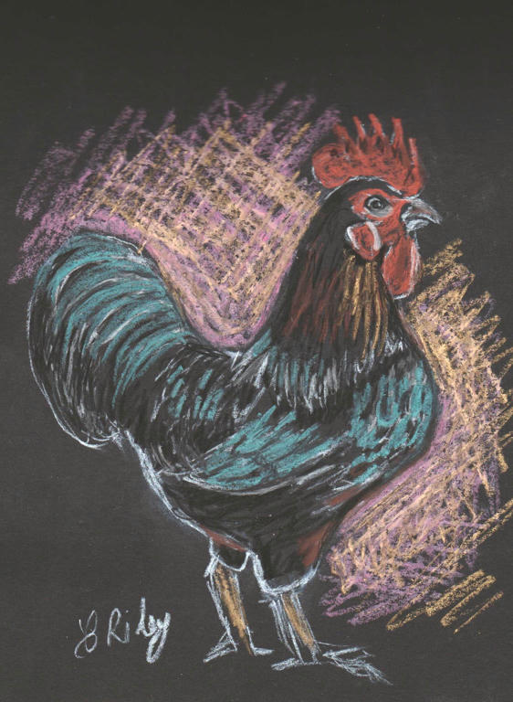
Remember those charcoal pencils which were given to me, but binned due to being of poor quality? Well I managed to find my artists knife and saved some of them. It was the only thing that would sharpen them without splitting the wood.


One little pencil had to be cut in half, due to the wood splitting most of the way down the shaft, when I originally attempted to sharpen them with a standard pencil sharpener. But thankfully some of them were savable with the use of a sharp blade.

Now I finally had something I could use on the tiny black pad, I was given, I had to find something to draw. While looking for native plants from my photo collection, I found another character...


It was my favourite rooster we've ever had. He was an Australorp we raised from an egg. Such a gentleman too. But I strugged with the limited range of colours of the charcoal pencil, so experimented with some metallic oil pastels. I needed to introduce the blue sheen to his black feathers, which I think the metallic pastels did well.

I also mixed a magenta and gold for the background, and roughly scratched it in. Because wherever there are chickens, there are scratches!

It was just a little afternoon exercise, experimenting with some new mediums I was given. All of them were free - even the metallic pastels which my daughter gave me. They were originally a gift from her grandmother - so its nice to know, we keep it all in the family. :)

Tuesday, January 13, 2015

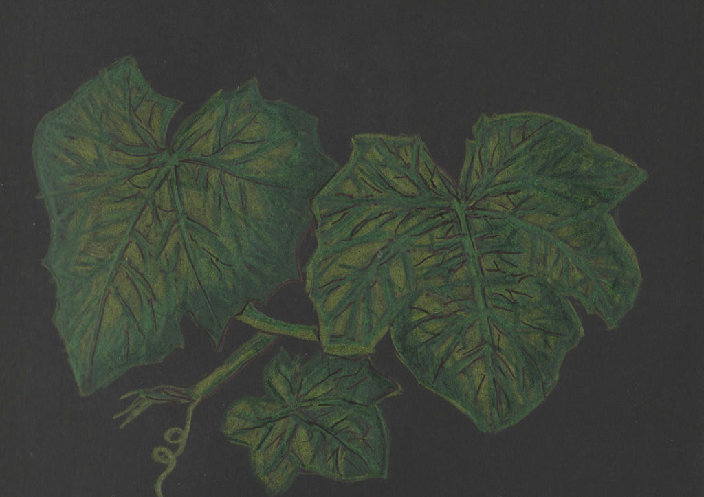
luffa

My daughter received some art supplies from a relative for Christmas, only she doesn't like to work in colour she later told me. While grateful for the thought behind the gift, she didn't feel she could use it, so gifted them to me.

The charcoal pencils came unsharpened and fell apart when I tried to put a point on them, with two separate sharpeners and a blade. They weren't well made so they were binned. But she was also given a tiny A5 (8" x 6") sketch pad of black paper, the charcoal pencils were meant to be used on.

So out came my watercolour pencils for an experiment.


The thing with experiments is, you never know what you're going to end up with. I learned the limitations on such dark paper, with pencils. They weren't very vibrant. I used the watercolour pencils dry, so I struggled to develop highlights on a black background.

I tried to use a black marker pen, to get some detail in the leaves, but fear I only made it look more messy. You never know if you don't try these things out though. This was not meant to be my best work, just demonstrating the results of an experiment. Perhaps prisma coloured pencils would have worked better? I know with such a small pad, I cannot use my chunky charcoal blocks or oil pastels.

The inspiration was my luffa vines, which are sporting a lot of leaf cover at the moment, but no flowers as yet.


Wednesday, January 7, 2015

Watercolour portrait

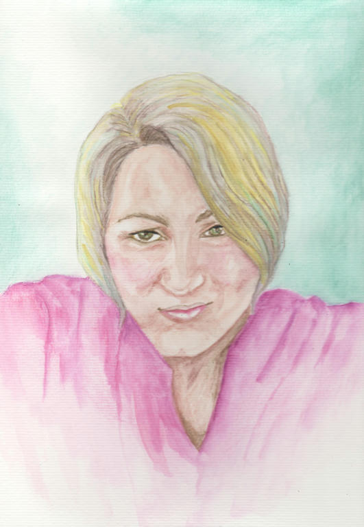
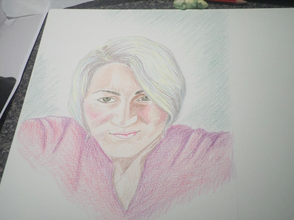
I wanted to try a new medium for my self-portrait. It's the complete opposite of the strong lines of charcoal I used formerly. While I loved working with charcoal, there is something deeply hypnotic about watercolour work as well.

This is not watercolour paints however, rather the pencils instead. I'm using them in a different way to how I have formerly. The application is a lot looser, and my aim was for subtlety, rather than sharp detail.


Click to enlarge


It looks nothing like watercolour, when the pencil first goes down. Normally I get very detailed in my pencil work, but I stuck to simple shading this time. Watercolour is a loose medium, where most of the magic happens when the water is added.

I tried to include some grey highlights in my hair, as since my henna-dye has grown out, I have ash-blonde colour, with a slight silver sheen.

Then I added the water...


Finished picture


I scanned the above image, and the real picture doesn't look as flat as it does here. But I was after subtle with the watercolour, so I got it.

The yellow was too bright I felt, but it didn't really come off when I attempted to lift it again. I added the aqua highlights to help the grey stand out, as it virtually disappeared when the water went on. The aqua also reflected the background, which I really liked.


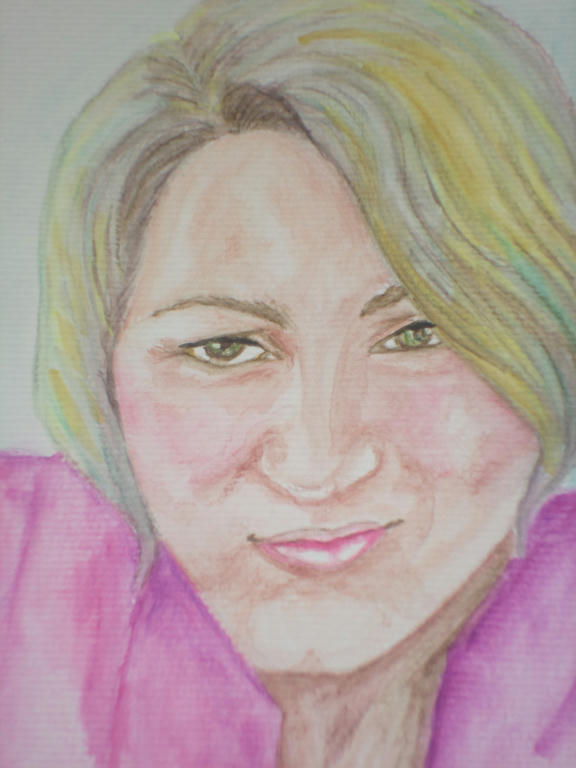
Close up


Even with an outline from a photo image to guide me, I still got some things wrong. The top lip is a little off, but as it was done by me it was bound to reflect some kind of flaw. I'm human, its what I do, lol.

The magenta I used in the shirt, I also used to colour the cheeks. I got this idea from the actual shirt I own, which is in the picture. Whenever I put it on, it brings out the colour in my cheeks, so I reflected that in the image too.


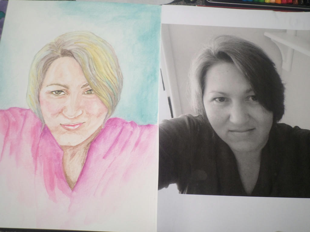
Side by side

It's not exactly the same as the photo, but it does carry a reasonable enough likeness. I enjoyed working with the watercolour pencil again, even if using it more loosely, made the application look amateurish. I'm still learning the art of moving the water around. Any suggestions to improve my watercolour application?

What I like about watercolour pencils though, is being able to control where the colour goes to a larger degree. Add too much water and it will still get away on you, but on the whole, pencils are less unpredictable than the watercolour paints.

I could stop at this portrait, but if I have the time and inspiration, I may try something else.


Tuesday, January 6, 2015

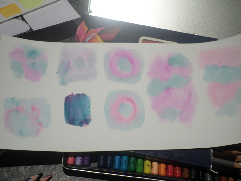
Watercolour swatches

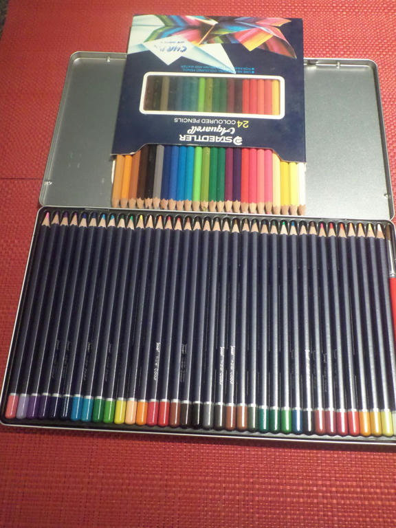
For Christmas I bought some new watercolour pencils, partly because I wanted a larger collection of colours, but also because I wanted to see what other brands were like. My existing Staedtler collection of 24 watercolour pencils (German made) was several decades old.


Old set (top) new set (bottom)

Unfortunately, when I purchased my new tin of 36 watercolour pencils, I thought they were Derwent (UK made) but it turned out they were Jasart. I must have gotten that confused with the Inktense pencils made by Derwent, which I bought at the same time.

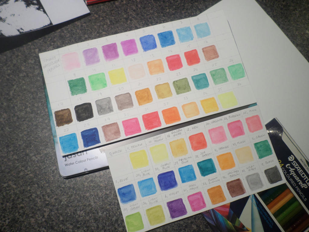
The problem with the Jasart pencils were, they didn't mark their pencils with numbers, or have the corresponding colour names, written on the packaging. Not even the name of the manufacturer was on the tin, or where it was made. So after I numbered the pencils myself, I did a sheet of swatches, to see what I was using.


Jasart pencils (top) Staedtler pencils (bottom)


It's a good idea to do swatches even when you have the colour names (as I had on my Staedlers) because the colours change once water is applied. My squares were only 3cms x 3cms, but were enough to demonstrate each pencil's saturation.

I noticed a few things about the two different sets of pencils though. Even though my existing Staedtler set were aging, when water was applied, they had really creamy texture. The newer Jasart pencils seemed to have less pigment in them, so when water was added, their colour was less intense.

It might also have to do with the fact, the Staedtler pencils were harder to apply dry, so I had to colour harder - therefore applying more pigment. The Jasart's were so much easier to apply dry, I had to barely press down at all. So perhaps that's why I didn't get such a strong pigment when water was added?


darker purple is the new set of pencils


On the bits of watercolour paper I had left over, I conducted a few experiments to see wet on wet application. I wet the paper first, then applied water directly to the pencil with a brush - then applied the brush to paper. It was a very fun experiment and I will have to do more. I tried to get a bloom effect to happen, which I wasn't successful at.

It's important to remember you should never sharpen your pencils after they've been wet in this way though. They must be completely dry before sharpening again, or you can damage the wood.

Speaking of wood, that's another problem with my ageing set of Staedtler pencils. They are almost impossible to sharpen now. The wood has hardened so much, the sharpener eats them up. Big chunks of wood come off. The greener the wood, the easier they are to sharpen.

So bear that in mind when buying watercolour pencils. Try to get as much use out of them as you can, and never use a dull sharpener to sharpen older wood. I recently sharpened the blade on my sharpener, as I have a stone, and yet it still chewed up the old wood. Imagine what a dull blade would have accomplished?


Monday, January 5, 2015

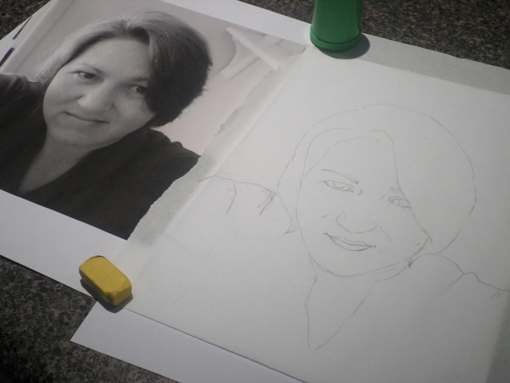
Copying a selfie

This self-portrait process is proving harder than I thought. I'm normally a proficient sketcher, but I cannot compose a realistic likeness of myself. Yesterday I tried an image in oil pastel, and when it failed I produced a basic HB pencil sketch. Both went straight into the bin.

I put it down to not having my mind in the game - competing priorities, etc. Today, I felt more composed and tried another attempt with a graphite stick (thicker than a pencil) which seemed to go a little better...but I still cannot bring myself to publish it.


In the interests of being honest about this process however, I must confess to copying the basic outline of an image I blew up. Should I be wrestling with this shortcut a little more? At this point, I'm not going to. The only work I'm plagiarising is my own selfie.

However, I suspect this technique runs the real risk of merely reproducing another photo image. I need to be creative in my colour-selection and the subsequent mood I convey through the medium of choice. If I fail in those things, then even if I've achieved a reasonable likeness - I would've failed the challenge.

Minor shortcuts are forgivable, but complete duplication is not creative expression at all. So in that regard, the hardest challenge is still ahead of me. I'm excited about trying a new technique with an old medium, but I'll experiment on scrap paper first.


Sunday, January 4, 2015

The process

Getting back into the swing of making art, has had its ups and downs. There's been a lot of fun rediscovering what I like doing so much, but there's also been a few negative side effects. Mostly to do with balancing everything and self-confidence. I think this is normal for starting anything new in life.

Which is why I wanted to share a few articles I found which were relevant. There's a lovely blog by Lianne Williams, a UK based artist, and her thoughts on The Unhealthy Artist. Also, a guest post on her blog, written by The Angry Dog, called Fear and loathing at the drawing board.

The last one is especially funny, and if you cannot relate to all the points in bold, you can at least relate to some.

Enjoy!

Friday, January 2, 2015

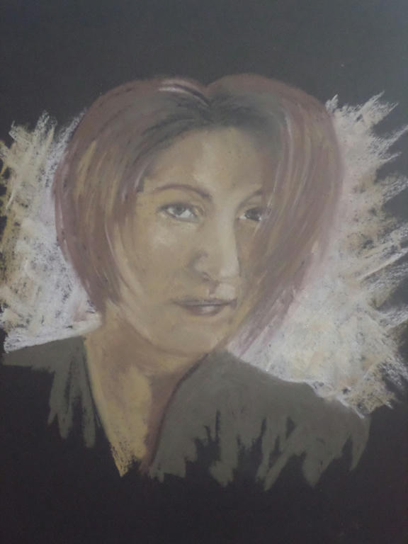
Charcoal portrait

I am joining the art challenge for January, at The Daily Art Tattler. Thank you Linda for giving me something interesting to tackle every month!

For the month of January, the challenge is to complete a self-portrait. Linda has posted some video tutorials to get people started. I haven't viewed them yet, but will make time soon.

I decided to start my self-portrait early, with the mediums I had already chosen (charcoal and black paper) to test how they work. I'm glad I did, because while I love the effects I was able to achieve, there was one obvious downside...


Click to enlarge


It didn't look anything like me! 

I had chosen the black paper and earthy colours for two reasons - firstly, I LOVE earthy tones and couldn't think of a better way to reproduce my likeness, but secondly, I wanted to do a portrait on black paper to acknowledge the mixed indigenous heritage I learned about, in 2013.

I just never meant to look that brown. I wouldn't have minded to be honest, only the likeness doesn't look much like me either and the right side of the face is kind of lopsided. I was drawing on an angle, so I think that's why its skewed. I drew completely freehand though, so there was no sketch outline to stick to. I'll reconsider that for my next attempt.

I'm not sure if I'll stick to charcoal or the black paper, but that's all part of working through the challenge!