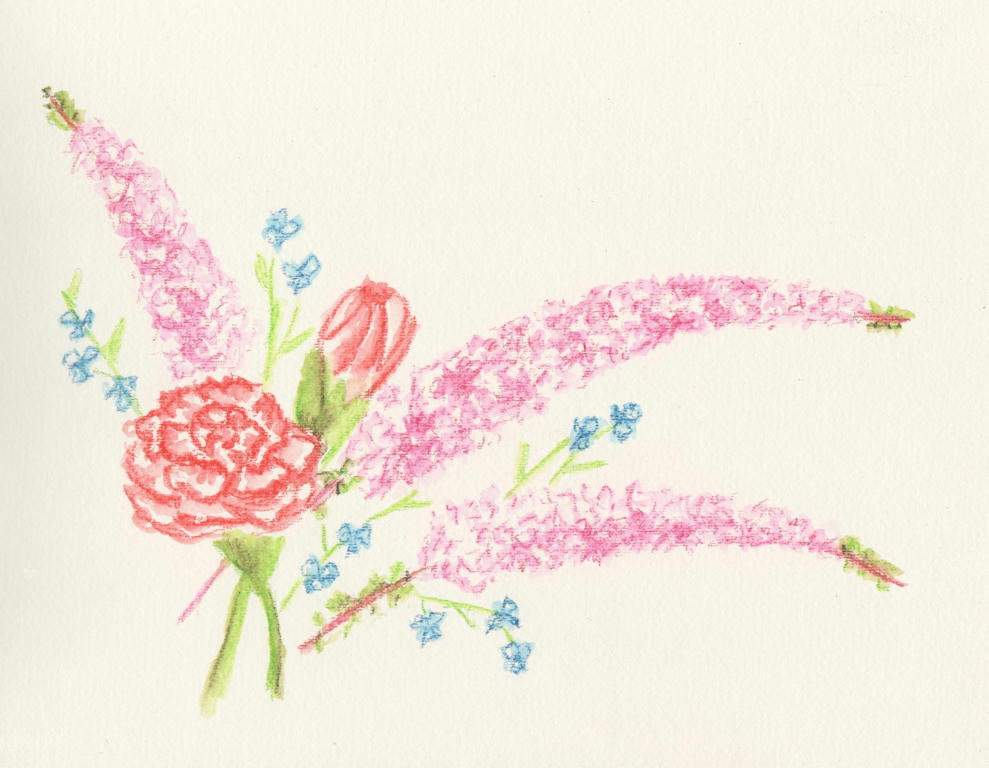
So it was our 12 year wedding anniversary this week (17 years together) and Dave gave me a delicate bouquet of flowers to celebrate. They were wonderfully received, but before they started withering, as all cut flowers eventually do, I thought to capture them in ink.
Intense pencils to be precise. I'm not sure what the long sprays of pink flowers are, but I do know the rest are red-tipped carnations and some blue wandering jew from our garden. I added them in to get a nice contrast in flower size and colour.
I liked it, but then I also thought it was a little boring too. After reading this article (its really good) about painting flowers, I decided to tackle the negative space in the background. And here's what happened...
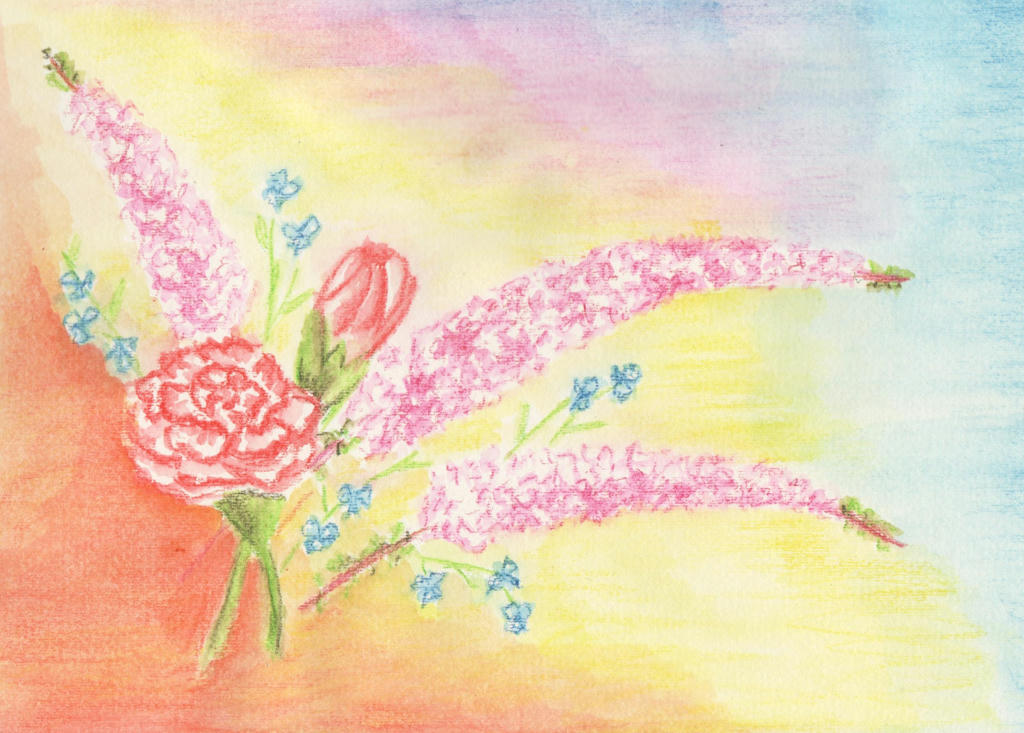
I ruined it. Inktense pencils are great for fine detailed work, but terrible for large areas. It dries really quickly, and by the time you get your brush loaded with water again (I used my new water brush) it starts to dry and you can't blend it back together, like you can with watercolour pencils. So the background looked splotchy.
I decided to tackle the picture again. It was going to be a reminder of our wedding anniversary, after all. This time however, I was going to stick with the Inktense pencils for the detailed work, and tinker with the flower arrangement (per the article) to make better use of the negative spaces in the background.
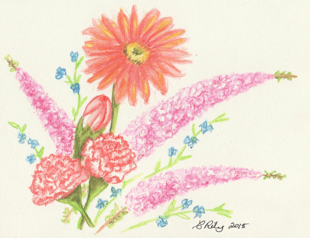
I added an extra carnation (the magic of threes) and held my breathe while adding the big gerbera daisy, last. The daisy was in the bouquet my husband gave me, but they were red (like the red-tipped carnations) and I didn't want to drown the picture in reds. I liked the tangerine in the background I used before , so added it to the gerbra instead.
I think the lone daisy complements the arrangement nicely. By keeping it simple and working on the flower arrangement, I doesn't need a fancy background.
This is also another contribution to the February challenge.
PS: which arrangement do you like the most?
Showing posts with label monthly prompt. Show all posts
Tuesday, February 10, 2015
Wednesday, January 7, 2015
Watercolour portrait
I wanted to try a new medium for my self-portrait. It's the complete opposite of the strong lines of charcoal I used formerly. While I loved working with charcoal, there is something deeply hypnotic about watercolour work as well.
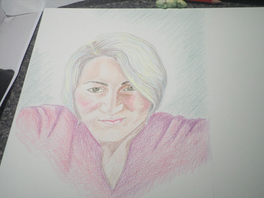
This is not watercolour paints however, rather the pencils instead. I'm using them in a different way to how I have formerly. The application is a lot looser, and my aim was for subtlety, rather than sharp detail.
It looks nothing like watercolour, when the pencil first goes down. Normally I get very detailed in my pencil work, but I stuck to simple shading this time. Watercolour is a loose medium, where most of the magic happens when the water is added.
I tried to include some grey highlights in my hair, as since my henna-dye has grown out, I have ash-blonde colour, with a slight silver sheen.
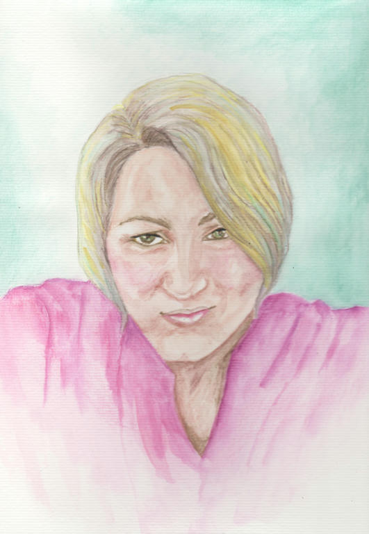
Then I added the water...
I scanned the above image, and the real picture doesn't look as flat as it does here. But I was after subtle with the watercolour, so I got it.
The yellow was too bright I felt, but it didn't really come off when I attempted to lift it again. I added the aqua highlights to help the grey stand out, as it virtually disappeared when the water went on. The aqua also reflected the background, which I really liked.
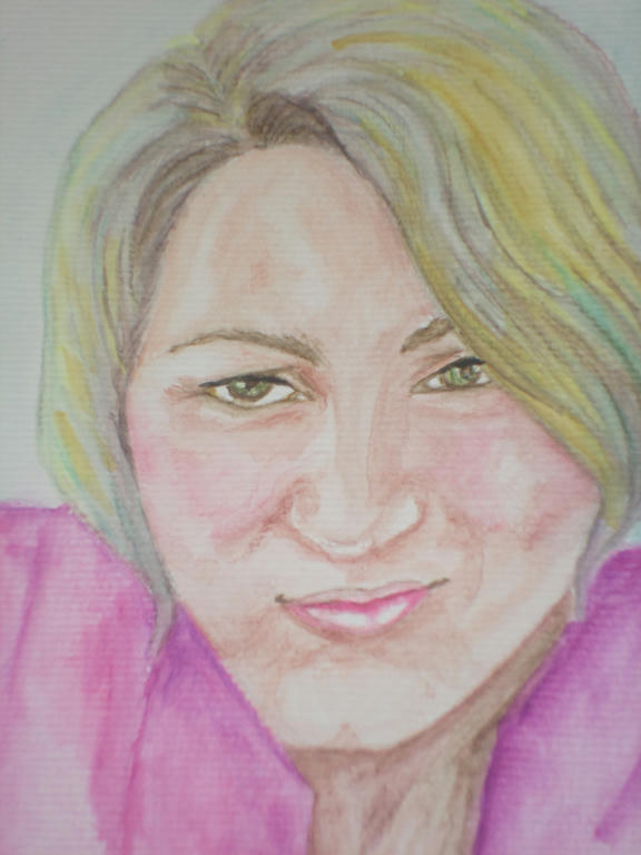
Even with an outline from a photo image to guide me, I still got some things wrong. The top lip is a little off, but as it was done by me it was bound to reflect some kind of flaw. I'm human, its what I do, lol.
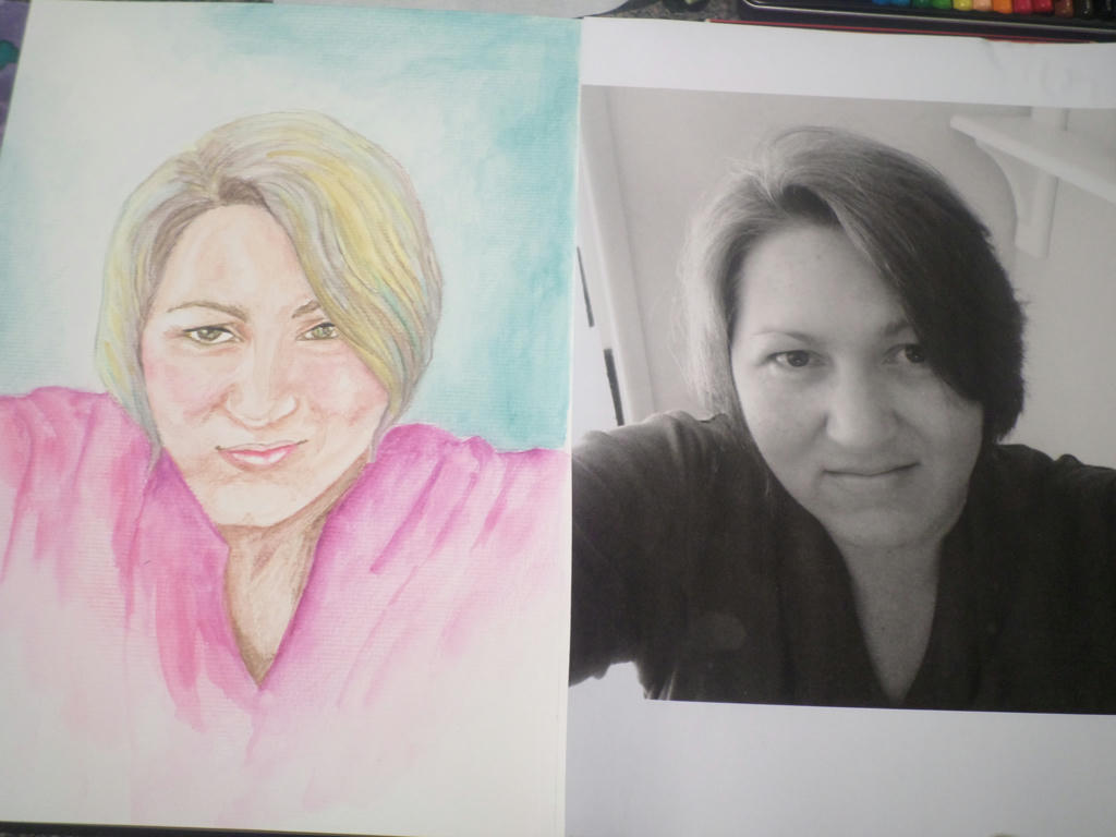
The magenta I used in the shirt, I also used to colour the cheeks. I got this idea from the actual shirt I own, which is in the picture. Whenever I put it on, it brings out the colour in my cheeks, so I reflected that in the image too.
It's not exactly the same as the photo, but it does carry a reasonable enough likeness. I enjoyed working with the watercolour pencil again, even if using it more loosely, made the application look amateurish. I'm still learning the art of moving the water around. Any suggestions to improve my watercolour application?
What I like about watercolour pencils though, is being able to control where the colour goes to a larger degree. Add too much water and it will still get away on you, but on the whole, pencils are less unpredictable than the watercolour paints.
I could stop at this portrait, but if I have the time and inspiration, I may try something else.
This is not watercolour paints however, rather the pencils instead. I'm using them in a different way to how I have formerly. The application is a lot looser, and my aim was for subtlety, rather than sharp detail.
Click to enlarge
It looks nothing like watercolour, when the pencil first goes down. Normally I get very detailed in my pencil work, but I stuck to simple shading this time. Watercolour is a loose medium, where most of the magic happens when the water is added.
I tried to include some grey highlights in my hair, as since my henna-dye has grown out, I have ash-blonde colour, with a slight silver sheen.
Then I added the water...
Finished picture
I scanned the above image, and the real picture doesn't look as flat as it does here. But I was after subtle with the watercolour, so I got it.
The yellow was too bright I felt, but it didn't really come off when I attempted to lift it again. I added the aqua highlights to help the grey stand out, as it virtually disappeared when the water went on. The aqua also reflected the background, which I really liked.
Close up
Even with an outline from a photo image to guide me, I still got some things wrong. The top lip is a little off, but as it was done by me it was bound to reflect some kind of flaw. I'm human, its what I do, lol.
The magenta I used in the shirt, I also used to colour the cheeks. I got this idea from the actual shirt I own, which is in the picture. Whenever I put it on, it brings out the colour in my cheeks, so I reflected that in the image too.
Side by side
It's not exactly the same as the photo, but it does carry a reasonable enough likeness. I enjoyed working with the watercolour pencil again, even if using it more loosely, made the application look amateurish. I'm still learning the art of moving the water around. Any suggestions to improve my watercolour application?
What I like about watercolour pencils though, is being able to control where the colour goes to a larger degree. Add too much water and it will still get away on you, but on the whole, pencils are less unpredictable than the watercolour paints.
I could stop at this portrait, but if I have the time and inspiration, I may try something else.
Monday, January 5, 2015
Copying a selfie
This self-portrait process is proving harder than I thought. I'm normally a proficient sketcher, but I cannot compose a realistic likeness of myself. Yesterday I tried an image in oil pastel, and when it failed I produced a basic HB pencil sketch. Both went straight into the bin.
I put it down to not having my mind in the game - competing priorities, etc. Today, I felt more composed and tried another attempt with a graphite stick (thicker than a pencil) which seemed to go a little better...but I still cannot bring myself to publish it.
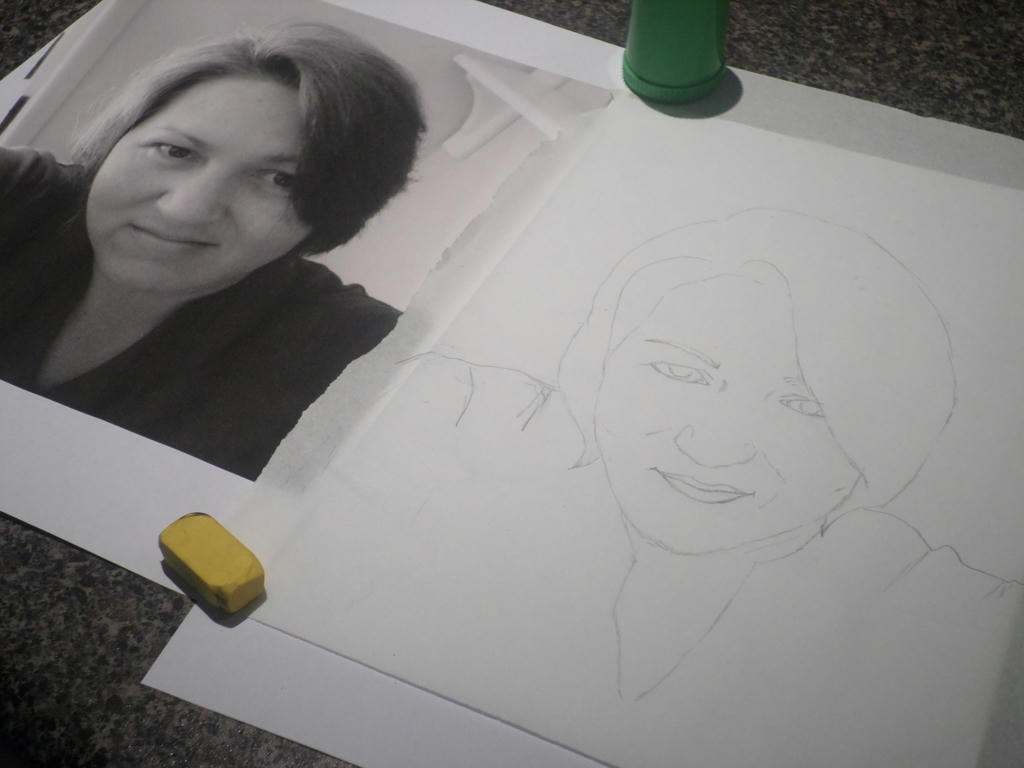
In the interests of being honest about this process however, I must confess to copying the basic outline of an image I blew up. Should I be wrestling with this shortcut a little more? At this point, I'm not going to. The only work I'm plagiarising is my own selfie.
However, I suspect this technique runs the real risk of merely reproducing another photo image. I need to be creative in my colour-selection and the subsequent mood I convey through the medium of choice. If I fail in those things, then even if I've achieved a reasonable likeness - I would've failed the challenge.
Minor shortcuts are forgivable, but complete duplication is not creative expression at all. So in that regard, the hardest challenge is still ahead of me. I'm excited about trying a new technique with an old medium, but I'll experiment on scrap paper first.
I put it down to not having my mind in the game - competing priorities, etc. Today, I felt more composed and tried another attempt with a graphite stick (thicker than a pencil) which seemed to go a little better...but I still cannot bring myself to publish it.
In the interests of being honest about this process however, I must confess to copying the basic outline of an image I blew up. Should I be wrestling with this shortcut a little more? At this point, I'm not going to. The only work I'm plagiarising is my own selfie.
However, I suspect this technique runs the real risk of merely reproducing another photo image. I need to be creative in my colour-selection and the subsequent mood I convey through the medium of choice. If I fail in those things, then even if I've achieved a reasonable likeness - I would've failed the challenge.
Minor shortcuts are forgivable, but complete duplication is not creative expression at all. So in that regard, the hardest challenge is still ahead of me. I'm excited about trying a new technique with an old medium, but I'll experiment on scrap paper first.
Friday, January 2, 2015
Charcoal portrait
I am joining the art challenge for January, at The Daily Art Tattler. Thank you Linda for giving me something interesting to tackle every month!
For the month of January, the challenge is to complete a self-portrait. Linda has posted some video tutorials to get people started. I haven't viewed them yet, but will make time soon.
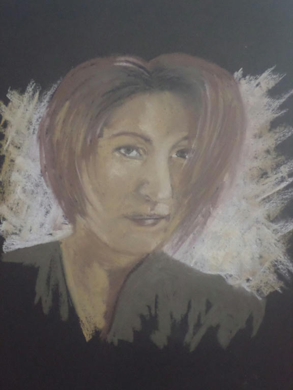
I decided to start my self-portrait early, with the mediums I had already chosen (charcoal and black paper) to test how they work. I'm glad I did, because while I love the effects I was able to achieve, there was one obvious downside...
I had chosen the black paper and earthy colours for two reasons - firstly, I LOVE earthy tones and couldn't think of a better way to reproduce my likeness, but secondly, I wanted to do a portrait on black paper to acknowledge the mixed indigenous heritage I learned about, in 2013.
I just never meant to look that brown. I wouldn't have minded to be honest, only the likeness doesn't look much like me either and the right side of the face is kind of lopsided. I was drawing on an angle, so I think that's why its skewed. I drew completely freehand though, so there was no sketch outline to stick to. I'll reconsider that for my next attempt.
I'm not sure if I'll stick to charcoal or the black paper, but that's all part of working through the challenge!
For the month of January, the challenge is to complete a self-portrait. Linda has posted some video tutorials to get people started. I haven't viewed them yet, but will make time soon.
I decided to start my self-portrait early, with the mediums I had already chosen (charcoal and black paper) to test how they work. I'm glad I did, because while I love the effects I was able to achieve, there was one obvious downside...
Click to enlarge
It didn't look anything like me!
I had chosen the black paper and earthy colours for two reasons - firstly, I LOVE earthy tones and couldn't think of a better way to reproduce my likeness, but secondly, I wanted to do a portrait on black paper to acknowledge the mixed indigenous heritage I learned about, in 2013.
I just never meant to look that brown. I wouldn't have minded to be honest, only the likeness doesn't look much like me either and the right side of the face is kind of lopsided. I was drawing on an angle, so I think that's why its skewed. I drew completely freehand though, so there was no sketch outline to stick to. I'll reconsider that for my next attempt.
I'm not sure if I'll stick to charcoal or the black paper, but that's all part of working through the challenge!
Subscribe to:
Posts (Atom)