Wednesday, September 19, 2018

Portraits #3

Part of the reason I signed-up for the Expressive Charcoal course, recently, was because I started working in mixed media. Which basically means, working in different mediums, in the same picture. I had a thing for working with collage, paint and charcoal.

If it wasn't for the love affair with mixed media, I wouldn't have signed-up for the course, this year. But I'm glad I did, because I'm learning so much about charcoal. It's uncanny however, that all roads lead back to Rome - as you'll see in my next portrait, in the series.


First layer


This wasn't going to be a reverse portrait, this time. I would apply the charcoal straight to white paper. As I was determined to use the stick, more on it's side, than on it's tip. It was great for filling in blocks of colour, without getting hung up on details.

Then things changed. Experimentation, soon evolved into a horrible, dark and unappealing mess. Major frustration! Rather than quit on my picture or give myself a hard time, I turned to my former muse of mixed media. Because collage, immediately covers a multitude of sins!


Finished


I finally got the chance to use my new Liquitex, matte medium, to paste on the newsprint. And because it's charcoal, the medium turned grey and stained the newsprint too. Effectively blending it to the rest of the picture, and making the charcoal less intense, overall.

Dark, muddy mess - be gone! Okay, maybe not completely, so I used a touch of white charcoal, under the chin, and in his hair, for highlights.


Unintentionally, looks like, Australian bush-ranger ~
Ned Kelly


In this close-up, you can see the original white paper, black charcoal, collage and matte medium. Which is actually the brush strokes, caused by the medium, moving the charcoal around. I like this effect. It tones down the charcoal - as my eraser, wasn't real good at cutting into the charcoal.

It was a fun experiment, but not strictly charcoal. Which is okay. Because all roads still lead back to Rome eventually! I'm going to return to charcoal. I'm debating whether I'll do another portrait, or just move on to the next exercise though. I'll see where my muse, takes me, tomorrow!

PS: I used the racing guide as newspaper, for this particular collage. Pieces were randomly torn and put down. After blowing up the picture, I find one of the names: "LOVE OR GOLD" on his cheek. Which kind of matches the Ned Kelly theme. Weird, huh?


Tuesday, September 18, 2018

Stranger things

It's funny how the early incarnations of a picture, can be just as interesting as the finished piece. Recently, I opened Google homepage, and my browsing history automatically appeared. Side by side, were two remarkably similar images.


Screenshot


I was going to mention how the ghostly silhouette of David, bore an uncanny resemblance to the masks, Australian band, TISM, wore. But then I thought, it was a rabbit trail no-one really needed to follow. Especially if you're not familiar with the band.

I never meant for it to look that way. Just turned out, it did! Anyway, consider this random rabbit trail, officially closed.


Monday, September 17, 2018

Portrait #2

Yesterday, I wrote about attempting a reverse portrait of my husband. As much as I enjoyed the exercise, I made two rookie mistakes. Firstly, I went too hard with the initial charcoal layer - making it difficult to erase any white highlights, afterwards. Secondly, I needed a closer view of his face, to manipulate the details better, with the charcoal.

So another portrait was attempted, utilising the same picture - just a closer view.


First layer


This time I went lighter on the initial charcoal layer. Then gradually cut away highlights. Willow charcoal, was better than the compressed charcoal for erasing too.


Second layer


Sketching the outline, made it look very cartoony. I've gotten into the habit of drawing lines around everything! Although, it has a rather abstract appearance about it, also. If I was aiming for abstract, this portrait would be done. But I wanted to see more charcoal.


Finished


There was a squinty expression, which made one of his eyes appear smaller than the other. It was more him, than the former attempt, yesterday. But still not entirely him. One thing was glaringly obvious, afterwards though. Where was my "expressive" charcoal? I achieved some character, but I used the charcoal like a pencil - rather than using it like charcoal!

So bear with me, I'm going to attempt another portrait (same picture) without aiming for "likeness" and proficient drawing skills. I want to tackle it very differently. Wish me luck! 


Sunday, September 16, 2018

A portrait of sorts

I was looking forward to this particular exercise, in my Expressive Charcoal course. I watched the video on Friday, but couldn't get started until after the weekend - when the kids returned to school.

The concept of working in reverse to form our picture, was intriguing. We had to select an image (the suggestion in the example, was a self portrait) but I chose the one of my husband, dressing up as Wolverine. I wasn't intending to do the whole claws thing, just draw his face.


As much as I loved the ghostly effect of cutting into the charcoal with an eraser, I quickly realised the paper I was using, wasn't compatible. As I couldn't remove all of the charcoal, to reveal the white paper, underneath. It was quite frustrating, but I had to press on!

While I think I obtained a "likeness" of my husband, in some aspects - the portrait kind of morphed into someone completely different. Which was okay, as the exercise wasn't about achieving a picture-perfect likeness. It was more about exploring the different values between light and dark.


One of my favourite things (it seems) is cutting into the charcoal with an eraser. As it added a textural element to the background. One of the most challenging aspects however, was achieving finer details, such as the eyes.

Even my thinnest stick of charcoal, was 6mm wide. With such a bulky implement on such fine detail, the eyes were too misshaped for my liking. As well as too cartoony, with an outline. I really struggled with variation, in those limited spaces though.

On the whole, it was still an enjoyable exercise.


Thursday, September 13, 2018

Expressive charcoal

I'm doing an expressive charcoal drawing class at the moment. I didn't intend to sign-up until next year, but the recent intake happened to coincide with my experimentation with charcoal in mixed media.

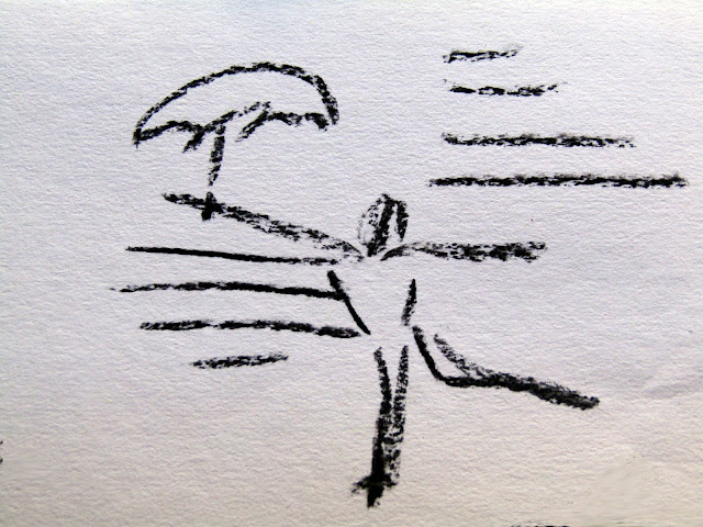
Here are some examples from a recent exercise...


 Stretching with umbrella


 Yoga pose


Twirling


Dog running with Frisbee


Skipping-walking


The idea was to work quickly, with time restrictions on how long you could observe the subject. Which is why I drew such basic figures. Yet clearly, they do possess movement.

While some of the exercises feel uncomfortable, as I'm not used to working within some of the limitations, I'm still enjoying the class. Some pennies are dropping for me, in areas I've always wondered - how do I incorporate energy, without making it look unnatural?


Sunday, September 9, 2018

Challenges & mixed media

While quiet on my blog, I've still been creating, here and there. I'm part of a lovely group of artists, via Facebook, and every month a reference photo is supplied, and everyone who wants to - can attempt their own interpretation.

I'd love to show you how amazing (and varied) the other artists' works are. However, it's a private Facebook group, so that's not possible. I can share the works I have completed, over the past few months though.


Monochrome sketch


July was the first month, I decided to participate. I didn't have much time to commit, so completed a quick pen-ink sketch, first. Thanks to my recent experiments with spirals and pen-ink, I was able to sketch quite loosely and without fear of making expected mistakes.


Colour


Then I wanted to play with colour a little more, and incorporated my Inktense pencils. I really enjoyed the exercise, because I truly love to sketch. However, I also realised sketching is ALL I had committed to doing artistically, lately. So for the next month of August, I decided to be a little more daring.


Mixed media


The reference image was of an old castle, nestled into the green hills of the countryside. It was quite beautiful, however, I wanted to do something different.

Now for some reason in my brain; brickwork, masonry and stones in general, remind me of newspaper print. So that's what I used, after putting down some acrylic paint. I also used charcoal and oil pastels, for a bit more definition, afterwards.

My mother actually saw it on the fridge, and asked if my 5 years old son had done it. Mostly, I guess, because I'm known for doing quite detailed work. I decided to take it as a compliment, because children have no inhibition when it comes to expressing themselves through art - and that's what I was attempting to do. I was trying to push myself into new territory, and you have to start somewhere.


 Mixed media


For this month, I decided to stick with the collage newsprint, with more brickwork involved. I actually ran a black and white filter, over the reference image, and it just confirmed, how much brickwork reminds me of newsprint! So I added some to the facing wall, in the ceiling and the 3 standing pillars.

Once again, acrylic paint was used for colour, and charcoal for adding details. I actually like this combination of mixed media. Because it encourages me to view the image in blocks (ie: newsprint) and in finer detail (paint and charcoal).

One of my goals for this year with my art, was to loosen up. While I know my work is still leaning towards the detailed side (something I'm trying to move away from) I can actually see through these monthly challenges, how much more variety I'm incorporating. The way I sketch has changed, I use more blocks of colour/collage, and even my painting has become a little more impressionistic.


Collage paper ~ not my work


I've so enjoyed doing mixed media, I intend to do a bit more. I have a collection of collage papers I can experiment with, but I also wouldn't mind making my own collage paper, from printing experiments. As that is another aspect of art, I wouldn't mind exploring.

To that end, I have reserved some books at the library to teach more about technique, more art supplies are on their way, and what better time than spring for new creations to emerge.

Happy creating in your neck of the woods, whatever season you're in.


Monday, May 28, 2018

Men & spirals

I just realised, I didn't share the further experimental sketches, completed, not long after finishing the 7-day challenge. As I was determined to find a way to incorporate spirals, into the appearance of men, who are naturally more angular, than women.


The first sketch to evolve, was inspired by the sea - of waves, and locks of hair, being caught in the wind. Mixing sketching with doodling, means, the composition didn't have to make sense. I captured what I wanted, and didn't need to explain more.

Which was extremely liberating, when I'm normally such a stickler for details.


Sketch number two, began with the focus on hair and glasses, to see how I could incorporate more round lines. The model in my reference picture, had a shirt on, but I thought muscles are round - so why not emphasise those? Once they were sketched in, however, I found the arms rather bare and uninteresting. Like they wanted to say, more. But what?

What else, but spiral tattoos!! Then the cigarette smoke was added, to lift the eye upwards again, because the heavy use of hatching (lower left, corner) was weighing the picture down.


Now I had tattoos on my mind, and found the ones, unique to New Zealand culture, were almost exclusively round! So my final sketch, became an exploration in more intricate detail, specific to the tattoos.

Doodling even allowed the tattoos to leave the skin, and become part of the background. So in the end, I discovered there were many more opportunities to introduce spirals, even when the subject I chose, didn't naturally posses them. What I loved about this specific challenge, was getting me to think outside my normal focus. Which is always fun.

So next time you think of sketching, challenge how you would normally do it. Explore how you make lines. It doesn't have to be with spirals. You might want to draw with dots or squares. Change the tools you use, as well. I eliminated the eraser and pencil, and went straight for permanent pen ink. You could even use a brush with any medium you want (watercolour, acrylic paint or ink) or why not charcoal?

The gist is, it doesn't have to make sense, and it doesn't have to fall within the regular rules - because it's purely about exploration. So liberating!


Wednesday, April 11, 2018

Last day

Well, I got to the end, of the 7 day challenge, and found I really enjoyed it. Even when I didn't have a great deal of time to spend on each sketch, or they didn't quite turn out right, I still learned a bit more about illustration, and interpretation.

The final day, gave me the final chance to make a guy with spirals, work! I think I got a little closer to success, but still needs further exploration. Which is why I'm going to try a few more sketches with guys, and see how far I can push it.


Day 7


I went looking for a male model, wearing head and eye wear - to continue that circular theme. The spirals in the background, are meant to represent the ocean waves behind him. Because of the roundness in his accessories, this guy looks the most connected to the spirals. Rather than looking like, an uncomfortable or misplaced addition.


So what did I learn after the 7 day challenge:

  1. I like random mark making, which I cannot erase. Sometimes leaving IN your mistakes, speaks volumes about where you're meant to go.

  2. Mistakes can lead to ideas, or new branches of experimentation. I WANT to make guys and spirals work now! I'm intrigued. There has to be a way.

  3. Smaller snippets of art, are easier to fit in the day, than longer, dedicated sessions. Great for when the kids are on holidays, or I'm otherwise booked, to overflowing

  4. Making art, is about personal explorations, rather than a set idea. It's okay to let things morph. See below:


Day 4


Of all the female models, this sketch, I liked the least. Then my daughter said it was her favourite. It forced me to contemplate what she saw, that I didn't. In the end, I realised it was the eccentric accessories and hair, the lopsided composition, and slightly enlarged head, that created its own mystery.

Leaving in my mistakes, showed an appreciation of how they create structure, regardless. A mistake to me, can be a way of viewing the world, to others - such as my daughter. You just never know. So let things morph, and it will be okay.

As simple as my sketches were, they taught me a great deal, in a week. Thanks for joining me.


Earlier posts about this challenge:

Days 1 to 3
Days 4 to 6

Tuesday, April 10, 2018

Day 4 to 6

Despite a tight schedule, I still managed to keep up with the 7 day challenge, through #mycreativetouches. There are many talented people on the instragram page. Which makes my simple illustrations, look downright primitive, in comparison. But it's not about being measured against others, rather, finding something new within yourself.

And I've discovered a lot during days, 4 to 6...


Day 4
~ eccentric, to add interest


Day 5
~ feeling boxed in, with male options


Day 6
~ noticing a pattern for spirals, favouring one gender


I discovered the difference between drawing men and women, was challenging in the marks made. Women were easier to incorporate spirals, because of their long hair, curvaceous figures, interesting accessories and headpieces. The spirals seemed to be an afterthought, with men, however. More of a background accessory, than part of their form, or what they were wearing. It felt more disconnected.

I'll attempt to address that on day 7, however, I can see myself exploring beyond the 7 day challenge. It ends tomorrow, and I'll reveal what I learned throughout this particular, illustrative series.

Saturday, April 7, 2018

Another 7 day challenge

I've started a new 7-day art challenge, via Tara Leaver's instagram #mycreativetouchstones. Please feel free to jump-in and add your own creations, so long as you have an Instagram account of your own. Here's mine, if you're an instagram user and want to see what I'm up to.

The gist is to pick a single subject, and explore it for 7 days - with the intension of narrowing your own style: rather than being all over the place. Which tends to be me, by the way, in case you hadn't noticed *wink*!

First, I'll show the three pictures I've completed, over the past 3 days. then explain why I'm exploring these particular avenues.


 Day 1: Experimenting with marks
cross-eyed, but couldn't erase


 Day 2: Added a little colour after sketch, for experimentation
but it may not be a habit


Day 3: Loser than day 1 ~
but not as lose as day 3


Reasons for choosing this subject and medium, for my 7 day challenge:

  1. Time was limited. It's the school holidays, so time was short. Painting was out of the question. Sketching would be easier to set up, and quicker to produce something. It's only taken 15-20 minutes to complete each sketch. 

  2. Challenges with mark making. Normally I use a pencil for sketching, but wanted to see the marks I'd make, without the buffer of an eraser. So permanent, black pen, it was. The goal: to learn how I sketch, without refinement.

  3. The doodling factor. In the past I've used lines and spirals as a form of meditative, "doodling" on paper. After a google search on, "faces", images, were used as models. The expansive nature of doodling, however, ensured no sketch, looked anything like the original counterpart.

  4. Faces. I'm fascinated with expression, and what they convey without words.

  5. Moving past realism. The goal is not, complete abstract, but to move past creating realistic representations.This is so I can create an experience beyond what you get from viewing a photograph.


I look forward to sharing more of how the 7 day challenge, unfolds. Then finally, sharing what I got out of it. I enjoy participating in art challenges, for this valuable learning component. That's why I push past the clock, to join in. Because creating a series, teaches you a lot about your creative process.

Here are the rest of the links in this series:

Day 4-6
Day 7
Further experiments


Monday, February 19, 2018

Still abstractify life

The final exercise of the course, was all about still life. I was uncertain where to begin, because I'm not really a "stuff" person. I wasn't even sure what still life was - did it include furniture, or just things that once lived (ie: flowers in a vase)?

So to satisfy my curiosity, I decided to embark on a few extra projects, to see if I couldn't thoroughly explore the subject matter.


For some reason, I wanted to capture our living area, because it's where we like to do our reading, research and to relax. So I set up the "arrangement", as you're supposed to do, for a still life painting. I knew I was going to remove things (like the red, stability ball) and add extra things - like maybe a traditional piece of fruit?

The first painting I tackled with acrylic...


I call this, "the one I had to get out of my system". Because it was mostly realism, with a vague play with abstract - meaning I simplified the shapes. I liked it, but I knew it was a little vanilla, as well. So I made another attempt.

This time I wanted to exploit the space, which so intrigued me, between the couch and the bookcase.


I set it up, so I could work on two pieces at the same time. Just because I wanted to see how far I could push the same living space, arrangement. But as often happens (to me anyway) I had to rescue the one on the right - it had too much charcoal, and became the dark abyss. So I covered it with white gesso, to start again.


I quite liked it at this stage. It was rough and not too precious. But I had an idea I wanted to exploit, which meant I had to add to it again. This piece eventually became, quite the "mixed media" project.


I ended up using, acrylic paints, charcoal, inktense pencils and collage (bookcase and book spine). The reason I chose this particular arrangement, was to make a feature of that space between the couch and bookcase, in the first painting. To do that, I used a lot of angles - like arrows, to point towards it.

Yet there is nothing so obvious, as a glaring arrow in sight. It merely encourages the eye, to slide down the side of the bookcase, with the glass and apple, to where the lamp is emerging, but pretending not to notice. There is no obvious gap between the bookcase and couch, any more, but I insinuate there is. Because in alignment with that sweet, invisible spot, is the unopened book, waiting to be read.

So that was my idea, in a nutshell.


The other piece I worked on, while waiting for the gesso to dry on the other, was very simple in comparison. Also inspired by the original painting, I wanted to extend the couch, to look like it was ready to embrace you.

The apple from the original painting, became the wallpaper. No books this time. It was just a little Inktense pencil, play - and everything a living space should be. Welcoming.


Then just to stick to convention, I decided to set-up a traditional "still life" arrangement. This little blue medical bottle, and shells, normally reside in our bathroom. They had to be temporarily relocated to my studio, however, in order to pose for my still life.

Out came the Inktense pencils again...


I probably could have played with it some more, but wanted to keep it simple. What I've learned with Inktense pencils is, you need very little, and you want to keep your colours clean. The more you layer them, the more muddy they become. Which is fine, if that's the look you're going for. But I wanted vivid colours, in this case.

So with that, the course ends. But the journey of creating, doesn't! I may take a break for a little while, to begin some sewing projects I've been meaning to. I've got some kid's birthday presents to plan for, in the next 3 months. But I will definitely return to the studio again.

Until next time...enjoy your creative journey, wherever it leads you!


Friday, February 16, 2018

Abstractify: in motion

Still in week four, and what I think, is the most useful of the course material. That's not to say, the rest wasn't useful - but what it imparted, broke through the "realism" tunnel-vision I had going. There is wanting to change, and then there is knowing how to.

Which is what some of the later exercises proved to address. It's all about capturing movement in your work. Which can be helped along with music and dancing, while you paint!


I was really surprised how effective this strategy was, at imparting "energy" into the brushwork. I even splattered my carpet with red paint, as I got into it, with my whole body. Sorry carpet!

The movement of my body, interrupted the thought process, so all I could capture, was the movement. I really enjoyed this exercise, and decided to call it, "collision". Because it looked like two bodies of energy, colliding with each other.


While I worked exclusively in landscape, I was surprised to see the dynamic remained, when the picture was placed in portrait position. This was a first for me though. Capturing, energy. I felt I was doomed to do everything "flat", before realising there were strategies to help.


I used splattered paint, credit cards to mix and move the paint around, as well as my fingers. So a variety of different marks were achieved. It may look a bit messy, and without reason - but I actually spent a lot of time, trying to create balance, so the marks wouldn't be too heavy in one area, or too sparse in others.

Over all, I was happy with this particular exercise, for providing a new strategy, in being more abstract. In fact, it was completely abstract!


Thursday, February 15, 2018

Abstractify: week four

As week three of my course, ended up being a mega post - I'm going to break up week four, a little more.

The first exercise, was trying to capture the essence, of an aspect in nature. In this case, a tree - and finding different ways to express what a tree is, or how it can be experienced. It was really just left up to your imagination, how you would approach the subject matter.


I opted to use my own image, from our property, than the one supplied. Mostly, because I loved the "dwarfed" feeling, it created, by standing underneath.

Loved the concept! But (once again) it proved to cause another stumbling block, because of "attachment" issues. Thus, I tried to recreate the image, rather than drawing from my imagination.


I started the trunk, with newspaper collage, but ended up covering most of it! Not to worry.

I thought the composition, created a lovely, weightless feeling at first, but I had to try "pushing" it, that little bit further...


I wanted to add more weight to the bottom, by adding some under-story plants. Effectively though, I made it look more cluttered. But what I'm learning with each exercise, is not to become "precious" about my creations. If I'm not prepared to risk ruining them, then I'm not prepared to learn what IS possible.

While I may not effectively capture the essence of the exercise (at first) I'm still practicing. Which can only make me more familiar with my process, and how to change it! I like these "failures" (to me) for learning. So they're not wasted efforts at all.

Once the course wraps up (start of next week) and I have more time, I will try new ways to explore trees again. I'm looking forward to that, because our five acres, has so many of them!! 


Abstractify: on location

I'm a little behind in posting, because I'm a little behind in completing the online course. Partly because I've been busy, and partly because, I was unmotivated by some of the course material. I discovered, "landscapes", aren't my thing! Week three of the course, was all about them.

The lessons were easy enough to follow, but I struggled with interpreting "feelings" and expression, adequately enough.


First job, was to go on location and try to capture a "scene". I chose my verandah and brought my trusty water brush, and Artbar, water soluble crayons. I quite enjoyed this part. It was a beautiful morning, there was a cool breeze and birds were all around. So an incredibly nice place to create in!


I started with the north-east, side of the verandah and tried to keep it simple. I wanted to capture that airy, sunny, morning. I believe I succeeded, and was rather happy with it. So then I moved to the western side of the verandah...


Another pleasing sketch to me - as a sketch. But I didn't really feel I was "abstractifying", very much. I was still, very stuck in realism. Then I received some feedback, by the course creator, to try pushing them a little further - to see if I could tip them, into more abstract.

I thought it was a wonderful idea, and gave it a try on the first sketch...


I really only succeeded in making it a little darker though. Which ruined the airy, sunny, feeling I had successfully captured, previously. I was a little miffed I'd ruined my initial sketch, and my confidence was low, in trying the next exercise.

Which was capturing a view from a window...and once again, it was seen through the lens of our verandah.


The colours looked pretty drab in the image, but I thought I could vamp it up, using non-local colours. I chose acrylic paints, because I need the practice!


I simplified the shapes, and while some aspects of the image, were successful on their own, like...


The brick work, and window frame. As well as ~


The horizon meeting the section of awning, worked as well. But as a whole, the window frame and awning, just looked bulky and stifled the view. 

As far as succeeding, in making a view you WANT to gaze out at - I failed! Burn. But guess what? I walked away learning something, nonetheless. I learned I needed more practice with landscapes. I also learned I was being too emotionally invested. Abstract, requires you to let go of the subject, and give it a new interpretation.

I was struggling, with detaching. Because this was my view, from my home, and I couldn't tear it apart and remake it (I suspect). But not all was lost. I rather enjoyed the last exercise of the week!


We learned all about compositions in landscapes, and were given the opportunity to simply create imaginary landscapes - using those different compositions, as guidelines. But by moving quickly through the nine squares, it didn't leave you long to ponder what you were doing. I seemed to respond well to that, lol. 

But the main objective I decided - given my former failures and learning from them, was just to have fun with it. That was going to be all I focused on. 


I chose a fun colour palette, I think, and only afterwards, did it dawn on me: how reminiscent it was of Ken Done's, earlier works. He used a lot of bright, vivid colours too.

I even incorporated some paper collage, in a few...


Remember, I was working quickly, so when I came back to fill in the final details (done in the darkest colour) I really didn't KNOW what I would pull from the paint. It's "imaginary", so you never really know what you're going to get. The only guideline, was the different rules of compositions.


I didn't know this was going to be a lighthouse, on top of a cliff, when I put the coloured paint down. But the yellow said something of "light", and then I realised there were some waves too!


I knew this was always going to be a crossroads, of sorts, but I didn't realise how busy the park would be, that emerged. Or the vague Asian feel to it. Again, not planned. It just kind of came out, as I was working between the nine squares.


I was thinking water lilies with these...but, not over thinking them.


Some kind of Caribbean location, but far too busy with details, I decided afterwards. So it became my least favourite. But still bright enough, to leave a happy feeling afterwards.


This one seemed to be favoured most, by the private Facebook Group, created for the course. I liked it's simplicity too. When the coloured paint went down, I was thinking "trees". When it came to applying the darker colour however, I changed my mind to, "sails".

So while week three had a bumpy start, and took a few days to work through the lack of confidence - it ended on a high. I enjoyed, going whacko with colours! Also fostering detachment, by working quickly and using my imagination.

I think I needed to absorb that distinction, between realism and abstract, was just letting go of what you see! Filtering through one's imagination though, takes time and a lot of practice.