Showing posts with label inktense pencils - plants. Show all posts

Monday, February 19, 2018

Still abstractify life

The final exercise of the course, was all about still life. I was uncertain where to begin, because I'm not really a "stuff" person. I wasn't even sure what still life was - did it include furniture, or just things that once lived (ie: flowers in a vase)?

So to satisfy my curiosity, I decided to embark on a few extra projects, to see if I couldn't thoroughly explore the subject matter.


For some reason, I wanted to capture our living area, because it's where we like to do our reading, research and to relax. So I set up the "arrangement", as you're supposed to do, for a still life painting. I knew I was going to remove things (like the red, stability ball) and add extra things - like maybe a traditional piece of fruit?

The first painting I tackled with acrylic...


I call this, "the one I had to get out of my system". Because it was mostly realism, with a vague play with abstract - meaning I simplified the shapes. I liked it, but I knew it was a little vanilla, as well. So I made another attempt.

This time I wanted to exploit the space, which so intrigued me, between the couch and the bookcase.


I set it up, so I could work on two pieces at the same time. Just because I wanted to see how far I could push the same living space, arrangement. But as often happens (to me anyway) I had to rescue the one on the right - it had too much charcoal, and became the dark abyss. So I covered it with white gesso, to start again.


I quite liked it at this stage. It was rough and not too precious. But I had an idea I wanted to exploit, which meant I had to add to it again. This piece eventually became, quite the "mixed media" project.


I ended up using, acrylic paints, charcoal, inktense pencils and collage (bookcase and book spine). The reason I chose this particular arrangement, was to make a feature of that space between the couch and bookcase, in the first painting. To do that, I used a lot of angles - like arrows, to point towards it.

Yet there is nothing so obvious, as a glaring arrow in sight. It merely encourages the eye, to slide down the side of the bookcase, with the glass and apple, to where the lamp is emerging, but pretending not to notice. There is no obvious gap between the bookcase and couch, any more, but I insinuate there is. Because in alignment with that sweet, invisible spot, is the unopened book, waiting to be read.

So that was my idea, in a nutshell.


The other piece I worked on, while waiting for the gesso to dry on the other, was very simple in comparison. Also inspired by the original painting, I wanted to extend the couch, to look like it was ready to embrace you.

The apple from the original painting, became the wallpaper. No books this time. It was just a little Inktense pencil, play - and everything a living space should be. Welcoming.


Then just to stick to convention, I decided to set-up a traditional "still life" arrangement. This little blue medical bottle, and shells, normally reside in our bathroom. They had to be temporarily relocated to my studio, however, in order to pose for my still life.

Out came the Inktense pencils again...


I probably could have played with it some more, but wanted to keep it simple. What I've learned with Inktense pencils is, you need very little, and you want to keep your colours clean. The more you layer them, the more muddy they become. Which is fine, if that's the look you're going for. But I wanted vivid colours, in this case.

So with that, the course ends. But the journey of creating, doesn't! I may take a break for a little while, to begin some sewing projects I've been meaning to. I've got some kid's birthday presents to plan for, in the next 3 months. But I will definitely return to the studio again.

Until next time...enjoy your creative journey, wherever it leads you!


Friday, September 16, 2016

Contour drawing

I'm really enjoying the "Touchstone" online art course, Tara Leaver is conducting at present. It's the end of the first week, and we've done a lot on what's called a "Manual of Self", which should be pretty self explanatory. It's designed to help us understand ourselves better, in our process of creating.

Anyway, the first art exercise, was the blind contour sketch. You basically draw an item, without taking your eyes of it, but your pen stays on the page the whole time. So you end up with a random, freestyle sketch at the end. It was much easier to do, than a sketch I would normally concentrate on all the details for.

Here was my reference picture. A Spanish Iris given to me by my mother, many moons ago...


From that, I did the contour sketch with a black pen. I thought it would look really bad, but I was surprised how well the lines merged - because I basically had to guess where the middle of the flower was, without taking my eyes off the reference picture.


After you've completed the sketch, you can add colour, while looking at the page again. By keeping the colours random and simple, it matches the style of sketch too. Of course, I used Inktense pencils for adding colour. When don't I?


The whole exercise took me only 10 minutes to complete. I loved the random  detail, while still being able to recognise what it is. I really enjoyed drawing with a black pen too.

At the same time, I'm planning for an artwork to be completed by the end of the course. I'm still developing the stages, but I'll show my progress as I go.


Monday, October 26, 2015

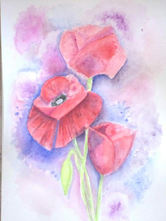
Poppies

So I decided to throw myself into some more experimentation with my Inktense pencils. I wanted to play around with them and learn something about my style.

Apparently, I'm all about the details! I told myself to loosen up, but I always got pulled into the details. If you want to work with colour, to see what they can do on a page however, you really need to let go of lines and work in blocks, instead.

The subject I decided upon was poppies, because poppies have loose petals, which are paper-thin and translucent. So they became my inspiration to loosen up. Of course, who can resist the delicious red of Flanders poppy?


Trio of poppies


I had to use a lot more water direct to the paper, and take the colour from the tip of my pencil. This allowed me to put down colour, without getting too caught in details, like a pencil would. But I even managaged to make the poppies, take the slight resemblance of roses, didn't I?

Because, guess what - roses are tight and controlled, which is more to my style. It's funny the things you learn, when you're in the process of experimenting.


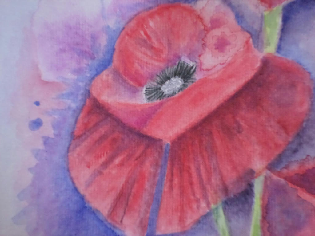
Close up


The main flower was open, so I gave it the most details. In the first under-painting layer, I managed to make a colour bloom, which I decided to make part of the flower. If I covered it up, I would lose the spontaneity and the effects of experimentation. This was a learning piece for me, rather than conceiving it to be a completed work.


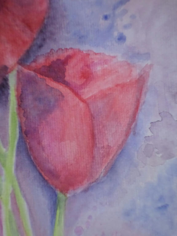
Smallest bloom


In the smallest flower, I kept the colour application in blocks, rather than going for gradients of shading. This was part of my loosening up strategy. The more I forced myself away from the details, the more I got to experiment with colour application.

What I learned was to mix some of the background colour (blue) into the red, in order to make purple shading for the petals. I could have selected a purple from my 72 piece set, but by choosing the same blue as I used in the background, it tied the flower to the background. If you notice in the lower left corner, I used some of the red in the blue of the background too.

It made a very warm purple, which I used to bring the stems of the flowers forward, into the picture.

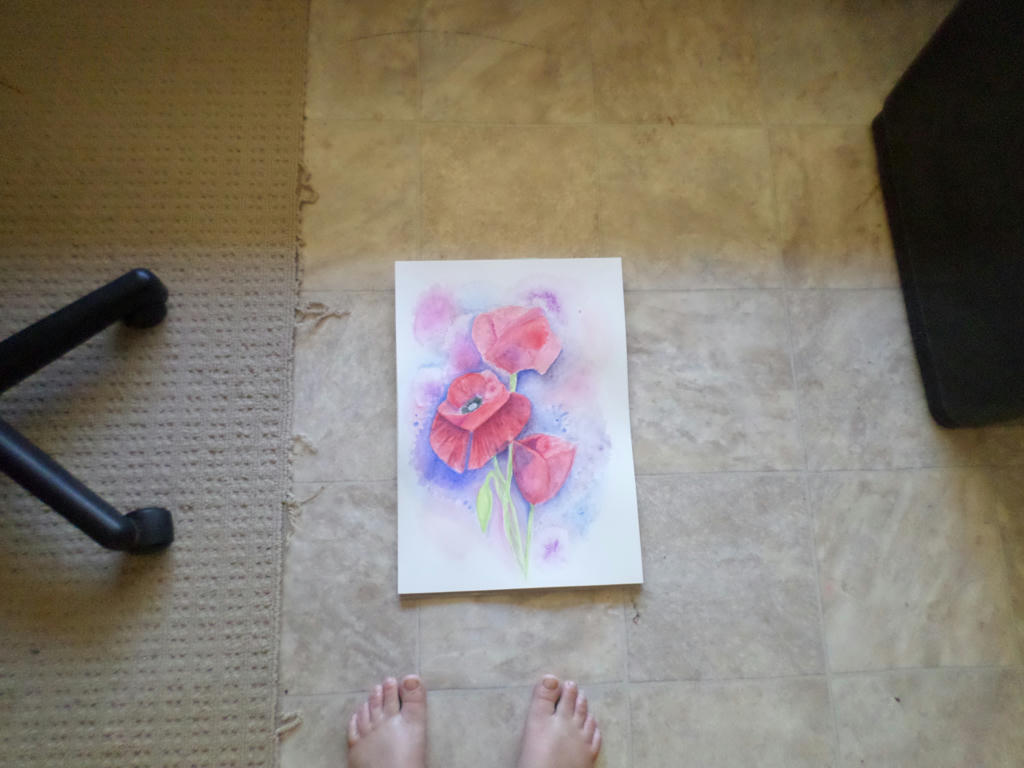
Distance


Forgive my fraying carpet, which I keep under the office chair, but I wanted to demonstrate what the picture looks like from a distance.

That gorgeous blue, really did lift out the red of the centre flower, which is what I wanted - but it does dominate the picture, so your eye doesn't naturally flow to the rest of the blooms.

There is probably more I could do to this picture, like adding that strong blue as background, to the top bloom. However, I don't want to appease my details-dominant style when I'm trying to break away from it. I will move onto something else. I think I will also use half the size paper, I am currently. This will be more economical on my resources, as I'm experimenting.


Tuesday, February 10, 2015

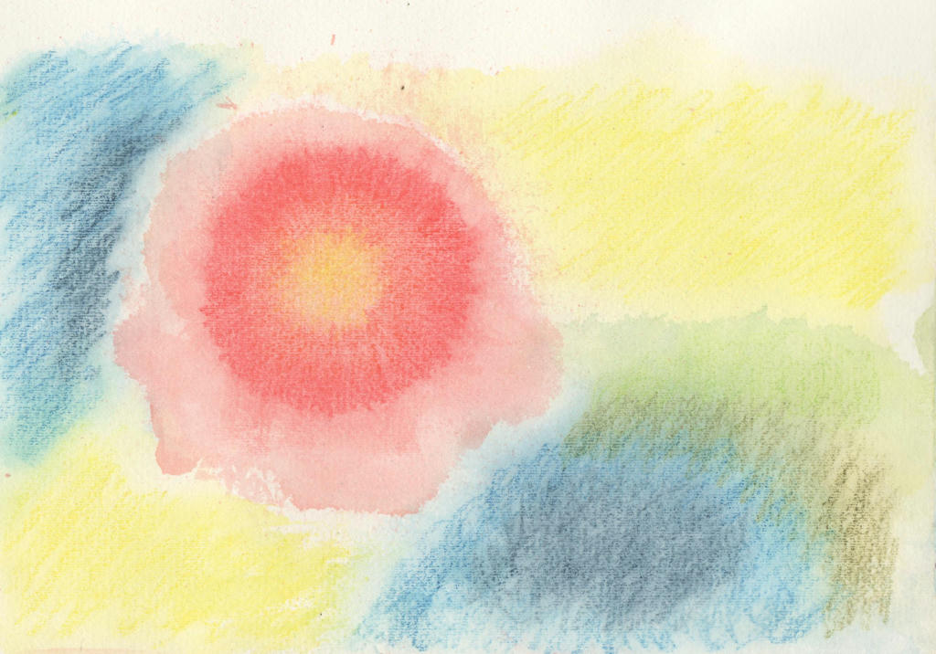
Random flower

Every day is not a masterpiece day, especially when it comes to experimenting! I've been pushing myself outside my comfort zone lately, looking for different ways to use my mediums. I had purchased a Derwent spritzer bottle, which I have seen used with watercolour previously.

I tried it with my Inktense pencils to see what effects I could create.


I started by drawing a disk with multiple colours (yellow, orange and red) then once I spritzed the ink with water, I moved the paper around to create a random flower shape. I did the background colours after it dried, in a similar fashion. I thought the random flower shape, looked a little like a hibiscus, but wanted to do a more dramatic flower instead.

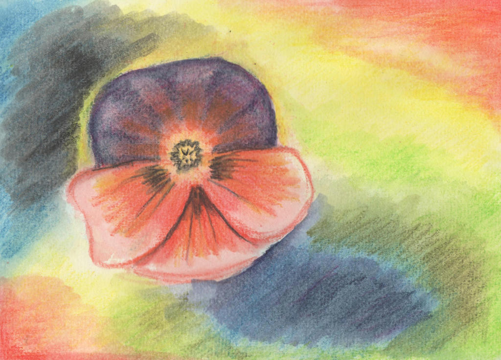
Cue the humble Pansy... 


I went over the original washed Inktense pencils, with more Inktense pencil and activated it with my water brush. I lost all that lovely randomness though. Such a shame. I started to wonder if I should've just done the hibiscus instead?

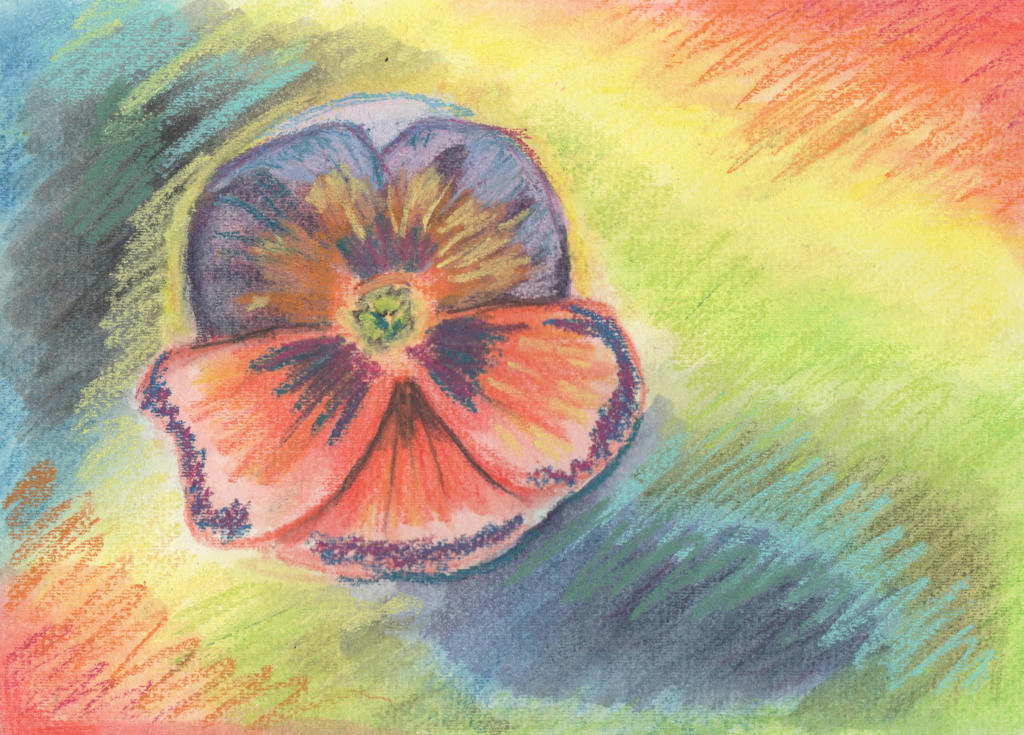
This was all in the name of experimentation however, so I went in with another medium over the top - soft pastels. I attempted a random over-painting with my strokes, to create a sense of movement in the picture.


Definitely not a masterpiece but the learning process was appreciated. Even if I don't like the final product, I do like the random strokes and can see how it contributes to movement - instead of just a pansy plonked on the page. You've got to try these new ideas out and rather than throw them in the bin, I can share my experience instead.

Perhaps it will inspire someone to try something different? It doesn't have to be perfect, just tried!

It was also good to test my water spritzer out, to see if it has a place in my kit. Like everything, it needs more practice, but its a quick way to get water on the page nonetheless. There's a video tutorial demonstrating the spritzer, using Artbar and Inktense blocks. I only have the pencils though.

Anyway, enjoy!


Bouquet

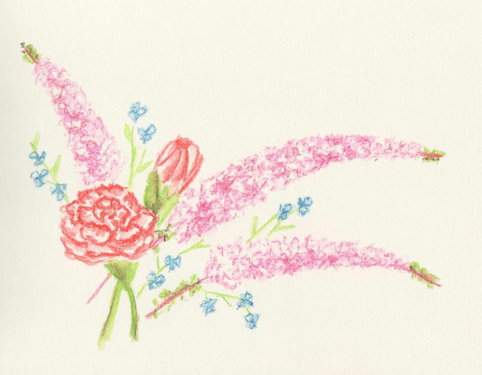
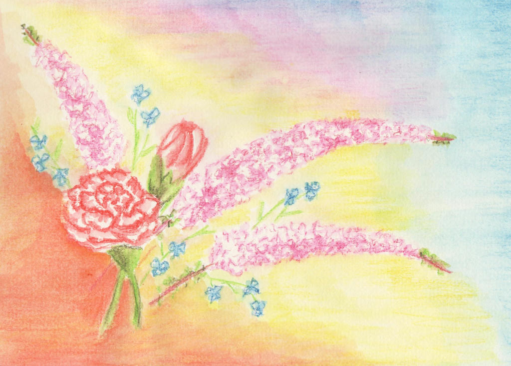
So it was our 12 year wedding anniversary this week (17 years together) and Dave gave me a delicate bouquet of flowers to celebrate. They were wonderfully received, but before they started withering, as all cut flowers eventually do, I thought to capture them in ink.


Intense pencils to be precise. I'm not sure what the long sprays of pink flowers are, but I do know the rest are red-tipped carnations and some blue wandering jew from our garden. I added them in to get a nice contrast in flower size and colour.

I liked it, but then I also thought it was a little boring too. After reading this article  (its really good) about painting flowers, I decided to tackle the negative space in the background. And here's what happened...


I ruined it. Inktense pencils are great for fine detailed work, but terrible for large areas. It dries really quickly, and by the time you get your brush loaded with water again (I used my new water brush) it starts to dry and you can't blend it back together, like you can with watercolour pencils. So the background looked splotchy.

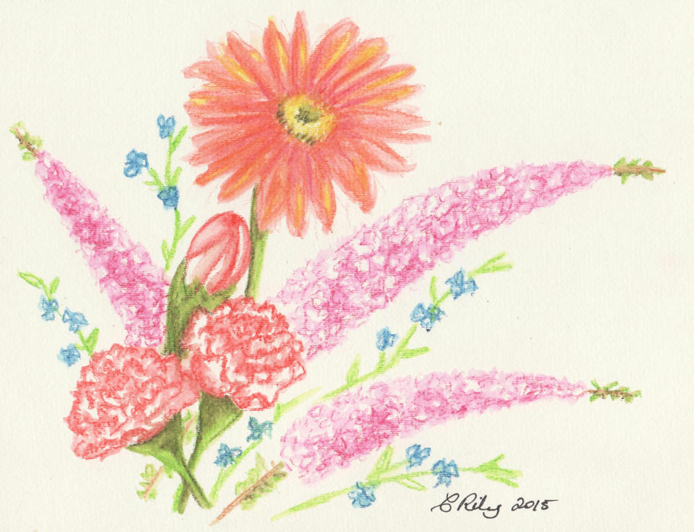
I decided to tackle the picture again. It was going to be a reminder of our wedding anniversary, after all. This time however, I was going to stick with the Inktense pencils for the detailed work, and tinker with the flower arrangement (per the article) to make better use of the negative spaces in the background.


I added an extra carnation (the magic of threes) and held my breathe while adding the big gerbera daisy, last. The daisy was in the bouquet my husband gave me, but they were red (like the red-tipped carnations) and I didn't want to drown the picture in reds. I liked the tangerine in the background I used before , so added it to the gerbra instead.

I think the lone daisy complements the arrangement nicely. By keeping it simple and working on the flower arrangement, I doesn't need a fancy background.

This is also another contribution to the February challenge.

PS: which arrangement do you like the most?