Showing posts with label illustration - people. Show all posts

Wednesday, April 11, 2018

Last day

Well, I got to the end, of the 7 day challenge, and found I really enjoyed it. Even when I didn't have a great deal of time to spend on each sketch, or they didn't quite turn out right, I still learned a bit more about illustration, and interpretation.

The final day, gave me the final chance to make a guy with spirals, work! I think I got a little closer to success, but still needs further exploration. Which is why I'm going to try a few more sketches with guys, and see how far I can push it.


Day 7


I went looking for a male model, wearing head and eye wear - to continue that circular theme. The spirals in the background, are meant to represent the ocean waves behind him. Because of the roundness in his accessories, this guy looks the most connected to the spirals. Rather than looking like, an uncomfortable or misplaced addition.


So what did I learn after the 7 day challenge:

  1. I like random mark making, which I cannot erase. Sometimes leaving IN your mistakes, speaks volumes about where you're meant to go.

  2. Mistakes can lead to ideas, or new branches of experimentation. I WANT to make guys and spirals work now! I'm intrigued. There has to be a way.

  3. Smaller snippets of art, are easier to fit in the day, than longer, dedicated sessions. Great for when the kids are on holidays, or I'm otherwise booked, to overflowing

  4. Making art, is about personal explorations, rather than a set idea. It's okay to let things morph. See below:


Day 4


Of all the female models, this sketch, I liked the least. Then my daughter said it was her favourite. It forced me to contemplate what she saw, that I didn't. In the end, I realised it was the eccentric accessories and hair, the lopsided composition, and slightly enlarged head, that created its own mystery.

Leaving in my mistakes, showed an appreciation of how they create structure, regardless. A mistake to me, can be a way of viewing the world, to others - such as my daughter. You just never know. So let things morph, and it will be okay.

As simple as my sketches were, they taught me a great deal, in a week. Thanks for joining me.


Earlier posts about this challenge:

Days 1 to 3
Days 4 to 6

Tuesday, April 10, 2018

Day 4 to 6

Despite a tight schedule, I still managed to keep up with the 7 day challenge, through #mycreativetouches. There are many talented people on the instragram page. Which makes my simple illustrations, look downright primitive, in comparison. But it's not about being measured against others, rather, finding something new within yourself.

And I've discovered a lot during days, 4 to 6...


Day 4
~ eccentric, to add interest


Day 5
~ feeling boxed in, with male options


Day 6
~ noticing a pattern for spirals, favouring one gender


I discovered the difference between drawing men and women, was challenging in the marks made. Women were easier to incorporate spirals, because of their long hair, curvaceous figures, interesting accessories and headpieces. The spirals seemed to be an afterthought, with men, however. More of a background accessory, than part of their form, or what they were wearing. It felt more disconnected.

I'll attempt to address that on day 7, however, I can see myself exploring beyond the 7 day challenge. It ends tomorrow, and I'll reveal what I learned throughout this particular, illustrative series.

Saturday, April 7, 2018

Another 7 day challenge

I've started a new 7-day art challenge, via Tara Leaver's instagram #mycreativetouchstones. Please feel free to jump-in and add your own creations, so long as you have an Instagram account of your own. Here's mine, if you're an instagram user and want to see what I'm up to.

The gist is to pick a single subject, and explore it for 7 days - with the intension of narrowing your own style: rather than being all over the place. Which tends to be me, by the way, in case you hadn't noticed *wink*!

First, I'll show the three pictures I've completed, over the past 3 days. then explain why I'm exploring these particular avenues.


 Day 1: Experimenting with marks
cross-eyed, but couldn't erase


 Day 2: Added a little colour after sketch, for experimentation
but it may not be a habit


Day 3: Loser than day 1 ~
but not as lose as day 3


Reasons for choosing this subject and medium, for my 7 day challenge:

  1. Time was limited. It's the school holidays, so time was short. Painting was out of the question. Sketching would be easier to set up, and quicker to produce something. It's only taken 15-20 minutes to complete each sketch. 

  2. Challenges with mark making. Normally I use a pencil for sketching, but wanted to see the marks I'd make, without the buffer of an eraser. So permanent, black pen, it was. The goal: to learn how I sketch, without refinement.

  3. The doodling factor. In the past I've used lines and spirals as a form of meditative, "doodling" on paper. After a google search on, "faces", images, were used as models. The expansive nature of doodling, however, ensured no sketch, looked anything like the original counterpart.

  4. Faces. I'm fascinated with expression, and what they convey without words.

  5. Moving past realism. The goal is not, complete abstract, but to move past creating realistic representations.This is so I can create an experience beyond what you get from viewing a photograph.


I look forward to sharing more of how the 7 day challenge, unfolds. Then finally, sharing what I got out of it. I enjoy participating in art challenges, for this valuable learning component. That's why I push past the clock, to join in. Because creating a series, teaches you a lot about your creative process.

Here are the rest of the links in this series:

Day 4-6
Day 7
Further experiments


Thursday, November 2, 2017

Musical composition

edited using GIMP


Music and Art, have something in common. Composition. I wanted MORE than just a visual, of musicians playing their instruments. Music, and art, had to somehow blend together.

Not entirely sure how I would achieve that, I experimented with my free digital software, GIMP.  I scanned the original sketches in my art journal, then set about cropping each image. It had to represent the best expression, of the individual musician and their instrument. When I began rearranging each picture in relation, to the next, I discovered the "white space", was talking to me.

If you notice the violinist on the far right, I flipped her, so she was facing the other way, to the original sketch. Because the lines worked better that way. As a triptych, the form of the instruments and the musician's arms, made a kind of geometric shape. Resembling closest to a triangle, and yet, not entirely enclosing the ends, either.

I always intended this to be a triptych - or 3 individual pieces, meant to hang together. While I'm happy with the composition, I'm not sure what medium I will use. Should I stick with pen & paper, or venture into paint?


Friday, October 13, 2017

Triptych times

So there was this incredibly LOOONG spell, between my creative muses. I put it down to being uncomfortable with my mediums. I've tried painting, charcoal, pastel, watercolour, different kinds of crayons, pencils, and even collage. No matter what I tried though, my muse always felt stifled. So I had to force it onto the page.

Naturally, that kind of creativity isn't enjoyable - so I've been avoiding the studio, ever since. But then something dawned on me recently. I was listening to music with my headphones, and the main lyric in the chorus was, "write your story on my heart." Don't ask me why, but that repeated chorus ignited an old story, in my heart.

Me, a piece of paper and a pencil - that's how it all began. From as early as I can remember, this is how I taught myself to draw. Three muses, like a trio of musicians, working together to find the right note. Was this, what I was missing? Then my subject matter, suddenly fell into my lap...


Violinist #1


Using an image online as a rough guide, I started to play with lines, in ways I haven't felt confident doing before. I played with the long diagonal of the bow, contrasting with the neck of the violin. Then, completely out of the blue, she was wearing a curved hat, with extra lines to match the bow. Was it even meant to be a hat? I was just playing with what lines could express.


Violinist #2


Another violinist, but this time, her stance was more subdued. The bow was almost vertical, as if she was willing the perfect note into being. I played with her hair, to make the curves, mirror the shape of the violin. But after I finished the sketch, it felt out of balance somehow. So I added a large spherical object - most likely a moon, in the background. It embraced her and the violin.


Cellist


To finish the triptych, I needed a cello player. To my surprise, it was the cello that wasn't going to play second-fiddle, here. As I continued to sketch, it filled up more of the page and hid the cellist. I liked this contrast, against the other two musicians. I wasn't sure how to treat the face, so cast shadows across her eyes. Which looked more like a blindfold. I decided it was acceptable. Because it was like the cello could play itself, without seeing the eyes or expression of the musician.

I knew when my muse hit me, what I was missing in the studio. Illustration. It was how I became an artist, in the first place. It's the one thing I don't have to force. I've decided to dance with illustration once more, and see where it leads me.

Sunday, September 4, 2016

Day 3 mini challenge

So day three of the mini challenge, happened to fall on Father's Day. Unfortunately, David had to work. It did afford me the opportunity to turn my mini challenge, into a Father's day card, however.


David is not into sports cars or golf, but he does like Fedora hats, ties and smart attire! He's also partial to the colour red. So the theme was really decided by the things David likes. I enjoyed being able to make him a custom card, rather than having to sort through the limited options available at the store.


I used inktense pencils, and really wanted to use acrylic paint. I didn't have any in red through, so I went with the inktense pencils. Which meant it got more of a scratchy treatment than I would have liked. I was hoping for a more smooth finish. Thankfully, it was more forgiving as a 3D card, better than a flat image.

David like it too, which was the most important thing.


Wednesday, December 31, 2014

Another period figure

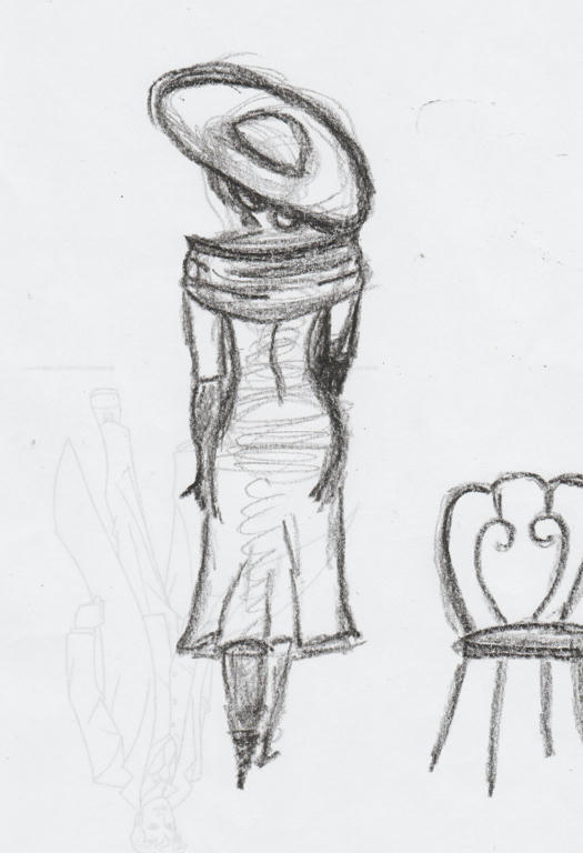
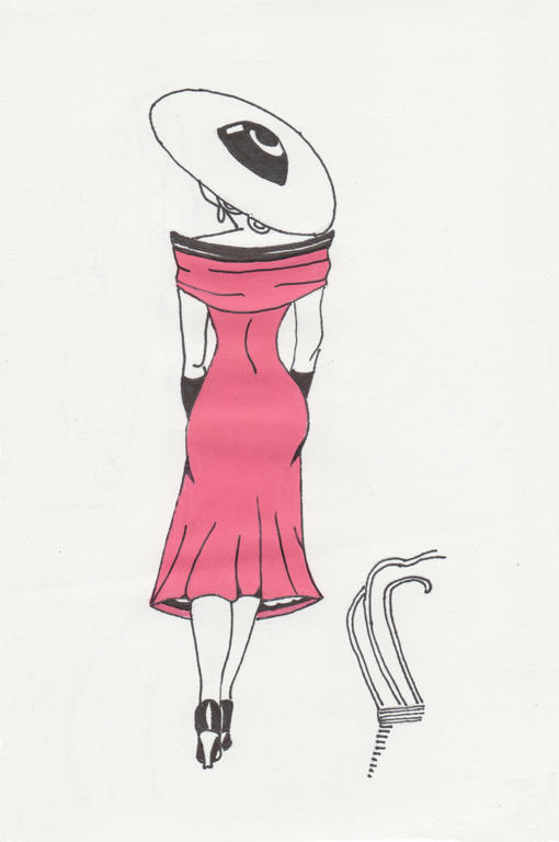
Thanks to a suggestion from Linda and Jasmine, in the comments of my period figure, I have made another pose for my model, in a hot-pink dress. I was already thinking I should do another period illustration, but I didn't think it would be of the same lady in the same dress.

This caused a small dilemma however, as she was in a seated position, and that would limit me to another seated pose. If this were to be a set, I would need similar proportions on the two separate pages. Keeping this in mind, I proceeded with an idea which would not be a seated pose...because I like a challenge.


I wanted an image of her walking away from the chair, as calmly as she had sat upon it. So I started with a contour sketch first. I was mostly happy with the composition, but there were small details I fixed on the tracing paper, when I transferred the image to the clean paper, for rendering.

And then out came the hot-pink paint again...


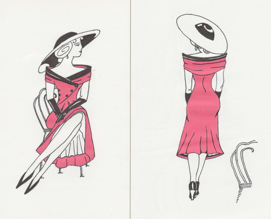
I know there are some differences between the seated and standing figures, but to make their attire exactly the same, would've compromised each piece individually. Like I didn't want a white hat in the above pose, but if I were to colour it black (same as the other one) it would take emphasis away from the dress.

Backs of dresses are always less interesting than fronts anyway, and the lighter hat helped to create levity, as opposed to heaviness. Her skirt also looks less full in this image, as opposed to the seated one, but I wanted her curves to create interest in the dress also - and that couldn't be achieved with a much fuller skirt.


 Side by side, for comparision


So they are similar, but not exactly the same. I kind of like that! Also, the standing position is only marginally taller than the seated one, so not letting the fear of proportions prevent me from trying something different, paid off.

Thanks to Linda and Jasmine for the suggestion to make a set. It was a fun challenge to attempt, and really made me think about form and composition. I know the images themselves don't look very complicated, but the thought in making them balanced (both individually and together) was rather involved.

In fact, if you notice the white hat looks a little smaller than the black one, they were done in proportion to how far their hem lines were cast - this added balance to each pose individually.

I also had them facing each other on purpose, to show interaction, even though they're meant to be the same model. If you wanted to show disassociation, you would swap the images around, so their backs would be facing each other instead.

Tuesday, December 30, 2014

Period figure

I'm not normally a fashion follower, but there's an era which I think is so glamours and flattering to women's figures, that its worth reproducing - its the 1920's through to the 1950's. I'm particularly fond of this fashion, even if I wouldn't necessarily wear it today myself.


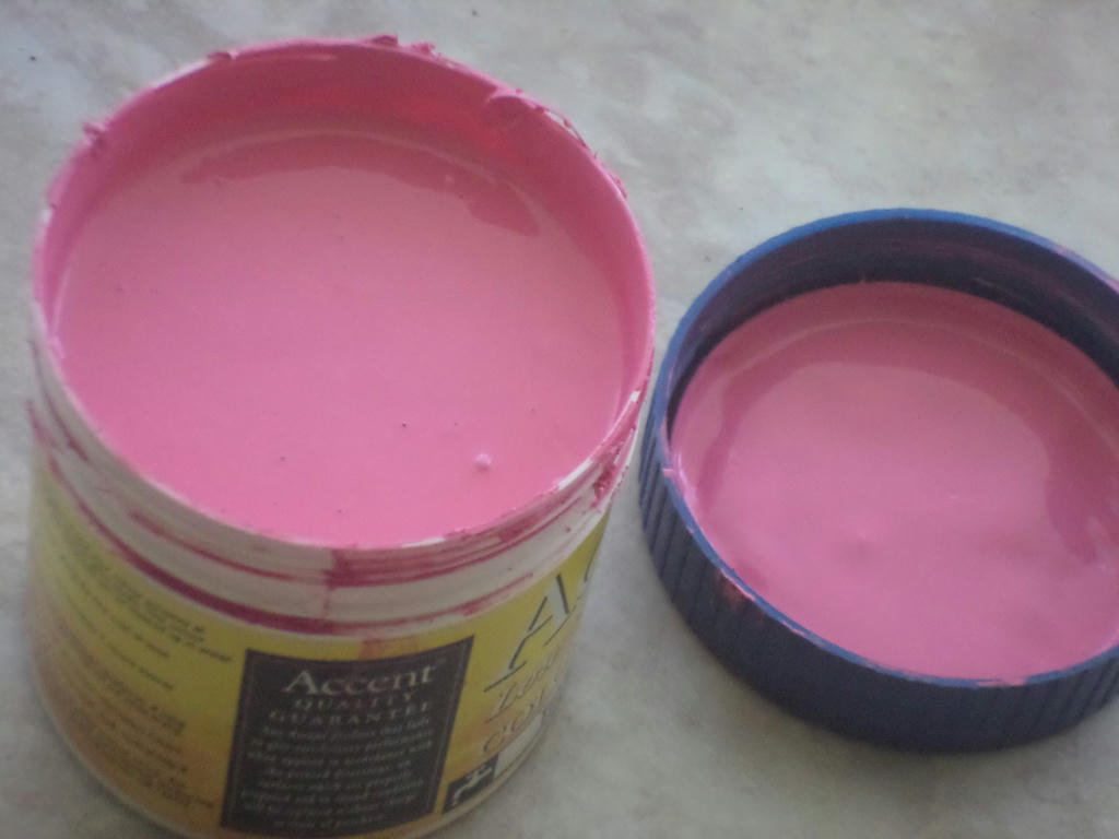
But I'm getting ahead of myself. First to where my inspiration came from - a sample pot of hot-pink paint. I found it while sorting through my supplies and wondered, how on earth could I possibly use this in a piece? The first thing which popped into my head however, was a Chanel hot-pink and black dress.

This was not typical of the fashion period I was drawing, but I didn't see any problem mashing things up, so long as the feel of the piece remained in-tact. Then it came to finding myself a suitable model.  

Oh boy...


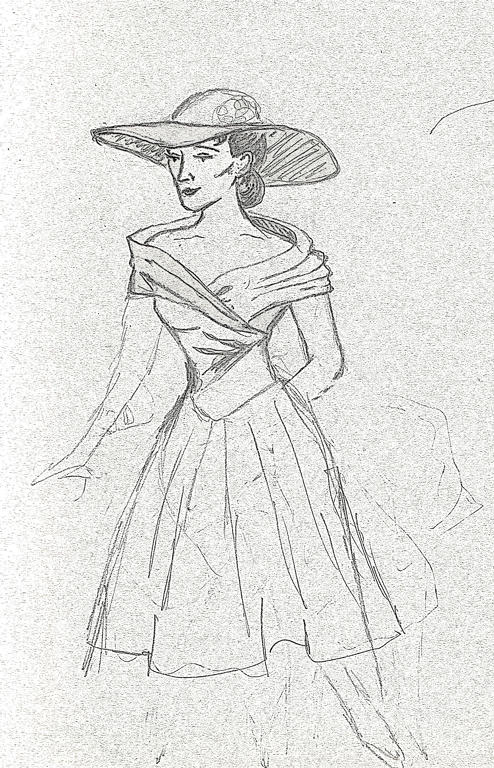
Edited using GIMP, to make pencil stand-out


This was going to come exclusively out of my head, as I didn't want to duplicate someone else's photography. Only problem was, it came out so flat and lac lustre, I didn't even finish the piece before deciding she wasn't going to be my model. Notice all those finicky details? I should have focused on her pose instead.

Then I read Jasmine's tutorial, and WHAM! What came out on paper next, suddenly had a more natural form.

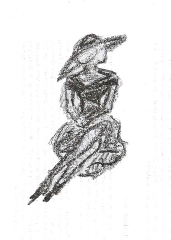
Edited using GIMP, to make crayon stand-out


Using my son's crayon was better for this type of sketching, rather than regular HB pencil. It just gave more body and filled in quicker. So when I was happy with the pose, it was on to complete the details of the fashion itself.


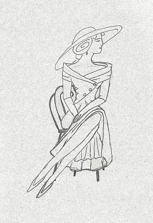
Edited using GIMP, to make pencil stand-out


I modelled the dress more off a Christian Dior dress, than a Chanel one, and even then its not exactly the same. I guess you could say, they're a combination of the two designs. Then I gave her a chair, probably a little French Parisian in style, to sit on.

I'm guessing this lady is outside, although she could be waiting at a cafe too. I didn't want to get too lost in background details, because it was all about her pose and style.

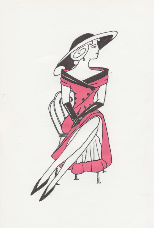
Then came that lovely hot-pink!


The mediums used are the acrylic paint, permanent black pen and white paper. Although it looks rather simple, the work involved getting it out of my head was incredibly complicated. But its nice to have a piece I can say is completely my own.

I did a little research on dresses and hats from the 50's, but even then, only took bits and pieces, of what I thought would work here. I even deliberately didn't give her a necklace, as it made the head and shoulders look too busy. A teardrop earring is all she has as jewellery. The hat and dress though - well that's the focal point!

If I go a little further, this piece is probably about sophistication too - of a time when women's fashion seemed to be more about intelligence and not just beauty. Men had always worn suits to look sophisticated, but women had frilly and effeminate attire only. This particular era of fashion (between the 20's and 50's) allowed women to dress more smart like a man, but without hiding their femininity either. 

But it all began for me, with a sample of hot-pink paint! What would that colour inspire you to create?