Showing posts with label watercolour pencils. Show all posts

Monday, September 7, 2015

Cockatoo - new medium

I've been carefully working on an old piece, as I'm not entirely sure how to treat it. I'm not even using the reference photo any more. I figured I've got nothing to lose and everything to gain, by continuing to experiment.


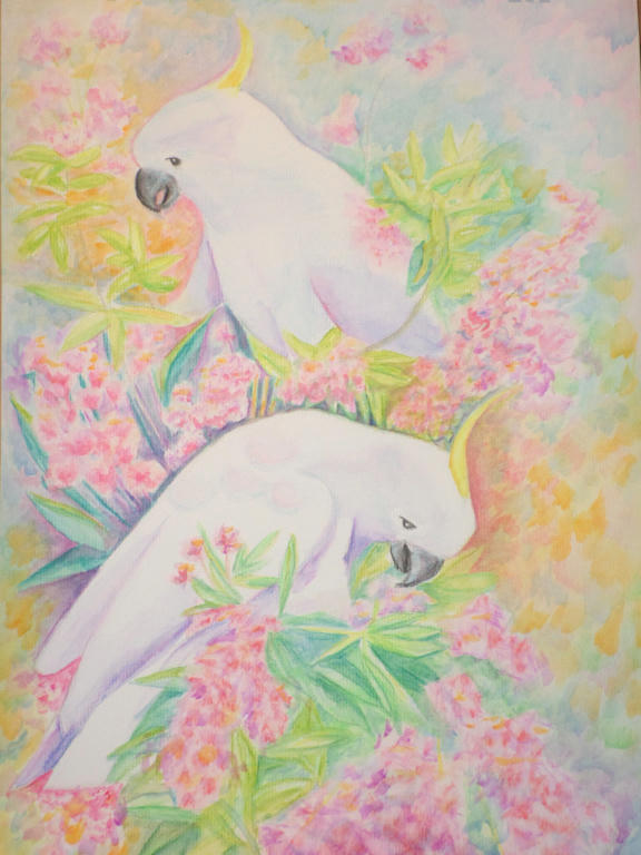
This is the original Cockatoo picture, I worked in watercolour pencil. The white of the Cockatoo, was difficult to contrast colours with, to make them stand out. I wasn't happy with the yellow-orange, dominating the picture, with nothing to bring harmony.

When I received my new 72 piece, Inktense pencil set, however, I started to rework the picture and develop something different.


I haven't really altered much of the top half - that's still watercolour pencil (mostly), but the lower section I used the Inktense pencils. These are permanent, so unlike watercolour pencils, I cannot remove colour after it dries. It forces me to apply little changes, rather than big ones that could potentially ruin the piece.

I'm bringing more green/blue into the yellow and even in the blooms, for shadow effect. These were the harmonising colours I needed, to tie the piece together.

I'm using "Chilli Red" and "Mauve" as the primary, bloom colours, which contrasts vividly against the white of the Cockatoos.

The plan is to gradually work through the middle and up to the top. It may take me another year or two, to finish, lol. I like being able to put it down, completely forget about it and then revisit when I have the time again. I have it on display in a living area, so I can walk past and see what catches my eye - in a good way or bad.


Tuesday, March 10, 2015

Cockatoo background


I've worked a little more on the background to make the Cockatoos stand out. I'm still not entirely happy with it, but its more vivid at least. I may work on it some more, but will probably leave a little more time between updates.

And hopefully I'll have made some new pictures in the meantime!

Monday, February 16, 2015

Cockatoo background


So I've worked a little more on my picture. I like the new colourful background, but I'm also missing the loss of the white paper. I feel like I've gone overboard with colour again, as I feared I would!

It's not finished, but I may give it a few days to think about my next move.

Sunday, February 15, 2015

Cockatoos

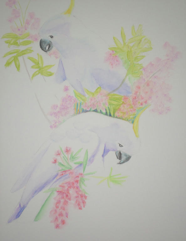
After finding a wonderful picture online, of a bunch of cockatoos feeding, I decided to select only two birds from opposite sides of the tree to represent. While I love the cockatoos, it was mostly for the NSW Christmas bush in bloom I wanted to capture...


Forgive the darkness of the photo. As the cockatoos aren't surrounded by foliage yet, it's difficult to see their definition. I'm using watercolour pencil and its still a work in progress.

I like the sparsity of this portrait so far, having all that white space, and yet I know it needs a lot more colour added too. I'm experimenting with colour, choosing lavender for the shading of the cockatoos, and trying to incorporate magenta as much as possible, in both the flowers and shading of the foliage (to come).

I'm worried I'll stuff it up, so I'm going as gently with the colour application as possible. Any new work is approached with much thought, because I could easily drown it with flat colour with little ability to lift it - as I learned with my bush creek landscape portrait.

It's a very peaceful piece to work on.

Saturday, January 31, 2015

Bush creek final

We have settled into our first week of high school and in the past few days, I've also finished the online course, "Making money making art". While there was a bunch of information I learned which will come in handy - I also recognised what kind of artist I didn't want to become.

I didn't want to become someone who ONLY sees money as incentive to create art. Neither did I want to put my life on hold to make it all about my art either. When I look back at these past few weeks - how hectic they've been, with very little room for making art, I recognise that I have a pretty amazing life! The art is the bonus when I can fit it in, but I have some wonderful people to share my life with in the meantime.

I can see my creative life and family, marrying nicely, without there needing to be a downside.


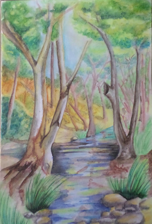
I have managed to squeeze in some time to complete my watercolour picture though. It was a very patient process, which in hindsight I enjoyed. I got some feedback from my mum when she came to visit, to spread the blue around the rest of the scenery - which I did in the tree leaves, about the middle canopy of the front two trees. Making it slightly darker added depth, but also linked the blue up with the water.

My mum even suggested I break the banks (so to speak) and let the water spill behind the tree, to break the bottleneck happening in the middle. I was surprised how these little changes made a significant difference. While I couldn't lift the heavy blue from the water, I could spread it around the scenery to soften the water's intensity.


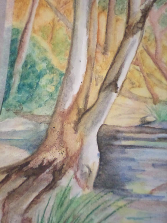
Thanks to Linda's youtube suggestion, I even learned some new techniques for improving the bark on the trees. The "vein" technique the artist used in the video to make flower petals and leaves, I used to make the bark. I was very pleased with the results. I even did some more splattering.

While I don't believe I saved this picture completely, I'm happy that I saved it from the bin! I learned a lot from experimenting with how the water reacted to the colour, even with pencils.

I still have a lot to learn with this medium, but the greatest lesson I'm taking away from this exercise, is not to give up. Plodding along is what I do best anyway. Thanks to others who also shared their feedback here, and it was Linda especially who kept me at this picture. I was going to give up on it, but you said not to - so I found a way to make it work a little better. So thank you Linda.


Sunday, January 25, 2015

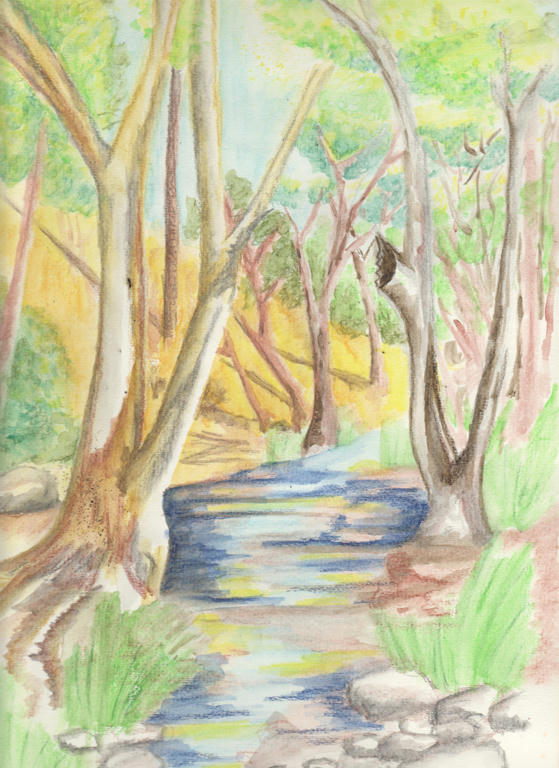
Bush creek

After my watercolour pencils dried, I worked a little more on my bush scene to add more depth. Like the pendulum swings both ways however, I took it in the opposite direction of not enough details into too much detail! The reason I am sharing this is for my own benefit. I need to record the errors, to highlight where I need to change.


Too much dark blue was added to the water. It was meant as a (small) contrast to the water, instead it changed the water colour completely. Use less darks next time, and build them up gradually. Some of that dark blue in the water, was meant to be the shadows of some of the trees - so I might be able to add greater contrast, by adding a darker brown (selectively) for the tree shadows.

I've also used too much brown in the landscape, with not enough variation between the closest trees and those furthest away. The closest trees should be the darkest, with the most shadow, but those in the distance seem to have more of that quality. 

So in my attempt to add more detail, I just added more darker colours over the lighter ones, with the same lack of variation I had before. Frustrating, but still a learning process for next time.

Is there anything others would like to highlight, which needs addressing too?


UPDATED to add a link, demonstrating how to achieve atmospheric perspective.


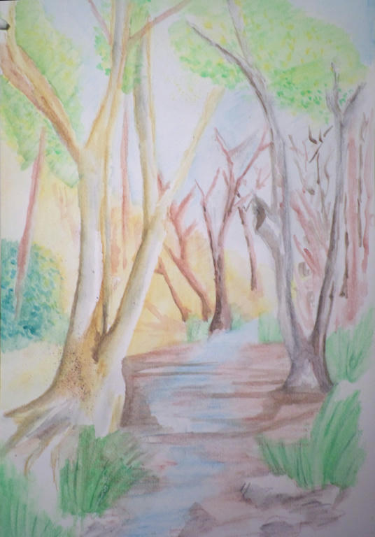
Water brush

I received a new Derwent water brush a few weeks ago, but have been madly preparing for school starting next week. Today I got a chance to experiment a little with it, and my watercolour pencils. Before I get to that however, here's a youtube video demonstrating what kind of brushes I'm talking about.


I've purchased a few inexpensive accessories from the Derwent range, and I find them to be well made and do what they claim to. I'm not paid for this endorsement, by the way, just sharing my experience - because I hate spending money on stuff that doesn't work! I'll share how my other goodies work when I get a chance to use them.


This is an attempt at a bush scene with a small creek. Some things work but a lot of it doesn't. Not to worry - it was just an experiment to see how the water brush worked as I needed a large section of pencil to blend. I'm happy with how the brush performs - its very economical on water and I'm not constantly dipping a brush into a pot. I prefer using it to a traditional brush with my water colour pencils now.

There's a small splattering of watercolour on the closet tree, I was able to do that with the water brush too, straight off the watercolour pencil - flicking it off the tip.

I may yet save this picture once my pencils dry and I can add more detail. I like the feel of the picture, but I can tell I'm still very "basic" at my skill level. So even my best attempts may not save it, lol.

I would recommend a water brush for anyone wanting to try them. I got the medium size, so not fine or broad and it gives me a range of strokes, depending how heavy I press the bristles down.


Tuesday, January 13, 2015

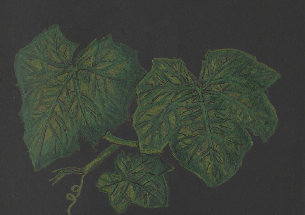
luffa

My daughter received some art supplies from a relative for Christmas, only she doesn't like to work in colour she later told me. While grateful for the thought behind the gift, she didn't feel she could use it, so gifted them to me.

The charcoal pencils came unsharpened and fell apart when I tried to put a point on them, with two separate sharpeners and a blade. They weren't well made so they were binned. But she was also given a tiny A5 (8" x 6") sketch pad of black paper, the charcoal pencils were meant to be used on.

So out came my watercolour pencils for an experiment.


The thing with experiments is, you never know what you're going to end up with. I learned the limitations on such dark paper, with pencils. They weren't very vibrant. I used the watercolour pencils dry, so I struggled to develop highlights on a black background.

I tried to use a black marker pen, to get some detail in the leaves, but fear I only made it look more messy. You never know if you don't try these things out though. This was not meant to be my best work, just demonstrating the results of an experiment. Perhaps prisma coloured pencils would have worked better? I know with such a small pad, I cannot use my chunky charcoal blocks or oil pastels.

The inspiration was my luffa vines, which are sporting a lot of leaf cover at the moment, but no flowers as yet.


Wednesday, January 7, 2015

Watercolour portrait

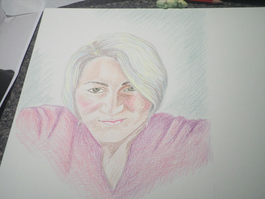
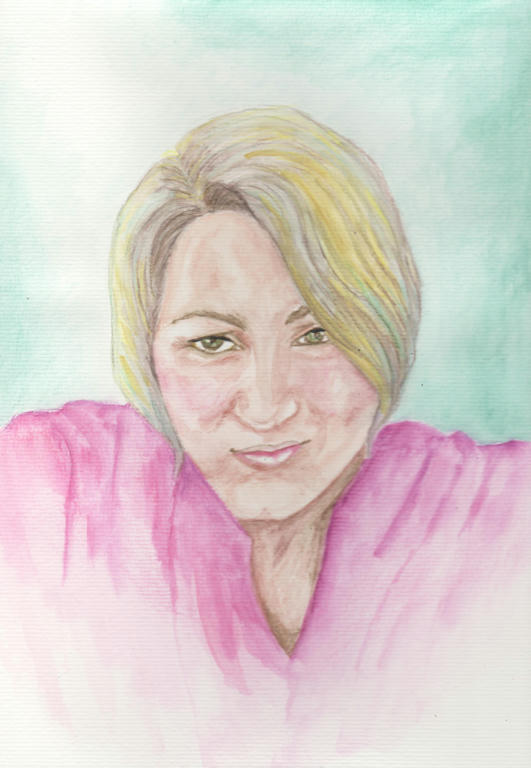
I wanted to try a new medium for my self-portrait. It's the complete opposite of the strong lines of charcoal I used formerly. While I loved working with charcoal, there is something deeply hypnotic about watercolour work as well.

This is not watercolour paints however, rather the pencils instead. I'm using them in a different way to how I have formerly. The application is a lot looser, and my aim was for subtlety, rather than sharp detail.


Click to enlarge


It looks nothing like watercolour, when the pencil first goes down. Normally I get very detailed in my pencil work, but I stuck to simple shading this time. Watercolour is a loose medium, where most of the magic happens when the water is added.

I tried to include some grey highlights in my hair, as since my henna-dye has grown out, I have ash-blonde colour, with a slight silver sheen.

Then I added the water...


Finished picture


I scanned the above image, and the real picture doesn't look as flat as it does here. But I was after subtle with the watercolour, so I got it.

The yellow was too bright I felt, but it didn't really come off when I attempted to lift it again. I added the aqua highlights to help the grey stand out, as it virtually disappeared when the water went on. The aqua also reflected the background, which I really liked.


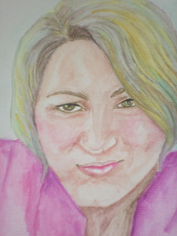
Close up


Even with an outline from a photo image to guide me, I still got some things wrong. The top lip is a little off, but as it was done by me it was bound to reflect some kind of flaw. I'm human, its what I do, lol.

The magenta I used in the shirt, I also used to colour the cheeks. I got this idea from the actual shirt I own, which is in the picture. Whenever I put it on, it brings out the colour in my cheeks, so I reflected that in the image too.


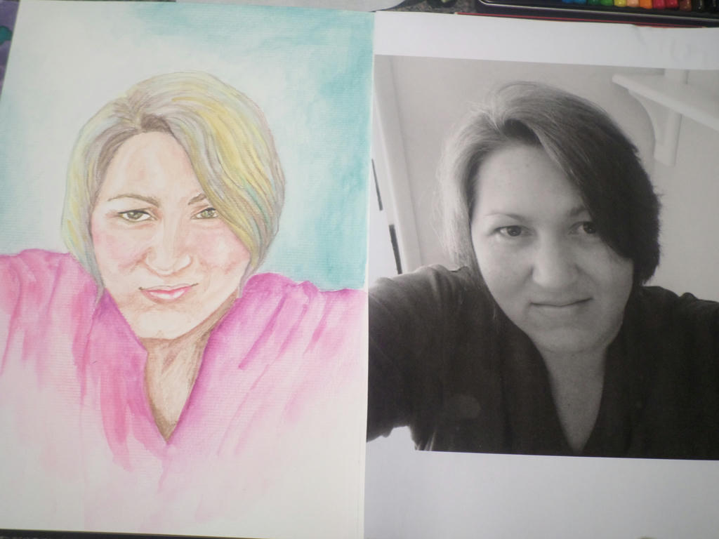
Side by side

It's not exactly the same as the photo, but it does carry a reasonable enough likeness. I enjoyed working with the watercolour pencil again, even if using it more loosely, made the application look amateurish. I'm still learning the art of moving the water around. Any suggestions to improve my watercolour application?

What I like about watercolour pencils though, is being able to control where the colour goes to a larger degree. Add too much water and it will still get away on you, but on the whole, pencils are less unpredictable than the watercolour paints.

I could stop at this portrait, but if I have the time and inspiration, I may try something else.


Tuesday, January 6, 2015

Watercolour swatches

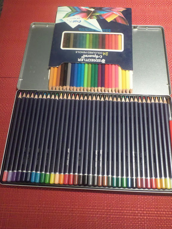
For Christmas I bought some new watercolour pencils, partly because I wanted a larger collection of colours, but also because I wanted to see what other brands were like. My existing Staedtler collection of 24 watercolour pencils (German made) was several decades old.


Old set (top) new set (bottom)

Unfortunately, when I purchased my new tin of 36 watercolour pencils, I thought they were Derwent (UK made) but it turned out they were Jasart. I must have gotten that confused with the Inktense pencils made by Derwent, which I bought at the same time.

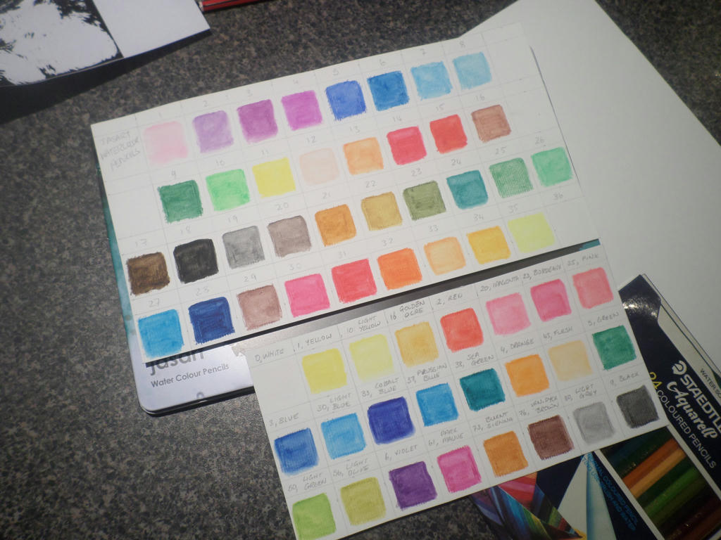
The problem with the Jasart pencils were, they didn't mark their pencils with numbers, or have the corresponding colour names, written on the packaging. Not even the name of the manufacturer was on the tin, or where it was made. So after I numbered the pencils myself, I did a sheet of swatches, to see what I was using.


Jasart pencils (top) Staedtler pencils (bottom)


It's a good idea to do swatches even when you have the colour names (as I had on my Staedlers) because the colours change once water is applied. My squares were only 3cms x 3cms, but were enough to demonstrate each pencil's saturation.

I noticed a few things about the two different sets of pencils though. Even though my existing Staedtler set were aging, when water was applied, they had really creamy texture. The newer Jasart pencils seemed to have less pigment in them, so when water was added, their colour was less intense.

It might also have to do with the fact, the Staedtler pencils were harder to apply dry, so I had to colour harder - therefore applying more pigment. The Jasart's were so much easier to apply dry, I had to barely press down at all. So perhaps that's why I didn't get such a strong pigment when water was added?


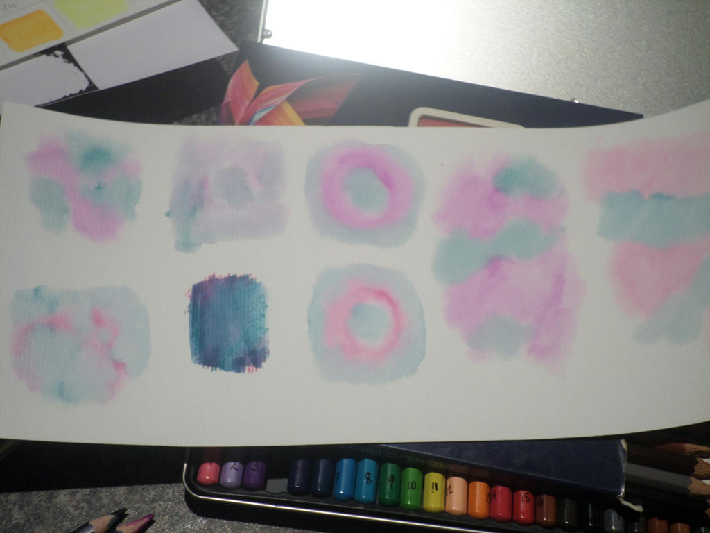
darker purple is the new set of pencils


On the bits of watercolour paper I had left over, I conducted a few experiments to see wet on wet application. I wet the paper first, then applied water directly to the pencil with a brush - then applied the brush to paper. It was a very fun experiment and I will have to do more. I tried to get a bloom effect to happen, which I wasn't successful at.

It's important to remember you should never sharpen your pencils after they've been wet in this way though. They must be completely dry before sharpening again, or you can damage the wood.

Speaking of wood, that's another problem with my ageing set of Staedtler pencils. They are almost impossible to sharpen now. The wood has hardened so much, the sharpener eats them up. Big chunks of wood come off. The greener the wood, the easier they are to sharpen.

So bear that in mind when buying watercolour pencils. Try to get as much use out of them as you can, and never use a dull sharpener to sharpen older wood. I recently sharpened the blade on my sharpener, as I have a stone, and yet it still chewed up the old wood. Imagine what a dull blade would have accomplished?