One of the exercises for the Touchstone online Art course I'm doing at the moment, is a vision board. The gist is to use magazines to cut-out, whatever images and words inspire you. If you don't have magazines, then you can do an online version, using Pinterest.
I got a little stuck on this exercise, because it brought back memories of an art assignment in high school. It turned into an innocent misunderstanding with the teacher, which led to a public "dressing down", in front of my peers. So every time I thought of doing this vision board, I reached a blank!
The thing is however, I REALLY wanted to do it, because having a vision board for inspiration, would be great! So I tweaked the exercise a little, to fit in with how I could do it.
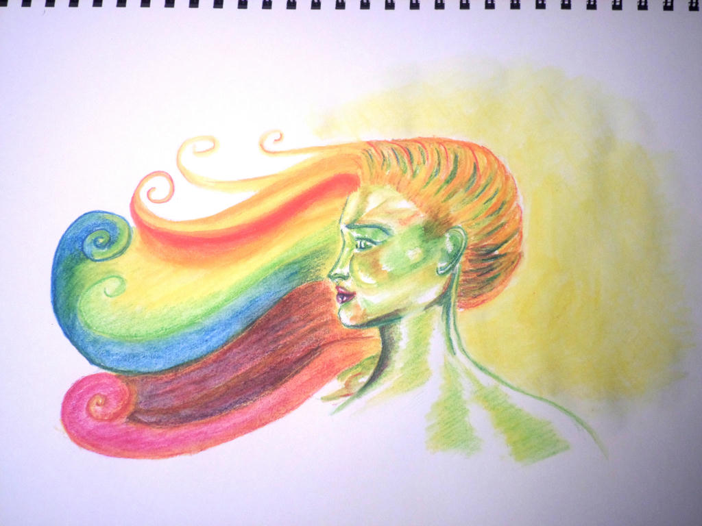
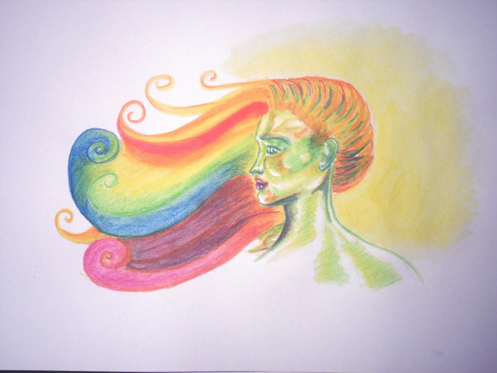
It took several hours to complete, from the depths of my imagination. It contains all the things I want to be inspired by. There's also somewhat of a cycle to it as well. I love cycles.
Basically, ideas start as seeds, then germinate. They can make us feel vulnerable and unsure at first, because they're new. It requires a little (or a lot) of grace to be inspired and make the connections, in order for the idea to bloom. Those ideas, return to the world, and we do what we can, to maintain the balance of ourselves through this cycle. She is naked because all she has is her creativity and perception.
I felt so much lighter after doing this exercise, because I climbed over a psychological barrier and was able to move to the next step. Which is basically what the entire course is about. It's making those steps we constantly tell ourselves, we're not entitled to take for some reason or another.
I would like to share some links I've obtained, via this course. They're publicly available links, which I think are worth sharing. The first is a free downloadable book, called, "The War of Art", and is written by Stephen Pressfield. I'm only up to page 50, but it has some interesting views on how we view our creativity - or, the desire to create.
The second link is from a TED talk by Tim Urban, dubbed the Master Procrastinator. It's a very easy to follow talk, which explains the dilemma of the procrastinator. It doesn't hurt that it's very amusing too.
I'm on week three at the moment, with one more week of the course to go!
Showing posts with label inktense pencils - people. Show all posts
Tuesday, September 27, 2016
Sunday, September 4, 2016
Day 3 mini challenge
So day three of the mini challenge, happened to fall on Father's Day. Unfortunately, David had to work. It did afford me the opportunity to turn my mini challenge, into a Father's day card, however.
David is not into sports cars or golf, but he does like Fedora hats, ties and smart attire! He's also partial to the colour red. So the theme was really decided by the things David likes. I enjoyed being able to make him a custom card, rather than having to sort through the limited options available at the store.
I used inktense pencils, and really wanted to use acrylic paint. I didn't have any in red through, so I went with the inktense pencils. Which meant it got more of a scratchy treatment than I would have liked. I was hoping for a more smooth finish. Thankfully, it was more forgiving as a 3D card, better than a flat image.
David like it too, which was the most important thing.
David is not into sports cars or golf, but he does like Fedora hats, ties and smart attire! He's also partial to the colour red. So the theme was really decided by the things David likes. I enjoyed being able to make him a custom card, rather than having to sort through the limited options available at the store.
I used inktense pencils, and really wanted to use acrylic paint. I didn't have any in red through, so I went with the inktense pencils. Which meant it got more of a scratchy treatment than I would have liked. I was hoping for a more smooth finish. Thankfully, it was more forgiving as a 3D card, better than a flat image.
David like it too, which was the most important thing.
Thursday, August 6, 2015
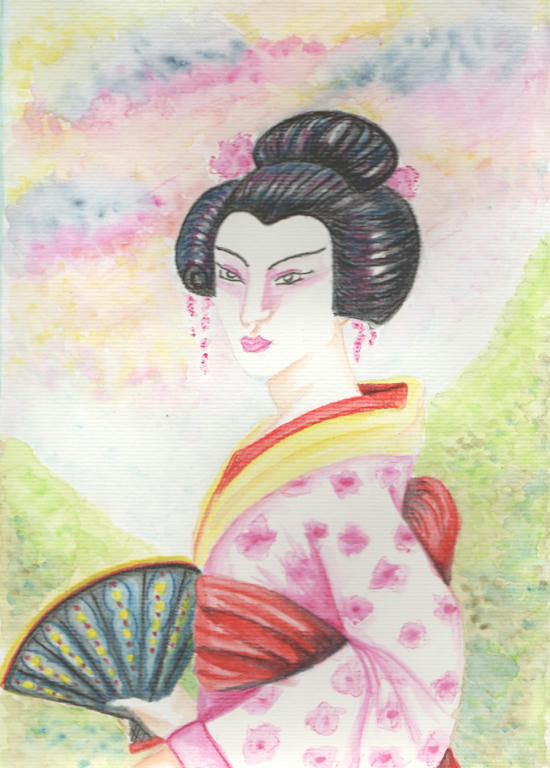
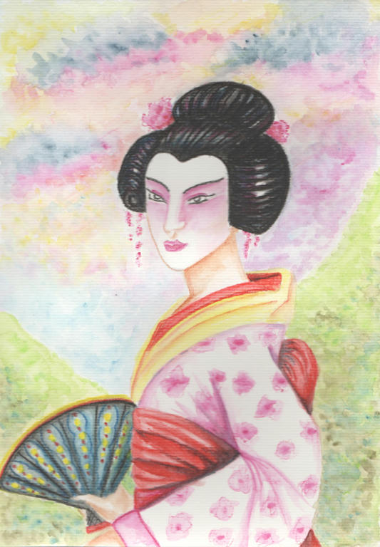
Inktense Geisha
Unfinished - see end for final
I am revisiting an old subject of mine - a Geisha. Nothing new in the subject matter, except perhaps she has a full Kimono now, but I wanted to share a new technique I have discovered with Inktense pencils.
If you remember in my former attempt to use Inktense pencils, I noted the difference to them in regards to watercolour pencils. I wasn't sure if I liked how different they were to use, but now I have tried them again (with some youtube inspiration) I think I have discovered their new potential.
The technique with the pencils are covered in the first 5 minutes of this video. The rest you can watch for pure enjoyment of making your own cards. I had also watched other videos which showed different techniques, but it would be painstaking to list them all.
I always struggled with application of the water or how thick to apply the pencil. I am getting more comfortable with alternating between both, rather than having one preferred method.
The difference between the top image and the last, is the addition of heavier shading. Good in some ways, bad in others. I know I still have a lot to experiment with these pencils. Maybe even the style of how I illustrate?
The pencils lend themselves more to animation than realism. More 2D than 3D. Or perhaps it has to do with the fact, I only have 10 pencils? I have ordered the 72 pack recently, when it went on sale, in hopes I can obtain a greater range of colour grades. But to be honest, I need to experiment with personal technique, more, as well.
While I think its a bright, happy picture, it also looks very flat. I haven't obtained the depth I was hoping for, with the addition of heavier shading.
Just more reason, to play around with different styles, subjects and techniques.
Sunday, December 28, 2014
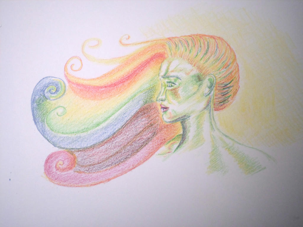
Refracted light
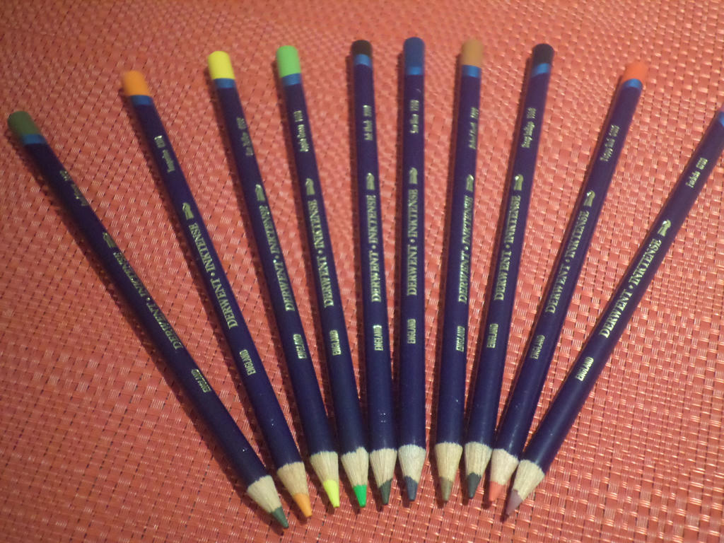
Introduction set of Inktense Pencils
I decided to do my "sunlight" prompt in the new Inktense pencils, I received for Christmas. They go on like a pencil, but when water is applied, turn into permanent ink. I was really excited to use them for the first time and made completing the prompt, very enjoyable.
I demonstrated the preliminary sketch yesterday. The next stage was to set down the inktense pencils, to give the illusion of refracted light, as the sunlight shone behind.
First colour application
The pencils go on smoothly, but give no real indication of what the final colour will look like...for once you add the water, it changes the application entirely.
First water application
The colours blend together really well - a little too well. It coloured some of the white pageI left for highlights, but I will remember to give more space next time. Unlike watercolour pencils, the inktense pencils, don't need a lot of water to carry the colour and there is quite a lot of pigment in a light application.
I only had 10 inktense pencils, so was limited in the colours I could use. I think they were enough to convey the application of sunlight however. But I wasn't quite finished yet. I felt like it still needed one more swirl, to harmonise the colour sequence better.
One more yellow swirl, towards the bottom
~ click to enlarge ~
The story behind this bust is, we are all vessels of light and every day the sun rises, we reflect a little of that in our being. She is almost luminescent, changing the light as it touches her.
We need the sunlight as much as any flower or blade of grass to live.
Subscribe to:
Posts (Atom)