Showing posts with label acrylic paint. Show all posts

Monday, February 19, 2018

Still abstractify life

The final exercise of the course, was all about still life. I was uncertain where to begin, because I'm not really a "stuff" person. I wasn't even sure what still life was - did it include furniture, or just things that once lived (ie: flowers in a vase)?

So to satisfy my curiosity, I decided to embark on a few extra projects, to see if I couldn't thoroughly explore the subject matter.


For some reason, I wanted to capture our living area, because it's where we like to do our reading, research and to relax. So I set up the "arrangement", as you're supposed to do, for a still life painting. I knew I was going to remove things (like the red, stability ball) and add extra things - like maybe a traditional piece of fruit?

The first painting I tackled with acrylic...


I call this, "the one I had to get out of my system". Because it was mostly realism, with a vague play with abstract - meaning I simplified the shapes. I liked it, but I knew it was a little vanilla, as well. So I made another attempt.

This time I wanted to exploit the space, which so intrigued me, between the couch and the bookcase.


I set it up, so I could work on two pieces at the same time. Just because I wanted to see how far I could push the same living space, arrangement. But as often happens (to me anyway) I had to rescue the one on the right - it had too much charcoal, and became the dark abyss. So I covered it with white gesso, to start again.


I quite liked it at this stage. It was rough and not too precious. But I had an idea I wanted to exploit, which meant I had to add to it again. This piece eventually became, quite the "mixed media" project.


I ended up using, acrylic paints, charcoal, inktense pencils and collage (bookcase and book spine). The reason I chose this particular arrangement, was to make a feature of that space between the couch and bookcase, in the first painting. To do that, I used a lot of angles - like arrows, to point towards it.

Yet there is nothing so obvious, as a glaring arrow in sight. It merely encourages the eye, to slide down the side of the bookcase, with the glass and apple, to where the lamp is emerging, but pretending not to notice. There is no obvious gap between the bookcase and couch, any more, but I insinuate there is. Because in alignment with that sweet, invisible spot, is the unopened book, waiting to be read.

So that was my idea, in a nutshell.


The other piece I worked on, while waiting for the gesso to dry on the other, was very simple in comparison. Also inspired by the original painting, I wanted to extend the couch, to look like it was ready to embrace you.

The apple from the original painting, became the wallpaper. No books this time. It was just a little Inktense pencil, play - and everything a living space should be. Welcoming.


Then just to stick to convention, I decided to set-up a traditional "still life" arrangement. This little blue medical bottle, and shells, normally reside in our bathroom. They had to be temporarily relocated to my studio, however, in order to pose for my still life.

Out came the Inktense pencils again...


I probably could have played with it some more, but wanted to keep it simple. What I've learned with Inktense pencils is, you need very little, and you want to keep your colours clean. The more you layer them, the more muddy they become. Which is fine, if that's the look you're going for. But I wanted vivid colours, in this case.

So with that, the course ends. But the journey of creating, doesn't! I may take a break for a little while, to begin some sewing projects I've been meaning to. I've got some kid's birthday presents to plan for, in the next 3 months. But I will definitely return to the studio again.

Until next time...enjoy your creative journey, wherever it leads you!


Friday, February 16, 2018

Abstractify: in motion

Still in week four, and what I think, is the most useful of the course material. That's not to say, the rest wasn't useful - but what it imparted, broke through the "realism" tunnel-vision I had going. There is wanting to change, and then there is knowing how to.

Which is what some of the later exercises proved to address. It's all about capturing movement in your work. Which can be helped along with music and dancing, while you paint!


I was really surprised how effective this strategy was, at imparting "energy" into the brushwork. I even splattered my carpet with red paint, as I got into it, with my whole body. Sorry carpet!

The movement of my body, interrupted the thought process, so all I could capture, was the movement. I really enjoyed this exercise, and decided to call it, "collision". Because it looked like two bodies of energy, colliding with each other.


While I worked exclusively in landscape, I was surprised to see the dynamic remained, when the picture was placed in portrait position. This was a first for me though. Capturing, energy. I felt I was doomed to do everything "flat", before realising there were strategies to help.


I used splattered paint, credit cards to mix and move the paint around, as well as my fingers. So a variety of different marks were achieved. It may look a bit messy, and without reason - but I actually spent a lot of time, trying to create balance, so the marks wouldn't be too heavy in one area, or too sparse in others.

Over all, I was happy with this particular exercise, for providing a new strategy, in being more abstract. In fact, it was completely abstract!


Thursday, February 15, 2018

Abstractify: on location

I'm a little behind in posting, because I'm a little behind in completing the online course. Partly because I've been busy, and partly because, I was unmotivated by some of the course material. I discovered, "landscapes", aren't my thing! Week three of the course, was all about them.

The lessons were easy enough to follow, but I struggled with interpreting "feelings" and expression, adequately enough.


First job, was to go on location and try to capture a "scene". I chose my verandah and brought my trusty water brush, and Artbar, water soluble crayons. I quite enjoyed this part. It was a beautiful morning, there was a cool breeze and birds were all around. So an incredibly nice place to create in!


I started with the north-east, side of the verandah and tried to keep it simple. I wanted to capture that airy, sunny, morning. I believe I succeeded, and was rather happy with it. So then I moved to the western side of the verandah...


Another pleasing sketch to me - as a sketch. But I didn't really feel I was "abstractifying", very much. I was still, very stuck in realism. Then I received some feedback, by the course creator, to try pushing them a little further - to see if I could tip them, into more abstract.

I thought it was a wonderful idea, and gave it a try on the first sketch...


I really only succeeded in making it a little darker though. Which ruined the airy, sunny, feeling I had successfully captured, previously. I was a little miffed I'd ruined my initial sketch, and my confidence was low, in trying the next exercise.

Which was capturing a view from a window...and once again, it was seen through the lens of our verandah.


The colours looked pretty drab in the image, but I thought I could vamp it up, using non-local colours. I chose acrylic paints, because I need the practice!


I simplified the shapes, and while some aspects of the image, were successful on their own, like...


The brick work, and window frame. As well as ~


The horizon meeting the section of awning, worked as well. But as a whole, the window frame and awning, just looked bulky and stifled the view. 

As far as succeeding, in making a view you WANT to gaze out at - I failed! Burn. But guess what? I walked away learning something, nonetheless. I learned I needed more practice with landscapes. I also learned I was being too emotionally invested. Abstract, requires you to let go of the subject, and give it a new interpretation.

I was struggling, with detaching. Because this was my view, from my home, and I couldn't tear it apart and remake it (I suspect). But not all was lost. I rather enjoyed the last exercise of the week!


We learned all about compositions in landscapes, and were given the opportunity to simply create imaginary landscapes - using those different compositions, as guidelines. But by moving quickly through the nine squares, it didn't leave you long to ponder what you were doing. I seemed to respond well to that, lol. 

But the main objective I decided - given my former failures and learning from them, was just to have fun with it. That was going to be all I focused on. 


I chose a fun colour palette, I think, and only afterwards, did it dawn on me: how reminiscent it was of Ken Done's, earlier works. He used a lot of bright, vivid colours too.

I even incorporated some paper collage, in a few...


Remember, I was working quickly, so when I came back to fill in the final details (done in the darkest colour) I really didn't KNOW what I would pull from the paint. It's "imaginary", so you never really know what you're going to get. The only guideline, was the different rules of compositions.


I didn't know this was going to be a lighthouse, on top of a cliff, when I put the coloured paint down. But the yellow said something of "light", and then I realised there were some waves too!


I knew this was always going to be a crossroads, of sorts, but I didn't realise how busy the park would be, that emerged. Or the vague Asian feel to it. Again, not planned. It just kind of came out, as I was working between the nine squares.


I was thinking water lilies with these...but, not over thinking them.


Some kind of Caribbean location, but far too busy with details, I decided afterwards. So it became my least favourite. But still bright enough, to leave a happy feeling afterwards.


This one seemed to be favoured most, by the private Facebook Group, created for the course. I liked it's simplicity too. When the coloured paint went down, I was thinking "trees". When it came to applying the darker colour however, I changed my mind to, "sails".

So while week three had a bumpy start, and took a few days to work through the lack of confidence - it ended on a high. I enjoyed, going whacko with colours! Also fostering detachment, by working quickly and using my imagination.

I think I needed to absorb that distinction, between realism and abstract, was just letting go of what you see! Filtering through one's imagination though, takes time and a lot of practice.


Tuesday, January 30, 2018

Figures

I'm not going to share every single exercise, in my online course, because some are more about experiments, than producing anything notable. Which is a great way to learn - through experimentation!

Nevertheless, this week, we're learning all about people, or figures - and how to bring them into being. I didn't realise there were so many creative ways to do this. I will share, two of the different ways we experimented with - and they're really, worlds apart.


Experiment #1


One of the exercises, had to do with exploring light and dark tones, specifically through paint. Using a naked model: we could opt for the female image supplied, or find our own. So I opted to find my own image, using a male model instead (above).

It was not my intention to give him, a "Wolverine knives" look to his hands, but I was experimenting with mark making, and trying to distract from the incomplete hands. As he was holding something in both hands, in the reference image. So I had to fudge his hands a little, in order to lose the items.

But then, we later came to do an exercise, which truly excited me...


Experiment #2 begins


This time, we were going to create figures from thin air. We could use a reference image for guidance, if we wanted to - but I was curious to see how I would go, with just my imagination, and the materials I chose.

Personally, I love incorporating newspaper prints in some of my work, through collage. And I found an awesome hand-written letter page, as my base material.


Two random pieces


I tore it up randomly, and started gluing it to my white paper. I had an idea of the figure's position on the page (conjured up in my imagination) but I was also prepared to see what would randomly appear, too.


Six random pieces


I thought this had the good basis for a seated, or crouched position. But at this stage, I still hadn't settled on the final position of the figure. It was still just an idea, forged out of random pieces of paper. Then I started adding the paint...


Acrylic Paint


This, again, was a random process. I liked the rust-coloured look, that yellow-oxide and red, made together. I also thought it complemented the vintage look of the hand-written prints, more than a more bold colour would.

To help in blending and highlighting though, I added a fair bit of white gesso.  Ever so gradually, a figure started to emerge...


Titled: "Mc Kenna Replies"
{Mc Kenna, being the surname, written on the envelope}


I decided to keep it more abstract, giving the illusion of a position, without locking it into one. My figure could've been in a crouched position, or standing on one leg.

This is the most abstract, I've gotten in this course. And it didn't make me feel uncomfortable either. Maybe because I didn't have a reference image to compare it to - did I get the proportions right, is the shading correct, etc. This was just a random process, to see what emerged.

I probably could've worked on it more, but I loved the weightless feeling to this painting - a lot more, than the heavy feeling, of the first. I didn't want to lose that, so stopped. I'm definitely going to try more of these.


Thursday, January 25, 2018

Abstractify

I've been plodding along on my little creative blog, over the years...but that's about to change. With my youngest now in school, I'm able to focus a lot more on my creative endeavours. So be prepared for more blog posts!

Right now though, I'm doing an online art course, run by Tara Leaver, called Abstractify. It will get me back into the swing of creating.


 Lesson 1


I don't want to share the details of the course, but I will share the impact it's having on my own style. As well as the works I create, as a result. This is, after all, a new journey for me and I want to take you on it.

Above is an exercise in making marks. It took me outside my comfort zone,  because it was so random. The instructions in this exercise, contradicted, every approach I normally like to take, painting. But after getting over the initial discomfort, and what felt like a lot of mess - it eventually taught me something.


 Best take-away from exercise.


The above frame, was pointed out later, as being reminiscent of French Riviera. It was feedback from the course creator. Yet it completely missed my radar. I actually thought it looked too simple for my tastes. I normally use a lot more of details.

But that's precisely why I'm doing this course. To be able to express myself more freely, and loosely. Somehow I'd reached that benchmark already, without realising it! I was grateful, to have it pointed out later, because I was stuck in my past way of doing things. If I hadn't been prepared to feel uncomfortable though, and push through, regardless - I never would've appreciated the mystery of mark making! 


 Titled: "You-eclipsed-us"


After the first two lessons, I was inspired enough to paint something for myself. In this case, gum nuts from our property. I took the reference photograph, in 2011, or the year of the big flood. It was fun to paint this picture, without feeling I had to get everything right. It was meant to be "representational", not identical to the source image.
   
I'm having fun doing this course, and really glad I signed up. It goes for about a month, and I'm happy to share how it adds to my creative journey.


Tuesday, August 1, 2017

Tranquility piece

It's been ten months since I worked in my studio. Nesting priorities, come first at this stage in my life. But what was working against me getting back in there, was having my studio overtaken with remnants of a quilt project, and anything else we cared to dump, when visitors were expected

I did a massive clean recently, and reclaimed my creative space. To mark this special occasion, I selected a subjected matter, I hoped would create a sense of tranquility and reflection, in my new space.


I found a picture online, of a young girl, playing with water from a jetty. But she had a frilly skirt on, and I wanted to create a lady. So I sketched with charcoal, something more from my mind - using the online image for cues.

I started with hot pick and green acrylic paint, for a more abstract use of colours. But the more I added, the more I found the pink burning into my retina. I wanted something more tranquil.


Using white gesso, helped me tone back the pink, with just a hint remaining. I could probably play with this piece some more, but figured it went against the tranquility I was aiming for. Too many details would have forced me to concentrate, more than I actually planned to.

So I leave it on my wall as a reminder, not to force creativity. Just accept it, how it flows sometimes.

Materials used: watercolour paper, charcoal, gesso, acrylic paint and water soluble, artbar.

Friday, October 7, 2016

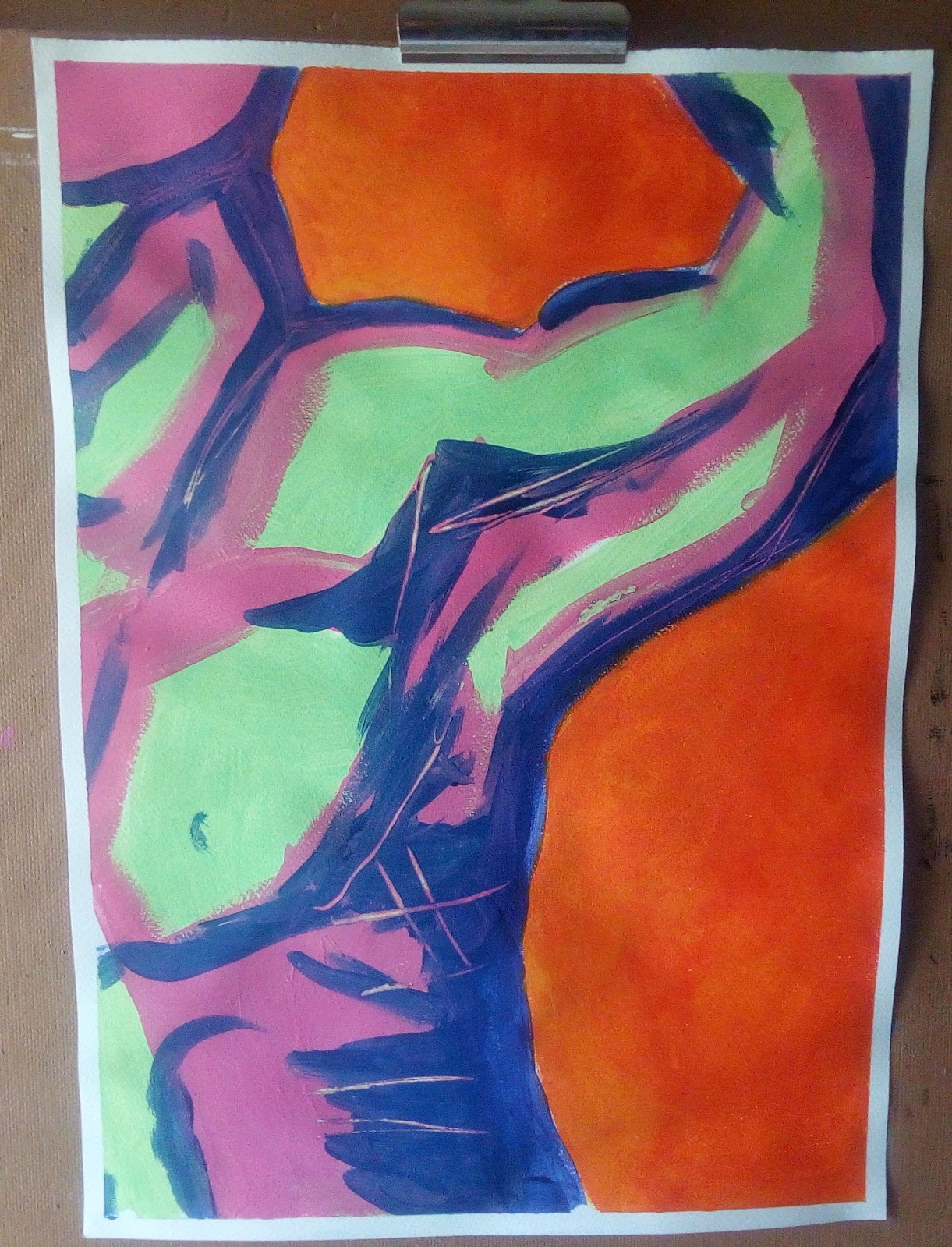
Male torso

I did a painting during the Touchstone course, which I would not normally do. It wasn't part of the course material, but I stumbled across it on the course creator's video collection.

When (or if) I ever find that video again, I'll be sure to post a link. I could not find it in my history files, and a search of the blog again, did not result in success either. It was actually a tutorial from one of the courses she runs, to demonstrate what to expect from the course. Perhaps it was removed?

So anyway, enter my abstract figure painting, in acrylic...


completed September 28


I decided to opt for a male figure, as it tends to be traditional to paint the female figure. The entire painting is different to anything I would normally do, but what I like about the Touchstone course, is how it pushes you beyond what you believe you are capable.

Not that it necessarily "forces" you to. It's however much you want to push yourself, in whatever direction you choose. It was fun to be prompted outside my regular process.


Sunday, September 4, 2016

Day 2 mini challenge

While I've managed to complete a picture each day, for the 7 day mini-painting challenge, I'm behind in posting about it. So here is day 2. I started with a free, internet reference photo:


While I loved the look and feel of this image - especially all that moss growing on the stone, I went in a completely different direction. I used the picture, only for line references, which I managed to change quite a bit too.

So this is what I ended up doing from the original reference picture:


Title: Only Arbor


I wanted to keep the lines and colours simple. Remember that pink from my period ladies series, here and here? Yep, same pink. I also wanted to use the lime green as homage to the moss on the rocks. Green is a wonderful contrast to pink!

I actually had to race to finish this picture, which is why it's not perfect. But I kind of like that it's not. I almost didn't get any time to complete a picture on this day, but David gave me an hour to myself. He suddenly decided to take Peter for a walk. So I dropped everything and ran to my paint supplies!

This picture from the outset, was always going to be about perspective, vibrant colour, light and shadows. None were meant to dominate, which is why they're so simple in application. Material is acrylic paint on paper.


Wednesday, December 31, 2014

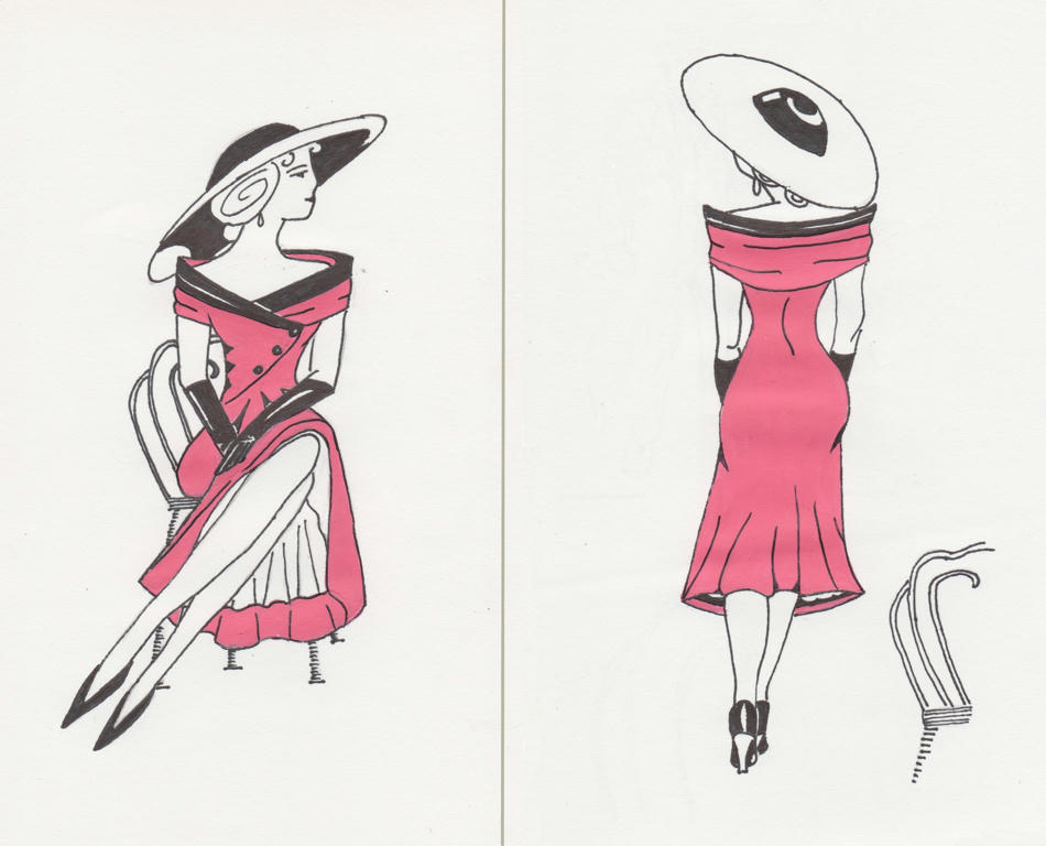
Another period figure

Thanks to a suggestion from Linda and Jasmine, in the comments of my period figure, I have made another pose for my model, in a hot-pink dress. I was already thinking I should do another period illustration, but I didn't think it would be of the same lady in the same dress.

This caused a small dilemma however, as she was in a seated position, and that would limit me to another seated pose. If this were to be a set, I would need similar proportions on the two separate pages. Keeping this in mind, I proceeded with an idea which would not be a seated pose...because I like a challenge.


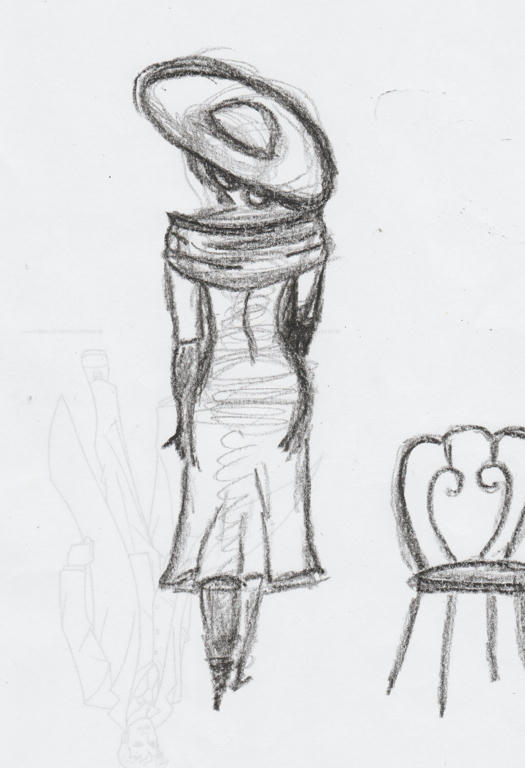
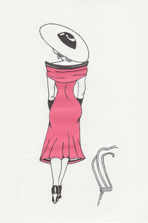
I wanted an image of her walking away from the chair, as calmly as she had sat upon it. So I started with a contour sketch first. I was mostly happy with the composition, but there were small details I fixed on the tracing paper, when I transferred the image to the clean paper, for rendering.

And then out came the hot-pink paint again...


I know there are some differences between the seated and standing figures, but to make their attire exactly the same, would've compromised each piece individually. Like I didn't want a white hat in the above pose, but if I were to colour it black (same as the other one) it would take emphasis away from the dress.

Backs of dresses are always less interesting than fronts anyway, and the lighter hat helped to create levity, as opposed to heaviness. Her skirt also looks less full in this image, as opposed to the seated one, but I wanted her curves to create interest in the dress also - and that couldn't be achieved with a much fuller skirt.


 Side by side, for comparision


So they are similar, but not exactly the same. I kind of like that! Also, the standing position is only marginally taller than the seated one, so not letting the fear of proportions prevent me from trying something different, paid off.

Thanks to Linda and Jasmine for the suggestion to make a set. It was a fun challenge to attempt, and really made me think about form and composition. I know the images themselves don't look very complicated, but the thought in making them balanced (both individually and together) was rather involved.

In fact, if you notice the white hat looks a little smaller than the black one, they were done in proportion to how far their hem lines were cast - this added balance to each pose individually.

I also had them facing each other on purpose, to show interaction, even though they're meant to be the same model. If you wanted to show disassociation, you would swap the images around, so their backs would be facing each other instead.

Tuesday, December 30, 2014

Period figure

I'm not normally a fashion follower, but there's an era which I think is so glamours and flattering to women's figures, that its worth reproducing - its the 1920's through to the 1950's. I'm particularly fond of this fashion, even if I wouldn't necessarily wear it today myself.


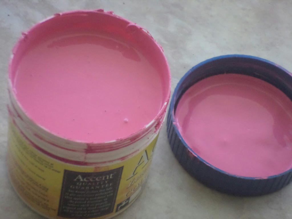
But I'm getting ahead of myself. First to where my inspiration came from - a sample pot of hot-pink paint. I found it while sorting through my supplies and wondered, how on earth could I possibly use this in a piece? The first thing which popped into my head however, was a Chanel hot-pink and black dress.

This was not typical of the fashion period I was drawing, but I didn't see any problem mashing things up, so long as the feel of the piece remained in-tact. Then it came to finding myself a suitable model.  

Oh boy...


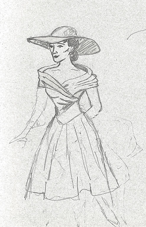
Edited using GIMP, to make pencil stand-out


This was going to come exclusively out of my head, as I didn't want to duplicate someone else's photography. Only problem was, it came out so flat and lac lustre, I didn't even finish the piece before deciding she wasn't going to be my model. Notice all those finicky details? I should have focused on her pose instead.

Then I read Jasmine's tutorial, and WHAM! What came out on paper next, suddenly had a more natural form.

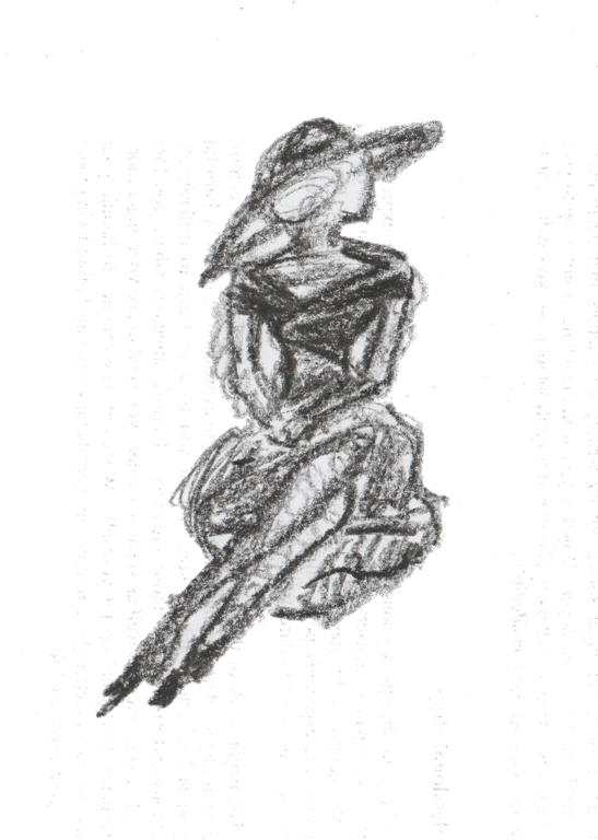
Edited using GIMP, to make crayon stand-out


Using my son's crayon was better for this type of sketching, rather than regular HB pencil. It just gave more body and filled in quicker. So when I was happy with the pose, it was on to complete the details of the fashion itself.


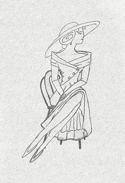
Edited using GIMP, to make pencil stand-out


I modelled the dress more off a Christian Dior dress, than a Chanel one, and even then its not exactly the same. I guess you could say, they're a combination of the two designs. Then I gave her a chair, probably a little French Parisian in style, to sit on.

I'm guessing this lady is outside, although she could be waiting at a cafe too. I didn't want to get too lost in background details, because it was all about her pose and style.

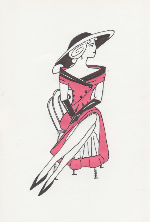
Then came that lovely hot-pink!


The mediums used are the acrylic paint, permanent black pen and white paper. Although it looks rather simple, the work involved getting it out of my head was incredibly complicated. But its nice to have a piece I can say is completely my own.

I did a little research on dresses and hats from the 50's, but even then, only took bits and pieces, of what I thought would work here. I even deliberately didn't give her a necklace, as it made the head and shoulders look too busy. A teardrop earring is all she has as jewellery. The hat and dress though - well that's the focal point!

If I go a little further, this piece is probably about sophistication too - of a time when women's fashion seemed to be more about intelligence and not just beauty. Men had always worn suits to look sophisticated, but women had frilly and effeminate attire only. This particular era of fashion (between the 20's and 50's) allowed women to dress more smart like a man, but without hiding their femininity either. 

But it all began for me, with a sample of hot-pink paint! What would that colour inspire you to create?