As week three of my course, ended up being a mega post - I'm going to break up week four, a little more.
The first exercise, was trying to capture the essence, of an aspect in nature. In this case, a tree - and finding different ways to express what a tree is, or how it can be experienced. It was really just left up to your imagination, how you would approach the subject matter.
I opted to use my own image, from our property, than the one supplied. Mostly, because I loved the "dwarfed" feeling, it created, by standing underneath.
Loved the concept! But (once again) it proved to cause another stumbling block, because of "attachment" issues. Thus, I tried to recreate the image, rather than drawing from my imagination.
I started the trunk, with newspaper collage, but ended up covering most of it! Not to worry.
I thought the composition, created a lovely, weightless feeling at first, but I had to try "pushing" it, that little bit further...
I wanted to add more weight to the bottom, by adding some under-story plants. Effectively though, I made it look more cluttered. But what I'm learning with each exercise, is not to become "precious" about my creations. If I'm not prepared to risk ruining them, then I'm not prepared to learn what IS possible.
While I may not effectively capture the essence of the exercise (at first) I'm still practicing. Which can only make me more familiar with my process, and how to change it! I like these "failures" (to me) for learning. So they're not wasted efforts at all.
Once the course wraps up (start of next week) and I have more time, I will try new ways to explore trees again. I'm looking forward to that, because our five acres, has so many of them!!
Showing posts with label landscapes. Show all posts
Thursday, February 15, 2018
Abstractify: week four
Abstractify: on location
I'm a little behind in posting, because I'm a little behind in completing the online course. Partly because I've been busy, and partly because, I was unmotivated by some of the course material. I discovered, "landscapes", aren't my thing! Week three of the course, was all about them.
The lessons were easy enough to follow, but I struggled with interpreting "feelings" and expression, adequately enough.
First job, was to go on location and try to capture a "scene". I chose my verandah and brought my trusty water brush, and Artbar, water soluble crayons. I quite enjoyed this part. It was a beautiful morning, there was a cool breeze and birds were all around. So an incredibly nice place to create in!
I started with the north-east, side of the verandah and tried to keep it simple. I wanted to capture that airy, sunny, morning. I believe I succeeded, and was rather happy with it. So then I moved to the western side of the verandah...
Another pleasing sketch to me - as a sketch. But I didn't really feel I was "abstractifying", very much. I was still, very stuck in realism. Then I received some feedback, by the course creator, to try pushing them a little further - to see if I could tip them, into more abstract.
I thought it was a wonderful idea, and gave it a try on the first sketch...
I really only succeeded in making it a little darker though. Which ruined the airy, sunny, feeling I had successfully captured, previously. I was a little miffed I'd ruined my initial sketch, and my confidence was low, in trying the next exercise.
Which was capturing a view from a window...and once again, it was seen through the lens of our verandah.
The colours looked pretty drab in the image, but I thought I could vamp it up, using non-local colours. I chose acrylic paints, because I need the practice!
I simplified the shapes, and while some aspects of the image, were successful on their own, like...
The lessons were easy enough to follow, but I struggled with interpreting "feelings" and expression, adequately enough.
First job, was to go on location and try to capture a "scene". I chose my verandah and brought my trusty water brush, and Artbar, water soluble crayons. I quite enjoyed this part. It was a beautiful morning, there was a cool breeze and birds were all around. So an incredibly nice place to create in!
I started with the north-east, side of the verandah and tried to keep it simple. I wanted to capture that airy, sunny, morning. I believe I succeeded, and was rather happy with it. So then I moved to the western side of the verandah...
Another pleasing sketch to me - as a sketch. But I didn't really feel I was "abstractifying", very much. I was still, very stuck in realism. Then I received some feedback, by the course creator, to try pushing them a little further - to see if I could tip them, into more abstract.
I thought it was a wonderful idea, and gave it a try on the first sketch...
I really only succeeded in making it a little darker though. Which ruined the airy, sunny, feeling I had successfully captured, previously. I was a little miffed I'd ruined my initial sketch, and my confidence was low, in trying the next exercise.
Which was capturing a view from a window...and once again, it was seen through the lens of our verandah.
The colours looked pretty drab in the image, but I thought I could vamp it up, using non-local colours. I chose acrylic paints, because I need the practice!
I simplified the shapes, and while some aspects of the image, were successful on their own, like...
The brick work, and window frame. As well as ~
The horizon meeting the section of awning, worked as well. But as a whole, the window frame and awning, just looked bulky and stifled the view.
As far as succeeding, in making a view you WANT to gaze out at - I failed! Burn. But guess what? I walked away learning something, nonetheless. I learned I needed more practice with landscapes. I also learned I was being too emotionally invested. Abstract, requires you to let go of the subject, and give it a new interpretation.
I was struggling, with detaching. Because this was my view, from my home, and I couldn't tear it apart and remake it (I suspect). But not all was lost. I rather enjoyed the last exercise of the week!
We learned all about compositions in landscapes, and were given the opportunity to simply create imaginary landscapes - using those different compositions, as guidelines. But by moving quickly through the nine squares, it didn't leave you long to ponder what you were doing. I seemed to respond well to that, lol.
But the main objective I decided - given my former failures and learning from them, was just to have fun with it. That was going to be all I focused on.
I chose a fun colour palette, I think, and only afterwards, did it dawn on me: how reminiscent it was of Ken Done's, earlier works. He used a lot of bright, vivid colours too.
I even incorporated some paper collage, in a few...
Remember, I was working quickly, so when I came back to fill in the final details (done in the darkest colour) I really didn't KNOW what I would pull from the paint. It's "imaginary", so you never really know what you're going to get. The only guideline, was the different rules of compositions.
I didn't know this was going to be a lighthouse, on top of a cliff, when I put the coloured paint down. But the yellow said something of "light", and then I realised there were some waves too!
I knew this was always going to be a crossroads, of sorts, but I didn't realise how busy the park would be, that emerged. Or the vague Asian feel to it. Again, not planned. It just kind of came out, as I was working between the nine squares.
I was thinking water lilies with these...but, not over thinking them.
Some kind of Caribbean location, but far too busy with details, I decided afterwards. So it became my least favourite. But still bright enough, to leave a happy feeling afterwards.
This one seemed to be favoured most, by the private Facebook Group, created for the course. I liked it's simplicity too. When the coloured paint went down, I was thinking "trees". When it came to applying the darker colour however, I changed my mind to, "sails".
So while week three had a bumpy start, and took a few days to work through the lack of confidence - it ended on a high. I enjoyed, going whacko with colours! Also fostering detachment, by working quickly and using my imagination.
I think I needed to absorb that distinction, between realism and abstract, was just letting go of what you see! Filtering through one's imagination though, takes time and a lot of practice.
Saturday, January 31, 2015
Bush creek final
We have settled into our first week of high school and in the past few days, I've also finished the online course, "Making money making art". While there was a bunch of information I learned which will come in handy - I also recognised what kind of artist I didn't want to become.
I didn't want to become someone who ONLY sees money as incentive to create art. Neither did I want to put my life on hold to make it all about my art either. When I look back at these past few weeks - how hectic they've been, with very little room for making art, I recognise that I have a pretty amazing life! The art is the bonus when I can fit it in, but I have some wonderful people to share my life with in the meantime.
I can see my creative life and family, marrying nicely, without there needing to be a downside.
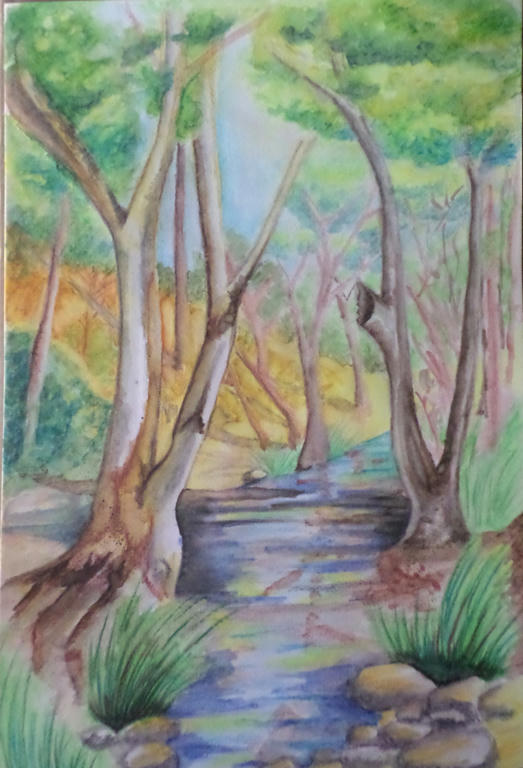
I have managed to squeeze in some time to complete my watercolour picture though. It was a very patient process, which in hindsight I enjoyed. I got some feedback from my mum when she came to visit, to spread the blue around the rest of the scenery - which I did in the tree leaves, about the middle canopy of the front two trees. Making it slightly darker added depth, but also linked the blue up with the water.
My mum even suggested I break the banks (so to speak) and let the water spill behind the tree, to break the bottleneck happening in the middle. I was surprised how these little changes made a significant difference. While I couldn't lift the heavy blue from the water, I could spread it around the scenery to soften the water's intensity.
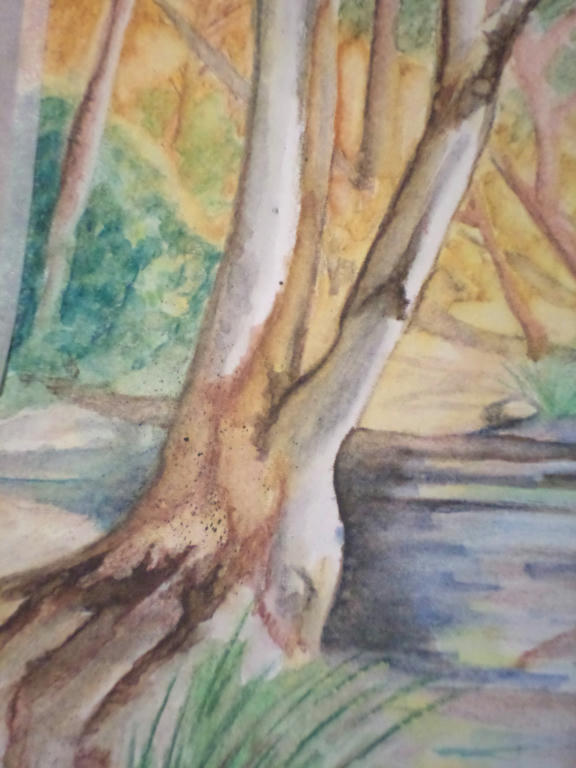
Thanks to Linda's youtube suggestion, I even learned some new techniques for improving the bark on the trees. The "vein" technique the artist used in the video to make flower petals and leaves, I used to make the bark. I was very pleased with the results. I even did some more splattering.
While I don't believe I saved this picture completely, I'm happy that I saved it from the bin! I learned a lot from experimenting with how the water reacted to the colour, even with pencils.
I still have a lot to learn with this medium, but the greatest lesson I'm taking away from this exercise, is not to give up. Plodding along is what I do best anyway. Thanks to others who also shared their feedback here, and it was Linda especially who kept me at this picture. I was going to give up on it, but you said not to - so I found a way to make it work a little better. So thank you Linda.
I didn't want to become someone who ONLY sees money as incentive to create art. Neither did I want to put my life on hold to make it all about my art either. When I look back at these past few weeks - how hectic they've been, with very little room for making art, I recognise that I have a pretty amazing life! The art is the bonus when I can fit it in, but I have some wonderful people to share my life with in the meantime.
I can see my creative life and family, marrying nicely, without there needing to be a downside.
I have managed to squeeze in some time to complete my watercolour picture though. It was a very patient process, which in hindsight I enjoyed. I got some feedback from my mum when she came to visit, to spread the blue around the rest of the scenery - which I did in the tree leaves, about the middle canopy of the front two trees. Making it slightly darker added depth, but also linked the blue up with the water.
My mum even suggested I break the banks (so to speak) and let the water spill behind the tree, to break the bottleneck happening in the middle. I was surprised how these little changes made a significant difference. While I couldn't lift the heavy blue from the water, I could spread it around the scenery to soften the water's intensity.
Thanks to Linda's youtube suggestion, I even learned some new techniques for improving the bark on the trees. The "vein" technique the artist used in the video to make flower petals and leaves, I used to make the bark. I was very pleased with the results. I even did some more splattering.
While I don't believe I saved this picture completely, I'm happy that I saved it from the bin! I learned a lot from experimenting with how the water reacted to the colour, even with pencils.
I still have a lot to learn with this medium, but the greatest lesson I'm taking away from this exercise, is not to give up. Plodding along is what I do best anyway. Thanks to others who also shared their feedback here, and it was Linda especially who kept me at this picture. I was going to give up on it, but you said not to - so I found a way to make it work a little better. So thank you Linda.
Sunday, January 25, 2015
Water brush
I received a new Derwent water brush a few weeks ago, but have been madly preparing for school starting next week. Today I got a chance to experiment a little with it, and my watercolour pencils. Before I get to that however, here's a youtube video demonstrating what kind of brushes I'm talking about.
I've purchased a few inexpensive accessories from the Derwent range, and I find them to be well made and do what they claim to. I'm not paid for this endorsement, by the way, just sharing my experience - because I hate spending money on stuff that doesn't work! I'll share how my other goodies work when I get a chance to use them.
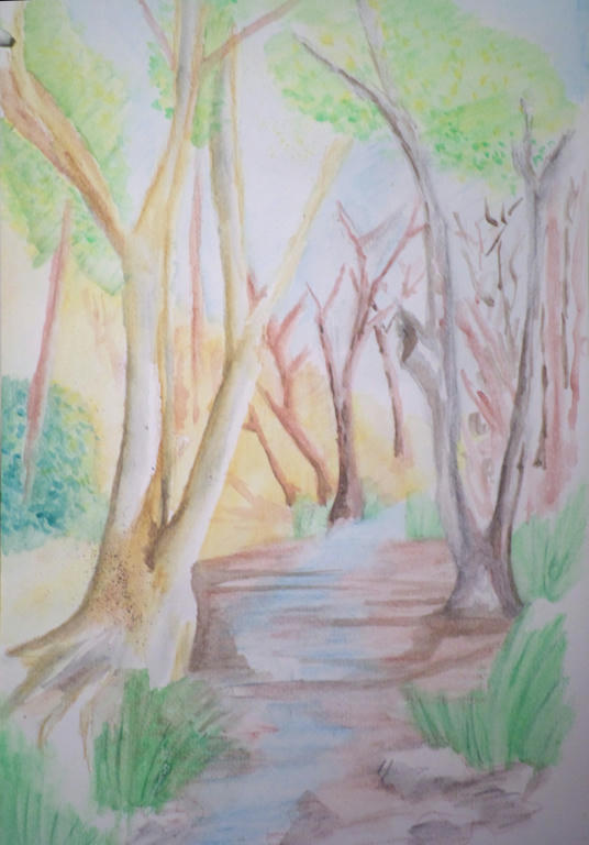
This is an attempt at a bush scene with a small creek. Some things work but a lot of it doesn't. Not to worry - it was just an experiment to see how the water brush worked as I needed a large section of pencil to blend. I'm happy with how the brush performs - its very economical on water and I'm not constantly dipping a brush into a pot. I prefer using it to a traditional brush with my water colour pencils now.
There's a small splattering of watercolour on the closet tree, I was able to do that with the water brush too, straight off the watercolour pencil - flicking it off the tip.
I may yet save this picture once my pencils dry and I can add more detail. I like the feel of the picture, but I can tell I'm still very "basic" at my skill level. So even my best attempts may not save it, lol.
I would recommend a water brush for anyone wanting to try them. I got the medium size, so not fine or broad and it gives me a range of strokes, depending how heavy I press the bristles down.
I've purchased a few inexpensive accessories from the Derwent range, and I find them to be well made and do what they claim to. I'm not paid for this endorsement, by the way, just sharing my experience - because I hate spending money on stuff that doesn't work! I'll share how my other goodies work when I get a chance to use them.
This is an attempt at a bush scene with a small creek. Some things work but a lot of it doesn't. Not to worry - it was just an experiment to see how the water brush worked as I needed a large section of pencil to blend. I'm happy with how the brush performs - its very economical on water and I'm not constantly dipping a brush into a pot. I prefer using it to a traditional brush with my water colour pencils now.
There's a small splattering of watercolour on the closet tree, I was able to do that with the water brush too, straight off the watercolour pencil - flicking it off the tip.
I may yet save this picture once my pencils dry and I can add more detail. I like the feel of the picture, but I can tell I'm still very "basic" at my skill level. So even my best attempts may not save it, lol.
I would recommend a water brush for anyone wanting to try them. I got the medium size, so not fine or broad and it gives me a range of strokes, depending how heavy I press the bristles down.
Subscribe to:
Posts (Atom)