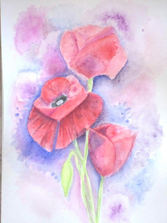
Apparently, I'm all about the details! I told myself to loosen up, but I always got pulled into the details. If you want to work with colour, to see what they can do on a page however, you really need to let go of lines and work in blocks, instead.
The subject I decided upon was poppies, because poppies have loose petals, which are paper-thin and translucent. So they became my inspiration to loosen up. Of course, who can resist the delicious red of Flanders poppy?
Trio of poppies
I had to use a lot more water direct to the paper, and take the colour from the tip of my pencil. This allowed me to put down colour, without getting too caught in details, like a pencil would. But I even managaged to make the poppies, take the slight resemblance of roses, didn't I?
Because, guess what - roses are tight and controlled, which is more to my style. It's funny the things you learn, when you're in the process of experimenting.
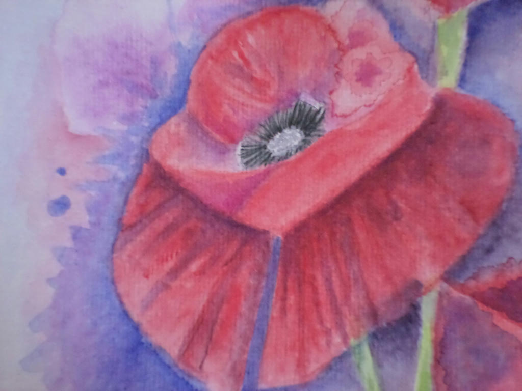
Close up
The main flower was open, so I gave it the most details. In the first under-painting layer, I managed to make a colour bloom, which I decided to make part of the flower. If I covered it up, I would lose the spontaneity and the effects of experimentation. This was a learning piece for me, rather than conceiving it to be a completed work.
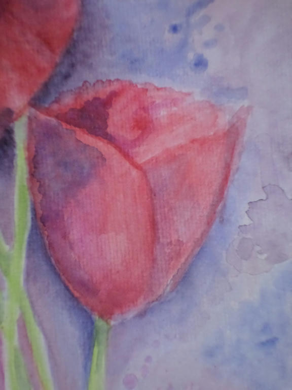
Smallest bloom
In the smallest flower, I kept the colour application in blocks, rather than going for gradients of shading. This was part of my loosening up strategy. The more I forced myself away from the details, the more I got to experiment with colour application.
What I learned was to mix some of the background colour (blue) into the red, in order to make purple shading for the petals. I could have selected a purple from my 72 piece set, but by choosing the same blue as I used in the background, it tied the flower to the background. If you notice in the lower left corner, I used some of the red in the blue of the background too.
It made a very warm purple, which I used to bring the stems of the flowers forward, into the picture.
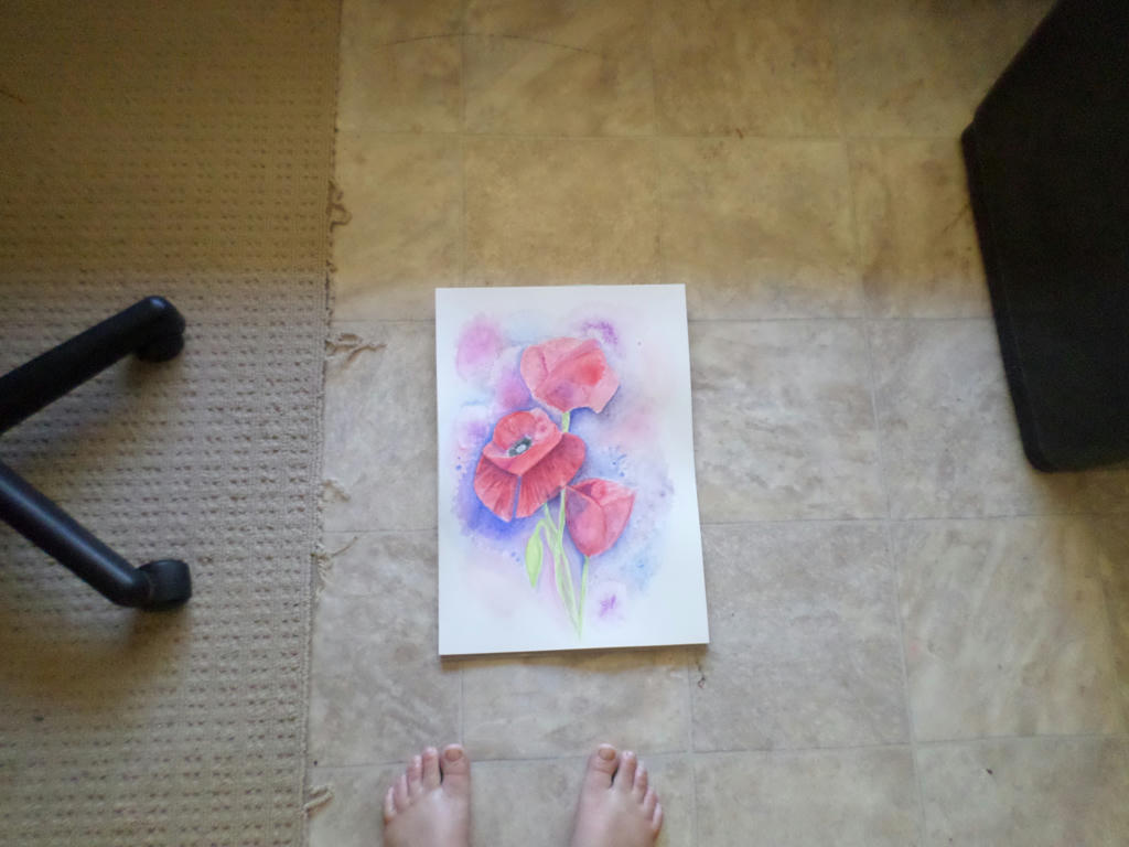
Distance
Forgive my fraying carpet, which I keep under the office chair, but I wanted to demonstrate what the picture looks like from a distance.
That gorgeous blue, really did lift out the red of the centre flower, which is what I wanted - but it does dominate the picture, so your eye doesn't naturally flow to the rest of the blooms.
There is probably more I could do to this picture, like adding that strong blue as background, to the top bloom. However, I don't want to appease my details-dominant style when I'm trying to break away from it. I will move onto something else. I think I will also use half the size paper, I am currently. This will be more economical on my resources, as I'm experimenting.


Never mind the frayed carpet, my eyes were drawn to the feet! LOL So nice to see you're keeping your hand to your artwork! The poppies turned out really well.
ReplyDeleteThanks Leigh. I enjoyed playing around with the poppies. And thankfully there are legs attached to those feet, or else I'd be in real trouble. ;)
ReplyDelete