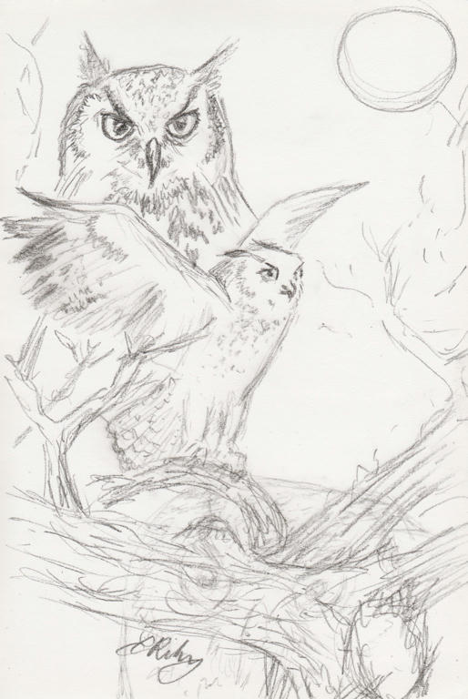
So the weather is getting cooler, so I'm staying inside more. Then I start to get some ideas in my head, and out comes the charcoal and paper...
The lower section looks a little confused, because I had another owl I didn't like. So I threw in an old gnarled tree.
Sunday, May 10, 2015
Tuesday, March 10, 2015
Cockatoo background
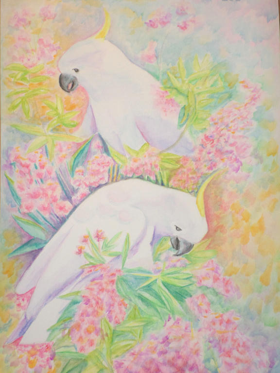
I've worked a little more on the background to make the Cockatoos stand out. I'm still not entirely happy with it, but its more vivid at least. I may work on it some more, but will probably leave a little more time between updates.
And hopefully I'll have made some new pictures in the meantime!
Monday, February 16, 2015
Cockatoo background
So I've worked a little more on my picture. I like the new colourful background, but I'm also missing the loss of the white paper. I feel like I've gone overboard with colour again, as I feared I would!
It's not finished, but I may give it a few days to think about my next move.
Sunday, February 15, 2015
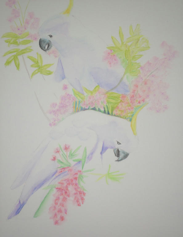
Cockatoos
After finding a wonderful picture online, of a bunch of cockatoos feeding, I decided to select only two birds from opposite sides of the tree to represent. While I love the cockatoos, it was mostly for the NSW Christmas bush in bloom I wanted to capture...
Forgive the darkness of the photo. As the cockatoos aren't surrounded by foliage yet, it's difficult to see their definition. I'm using watercolour pencil and its still a work in progress.
I like the sparsity of this portrait so far, having all that white space, and yet I know it needs a lot more colour added too. I'm experimenting with colour, choosing lavender for the shading of the cockatoos, and trying to incorporate magenta as much as possible, in both the flowers and shading of the foliage (to come).
I'm worried I'll stuff it up, so I'm going as gently with the colour application as possible. Any new work is approached with much thought, because I could easily drown it with flat colour with little ability to lift it - as I learned with my bush creek landscape portrait.
It's a very peaceful piece to work on.
Forgive the darkness of the photo. As the cockatoos aren't surrounded by foliage yet, it's difficult to see their definition. I'm using watercolour pencil and its still a work in progress.
I like the sparsity of this portrait so far, having all that white space, and yet I know it needs a lot more colour added too. I'm experimenting with colour, choosing lavender for the shading of the cockatoos, and trying to incorporate magenta as much as possible, in both the flowers and shading of the foliage (to come).
I'm worried I'll stuff it up, so I'm going as gently with the colour application as possible. Any new work is approached with much thought, because I could easily drown it with flat colour with little ability to lift it - as I learned with my bush creek landscape portrait.
It's a very peaceful piece to work on.
Tuesday, February 10, 2015
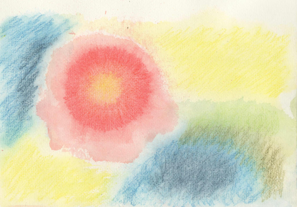
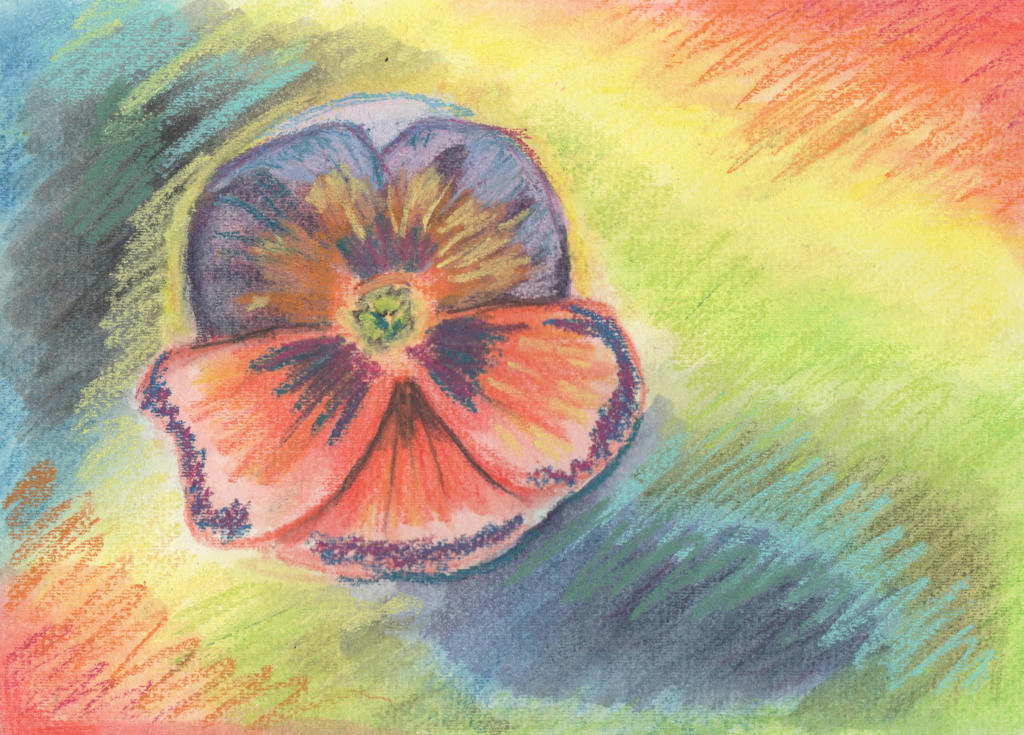
Random flower
Every day is not a masterpiece day, especially when it comes to experimenting! I've been pushing myself outside my comfort zone lately, looking for different ways to use my mediums. I had purchased a Derwent spritzer bottle, which I have seen used with watercolour previously.
I tried it with my Inktense pencils to see what effects I could create.
I started by drawing a disk with multiple colours (yellow, orange and red) then once I spritzed the ink with water, I moved the paper around to create a random flower shape. I did the background colours after it dried, in a similar fashion. I thought the random flower shape, looked a little like a hibiscus, but wanted to do a more dramatic flower instead.
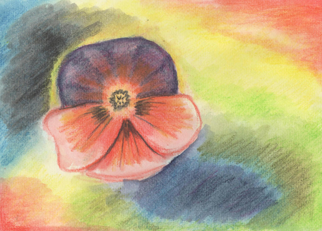
Cue the humble Pansy...
I went over the original washed Inktense pencils, with more Inktense pencil and activated it with my water brush. I lost all that lovely randomness though. Such a shame. I started to wonder if I should've just done the hibiscus instead?
This was all in the name of experimentation however, so I went in with another medium over the top - soft pastels. I attempted a random over-painting with my strokes, to create a sense of movement in the picture.
Definitely not a masterpiece but the learning process was appreciated. Even if I don't like the final product, I do like the random strokes and can see how it contributes to movement - instead of just a pansy plonked on the page. You've got to try these new ideas out and rather than throw them in the bin, I can share my experience instead.
Perhaps it will inspire someone to try something different? It doesn't have to be perfect, just tried!
It was also good to test my water spritzer out, to see if it has a place in my kit. Like everything, it needs more practice, but its a quick way to get water on the page nonetheless. There's a video tutorial demonstrating the spritzer, using Artbar and Inktense blocks. I only have the pencils though.
Anyway, enjoy!
I tried it with my Inktense pencils to see what effects I could create.
I started by drawing a disk with multiple colours (yellow, orange and red) then once I spritzed the ink with water, I moved the paper around to create a random flower shape. I did the background colours after it dried, in a similar fashion. I thought the random flower shape, looked a little like a hibiscus, but wanted to do a more dramatic flower instead.
Cue the humble Pansy...
I went over the original washed Inktense pencils, with more Inktense pencil and activated it with my water brush. I lost all that lovely randomness though. Such a shame. I started to wonder if I should've just done the hibiscus instead?
This was all in the name of experimentation however, so I went in with another medium over the top - soft pastels. I attempted a random over-painting with my strokes, to create a sense of movement in the picture.
Definitely not a masterpiece but the learning process was appreciated. Even if I don't like the final product, I do like the random strokes and can see how it contributes to movement - instead of just a pansy plonked on the page. You've got to try these new ideas out and rather than throw them in the bin, I can share my experience instead.
Perhaps it will inspire someone to try something different? It doesn't have to be perfect, just tried!
It was also good to test my water spritzer out, to see if it has a place in my kit. Like everything, it needs more practice, but its a quick way to get water on the page nonetheless. There's a video tutorial demonstrating the spritzer, using Artbar and Inktense blocks. I only have the pencils though.
Anyway, enjoy!
Bouquet
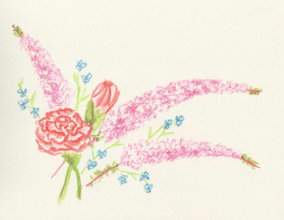
So it was our 12 year wedding anniversary this week (17 years together) and Dave gave me a delicate bouquet of flowers to celebrate. They were wonderfully received, but before they started withering, as all cut flowers eventually do, I thought to capture them in ink.
Intense pencils to be precise. I'm not sure what the long sprays of pink flowers are, but I do know the rest are red-tipped carnations and some blue wandering jew from our garden. I added them in to get a nice contrast in flower size and colour.
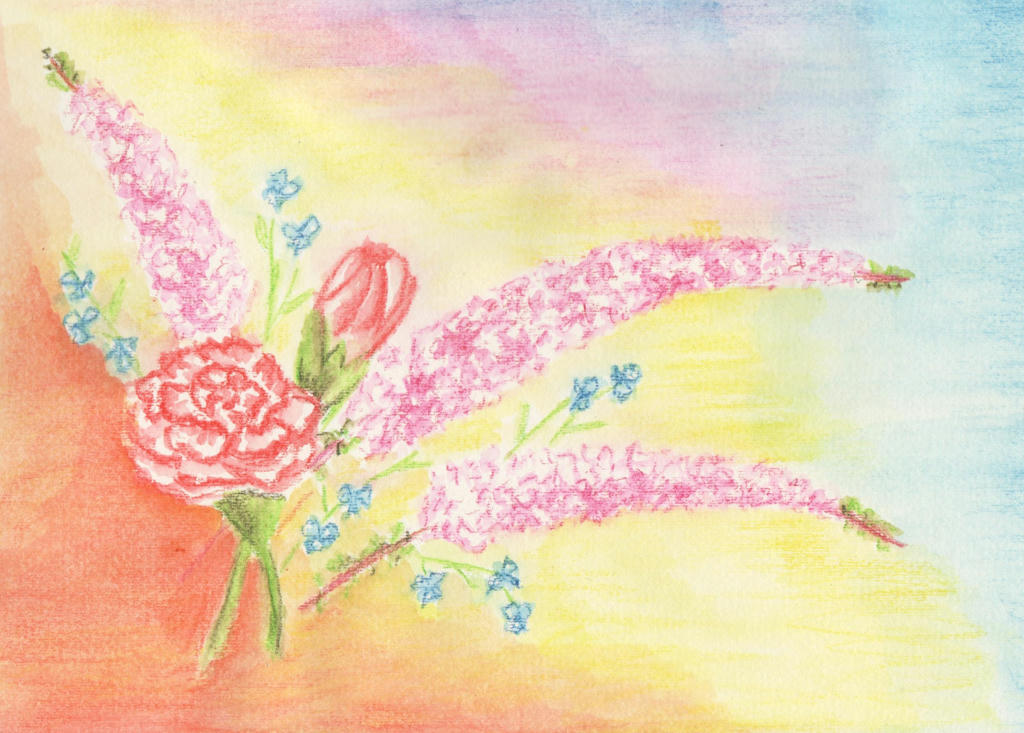
I liked it, but then I also thought it was a little boring too. After reading this article (its really good) about painting flowers, I decided to tackle the negative space in the background. And here's what happened...
I ruined it. Inktense pencils are great for fine detailed work, but terrible for large areas. It dries really quickly, and by the time you get your brush loaded with water again (I used my new water brush) it starts to dry and you can't blend it back together, like you can with watercolour pencils. So the background looked splotchy.
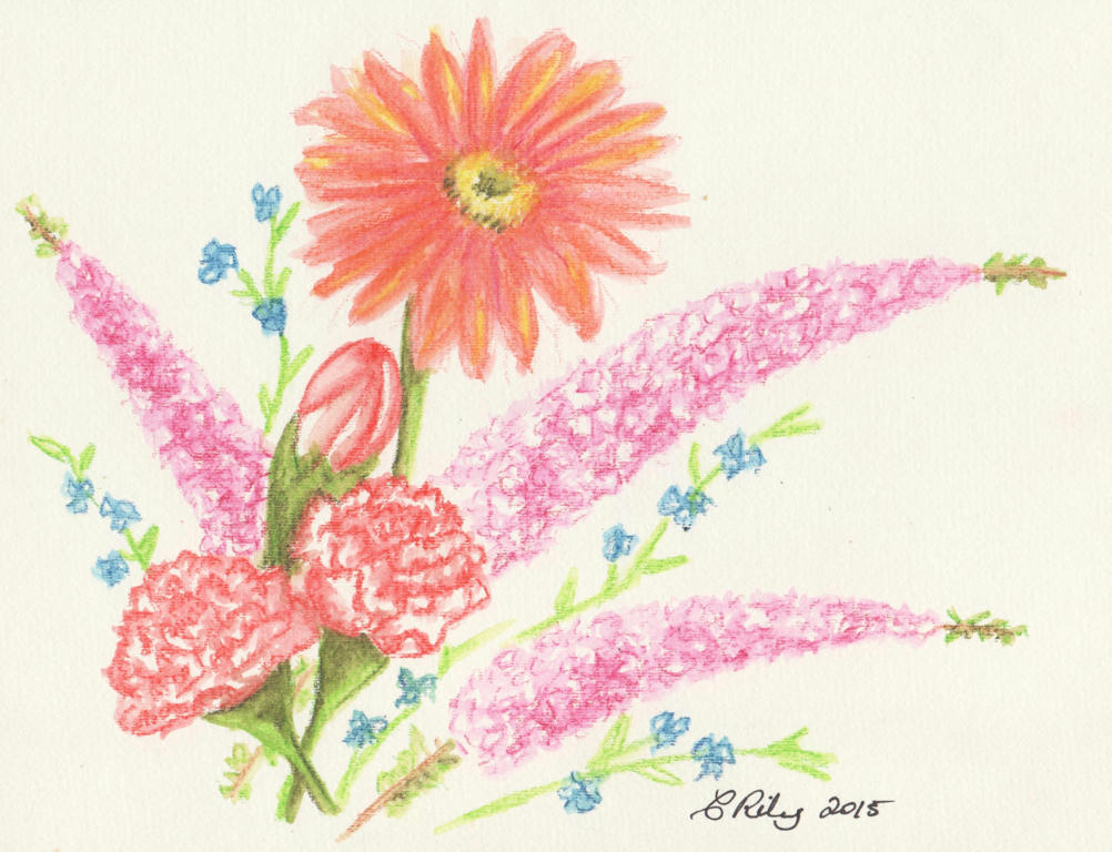
I decided to tackle the picture again. It was going to be a reminder of our wedding anniversary, after all. This time however, I was going to stick with the Inktense pencils for the detailed work, and tinker with the flower arrangement (per the article) to make better use of the negative spaces in the background.
I added an extra carnation (the magic of threes) and held my breathe while adding the big gerbera daisy, last. The daisy was in the bouquet my husband gave me, but they were red (like the red-tipped carnations) and I didn't want to drown the picture in reds. I liked the tangerine in the background I used before , so added it to the gerbra instead.
I think the lone daisy complements the arrangement nicely. By keeping it simple and working on the flower arrangement, I doesn't need a fancy background.
This is also another contribution to the February challenge.
PS: which arrangement do you like the most?
Intense pencils to be precise. I'm not sure what the long sprays of pink flowers are, but I do know the rest are red-tipped carnations and some blue wandering jew from our garden. I added them in to get a nice contrast in flower size and colour.
I liked it, but then I also thought it was a little boring too. After reading this article (its really good) about painting flowers, I decided to tackle the negative space in the background. And here's what happened...
I ruined it. Inktense pencils are great for fine detailed work, but terrible for large areas. It dries really quickly, and by the time you get your brush loaded with water again (I used my new water brush) it starts to dry and you can't blend it back together, like you can with watercolour pencils. So the background looked splotchy.
I decided to tackle the picture again. It was going to be a reminder of our wedding anniversary, after all. This time however, I was going to stick with the Inktense pencils for the detailed work, and tinker with the flower arrangement (per the article) to make better use of the negative spaces in the background.
I added an extra carnation (the magic of threes) and held my breathe while adding the big gerbera daisy, last. The daisy was in the bouquet my husband gave me, but they were red (like the red-tipped carnations) and I didn't want to drown the picture in reds. I liked the tangerine in the background I used before , so added it to the gerbra instead.
I think the lone daisy complements the arrangement nicely. By keeping it simple and working on the flower arrangement, I doesn't need a fancy background.
This is also another contribution to the February challenge.
PS: which arrangement do you like the most?
Saturday, February 7, 2015
Watercolour pencil tutorial
I'm always on the lookout for videos which help me understand a medium better. I have my own way of using watercolour pencils, but always find it interesting to see how others do it too. If you're looking for a place to start with watercolour pencils, or perhaps want to pick up some new tips, this video is a good place to start.
Be inspired, but also remember to experiment your own way too.
Subscribe to:
Posts (Atom)