Sunday, April 3, 2016

Crazy chicken

So I wasn't getting much inspiration happening, because I only had small blocks of time available. My inspiration tends to vacate, the minute its expected to perform on demand. So knowing this, I told myself to loosen up and go with whatever came to mind, anyway.


So of course, what else, but chickens? No reference photo, just my experience with watching them. The medium was watercolour paints, used with a very fine brush at first. I was kind of "doodling" as one does with a fine tip pen, than painting blocks of colour. Save perhaps, washing a little of the background with a larger brush.

I left it for a while. Over a week I'm sure. It was okay, but it didn't leave me with an urge to transform it. But then another block of time arrived, and instead of avoiding any creativity at all, I decided to go with whatever showed up again.


I liked the free-form of doodling, when I had no idea what I wanted to achieve. So out came my inktense pencils, to go over the original watercolour, brush strokes again.

I was kind of inspired by peacock feathers with the diamond shapes in the background, but it wasn't meant to be "feathers". Just ornamentation. No idea why. This was mindless doodling, remember.


When I applied the final stokes and washed them with water, I actually felt quite depressed. I don't know why. Perhaps I was expecting something to wow me. Or perhaps I expected something more from the marks I put onto paper? I kind of told myself, I must not be very good at art, after all.

It wasn't until I was uploading the photos from my camera though, I realised what an original treatment of a chicken, it was. And that was the purpose of the exercise, in my tiny blocks of time. When my inspiration wasn't showing up, I wasn't sticking with the regular rules. At least not in the treatment side of things. But I think my expectations of wanting to be wowed by the process, remained the same.

Sometimes I need to try "whatever", making attempts instead of avoiding the process of creating. Giving myself plenty of permission to go "crazy" if that's what's happening at the other end of the medium. So this is my crazy chicken, with a flow of energy I don't entirely understand.

Friday, February 12, 2016

The Art of Play

I haven't been in my studio for a few weeks. There are valid reasons for this, but I wanted to show some of the last pictures I did before my hiatus. Not because they were great pieces - far from it, in fact, I disliked them immensely at the time. But because I want to demonstrate the art of play, or playing with your art, which requires a great deal of imperfection - I have to show you some things which might not be comfortable to view.

The benefit being, you can return to it later, and see the lessons behind each piece. There's a story to go along with these evolving pictures. I had some new watercolour tubes I wanted to try out, along with some cheap watercolour paper I got for Christmas. Cheap, being the optimal word, because...


First picture


It didn't take me long to realise, it didn't matter how much I wet the paper, the colours weren't going to bleed. If it looks like a mess, you wouldn’t believe it took me days to even get to the painting part? I spent hours pouring over pictures on the internet, to get a 1920's composition of a lady and interior decor, that didn't look like I took it from any one individual picture.

When I realised the paper was a dud, and I wasn't going to create the masterpiece in my head, I decided to try and experiment with different colour ideas and techniques.

It's a mess, yes, but it also made me realise, I like incomplete pictures, which are a little brave with colour and technique. When I realised I didn't want to play with this picture any more, I was going to pack up my supplies. But saw all that lovely paint still on my palette. I decided to use it up, playing randomly, with whatever came to mind.


Second experiment


This experiment demonstrated, the cheap watercolour paper wasn't entirely useless, if I loaded up the paint bush with lots of paint and applied it to the dry paper. Or, wet on dry, is the technical term.

The forms I could make sketching with the brush, required some confidence, but also the ability to work within mistakes. These images aren't perfect, but they're "like" enough to be recognised. I think I achieved much more movement in these simple piece, than the 1920's style picture which I tried to keep within the lines.

I also stumbled across the contrast of using warm colours (yellow/orange) with cool colours (blue/purple). Which I teased out a bit more, with some random doodles, with "plants" in mind.


Third experiment


This had bamboo as inspiration, but I added other marks and shadows, incorporating the warm colours into the cool colours. Giving it a warmer colour overall. But I also added some straight, cool colours in the background for contrast.

Having completed this experiment, I wanted to try the opposite effect...


Fourth experiment


This is a randomised plant in a pot, but I used more cool colours than warm. Instead of jumping out at you, like the bamboo, it creates an almost dormant effect, which wants to freeze on the page.

Again, I wasn't going for perfection, it was the art of play to see what effects I could achieve with different ideas. With all this in mind however, I thought I would try out one more piece. Only in Inktense pencil this time.


Fifth picture


I know, its hideous, but with its own story to tell too. Firstly, drawing within lines I've realised is my preferred approach - I feel most comfortable with this technique. However, it also stilts the creative process the most. To add movement to any picture, I have to be prepared to be more random and become comfortable doing that.

Therefore, more experiments like all the above. I have to be comfortable turning out pieces, that not only look flawed, but actually exploits the imperfectionist approach. Can I start a new art movement? Is "Imperfectionism", taken yet? Perhaps it's already covered under abstract art?

I think any artist who has created their own recognisable style, as distinct from all the rest - have challenged their own creative boundaries. Perhaps this is what we should all be doing?


Friday, December 4, 2015

Loose Watercolour Pheasant by Andrew Geeson

I mentioned watching a watercolour tutorial, by Andrew Geeson recently. This youtube video, is not that tutorial, but it shows the wonderful medium that is watercolour painting, through a skilled hand. I love the poultry theme too.

Runs for nearly 13 minutes, and has beautiful music as background.

Enjoy!


If you're interested in watching other free, Andrew Geeson watercolour videos, visit this link. Or you can visit his website, here.


Tuesday, December 1, 2015

New studio

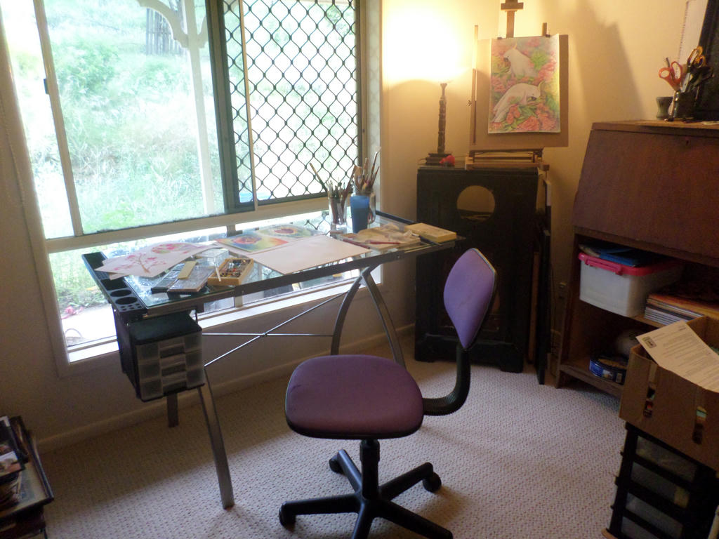
It's been a long time coming, but I finally etched out a permanent place for my art supplies and creative space. Thanks to an early Christmas present from my husband, I was able to set up and get to work on some new experimental pieces today.


 New art desk


I've had my eye on an art table for a while, and similar designs to the one above, normally retail for around the $200 mark, on sale! This one came up at ALDI recently, for $99. My husband searched all the stores in town, only to discover they were sold out. But his final attempt at a rural ALDI store however, saw him buying the absolutely last one! I feel incredibly fortunate.

Not so fortunate, putting it together, however - as I had to drill larger holes for some of the screws. My patience paid off in the end, when I finally got to sit at my new pivoting, glass table.


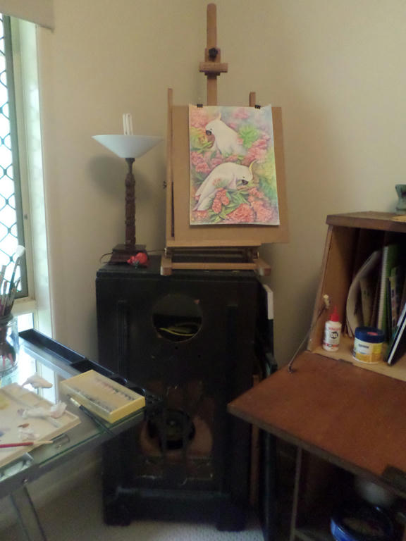
Old but still useful


The rest of the furniture however, are all cheap finds from days gone by. This is an old wireless stero. Its tall enough to hold my easel (another free find) and shares the same space with a lamp, for those overcast days like today. The lamp was also a gift from a relative. I might do something more with the wireless stereo, given that its empty, but for now it will do, as is.


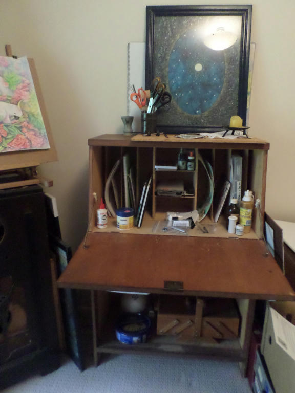
Not my painting on top


I'm not sure what they call these desks - mail desks, postman's desks or something, but it was a second-hand find, for under $10. I can put the more vulnerable art supplies up top, and close the door, so they're safely out of reach of our toddler. I'm sharing this room with some of my husband's book collection, and collectable toys from his youth. While it may be a shared space, there's still plenty of room for me!

We had to do some room changes recently, when our toddler needed his own bedroom. I have wanted an area I can drag my art supplies out to work on, without taking over the eating areas in the house. So it was a great day, to finally get my watercolour paints out, and do some experimenting.


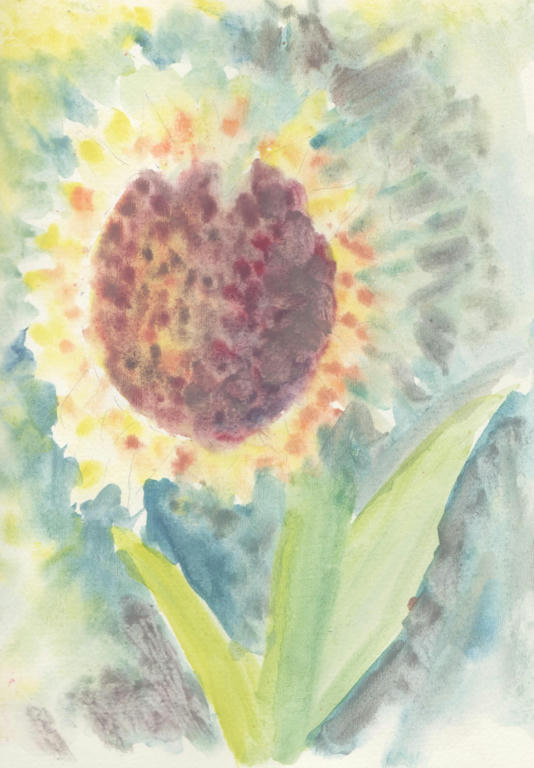
 Sunflower


I tried wet on wet techniques, with cheap, dry, watercolours pots, and quickly discovered they didn't disperse in the water properly. My watercolour pencils do a better job. So these cheap pots, are best used on dry paper only. I wanted to demonstrate this piece to show how ineffective they are with wet on wet. Because even when they touched the water, the pigment didn't want to bleed out and merge the colours, so I got a very stippled effect like using acrylics.


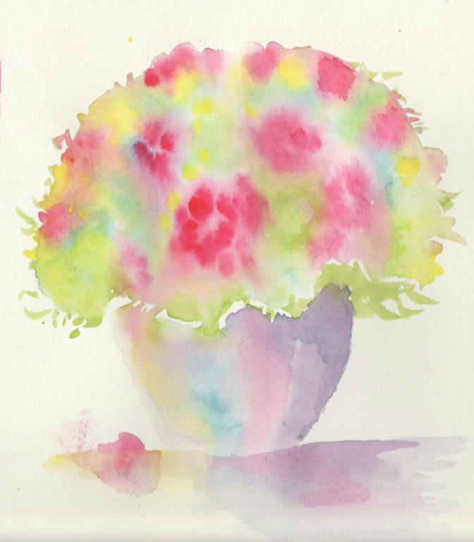
Bouquet in pot


So I got out some tube watercolour paints instead. They were given to me a long time ago, by a person who had no use for them any more. They were surprisingly, still in good working order! My inspiration came from an art tutorial, by Andrew Geeson, with wet on wet, watercolour techniques.

If you do a google search, you will find some free demonstrations on youtube, by Andrew Geeson. I watched the tutorial yesterday, and did my best to recall the steps - but I know I've left out techniques, like negative painting to highlight different areas. I wanted to go easy today however, and just have fun with it.


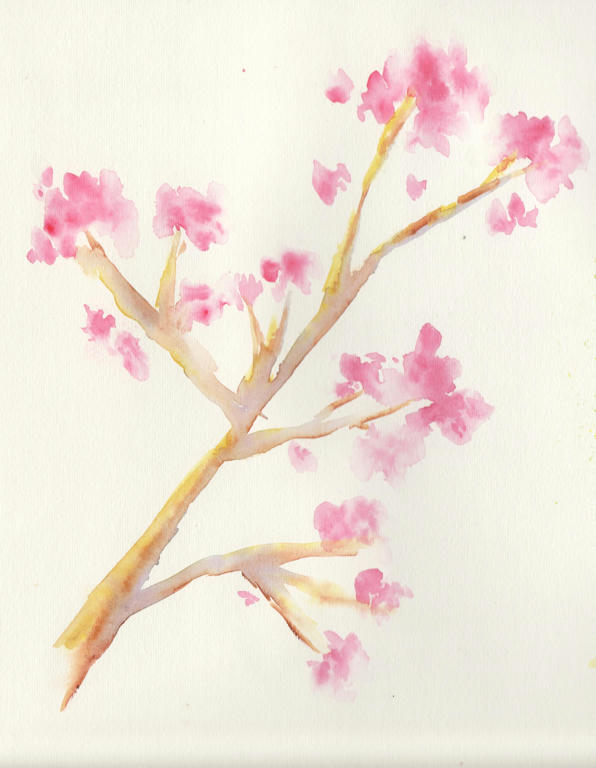
Loose, cherry blossom


I loved the effects of the flowers so much, I was inspired to experiment with a cherry blossom branch, next. I didn't have any reference picture, so it wasn't complicated. I like the delicate effect however, which didn't require too much concentration. When you haven't been doing art for a while, its best to ease yourself back into it - especially when using a new medium.

I've used watercolour pencils before, but watercolour paints are more fluid and an entirely different medium to control. So this is all new to me.


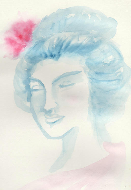
Still thoughts


My final piece was based on my Geisha, but wasn't intended to be one. I used my original sketch as inspiration, but let the watercolour paints decide what form she took. I sketched with the brush and used only two colours - changing the tone of the blue, by adding more or less water.

It's quite a subtle piece, which my scanner did its best to replicate, but looks more washed out than it actually is. I like it, because the soft colours and simple pallet, give it a calming effect.

I have to say, a lot of this was done, thanks to my husband's persistence at hunting down a table, and many free art supplies, given to me over the years. Even the watercolour paper I used today, was gifted to me, by the same artist. They decided to concentrate on different mediums, so gave the watercolour supplies to someone who would use them. I've kept them for years, but finally braved the wet on wet, techniques, for the first time today.

I had heaps of fun too!


Wednesday, November 4, 2015

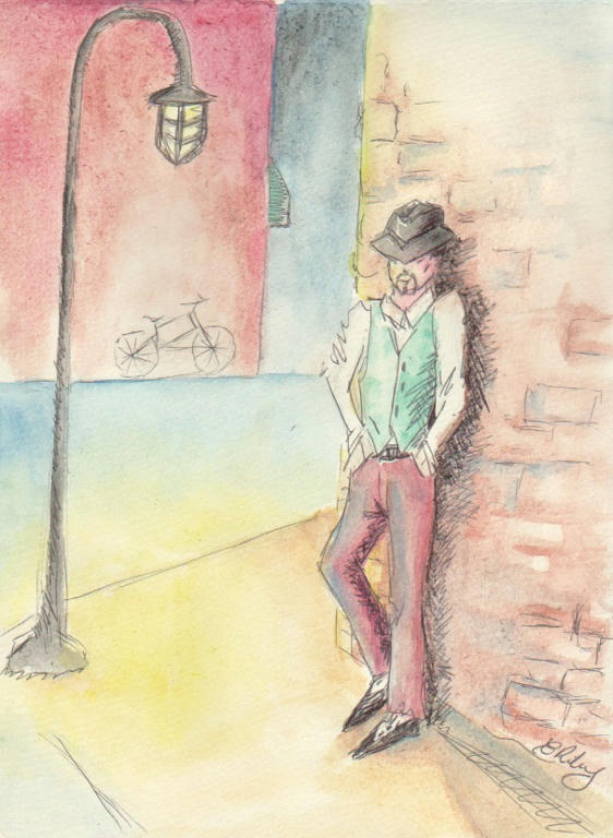
A man's style

My husband was the first to bring this to my attention, but apparently not a lot is made of men's fashion. Well, not as prominent in the minds of society, as women's fashion is. It's the poorer cousin, twice removed.

So when I read an art tutorial recently, which said to just let loose with your creativity, and do whatever comes to your mind (no photo reference material) I thought of a man's style.

What does male fashion look like to him? Is it about the clothes, or is it about the way he feels in said clothes. This is the story behind my random picture that I drew with pen and watercolour, recently.


Black pen and watercolour


It's meant to be a calm repose, isolated, yet in a public space. It was not meant to be super realistic, and I deliberately didn't fuss over the details. Normally I could spend an hour, just drawing the picture, but instead it took me an hour to sketch, pen and paint, while also having to distract a toddler.

I like the finished picture. It works for me as an experiment in a man's fashion sense. Because it's both a little bit stylish, but also not fussy either.

I also enjoyed, playing with perspective on the page.


Monday, October 26, 2015

Poppies

So I decided to throw myself into some more experimentation with my Inktense pencils. I wanted to play around with them and learn something about my style.

Apparently, I'm all about the details! I told myself to loosen up, but I always got pulled into the details. If you want to work with colour, to see what they can do on a page however, you really need to let go of lines and work in blocks, instead.

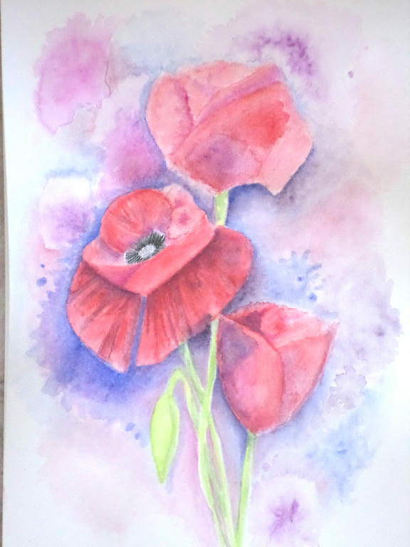
The subject I decided upon was poppies, because poppies have loose petals, which are paper-thin and translucent. So they became my inspiration to loosen up. Of course, who can resist the delicious red of Flanders poppy?


Trio of poppies


I had to use a lot more water direct to the paper, and take the colour from the tip of my pencil. This allowed me to put down colour, without getting too caught in details, like a pencil would. But I even managaged to make the poppies, take the slight resemblance of roses, didn't I?

Because, guess what - roses are tight and controlled, which is more to my style. It's funny the things you learn, when you're in the process of experimenting.


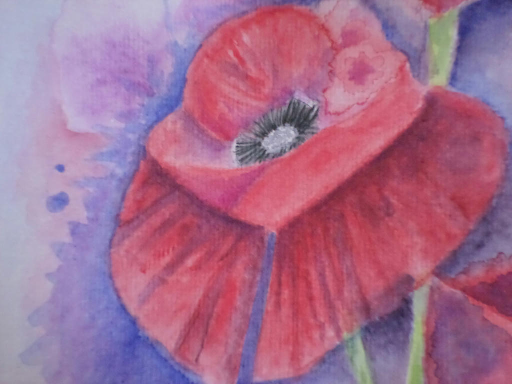
Close up


The main flower was open, so I gave it the most details. In the first under-painting layer, I managed to make a colour bloom, which I decided to make part of the flower. If I covered it up, I would lose the spontaneity and the effects of experimentation. This was a learning piece for me, rather than conceiving it to be a completed work.


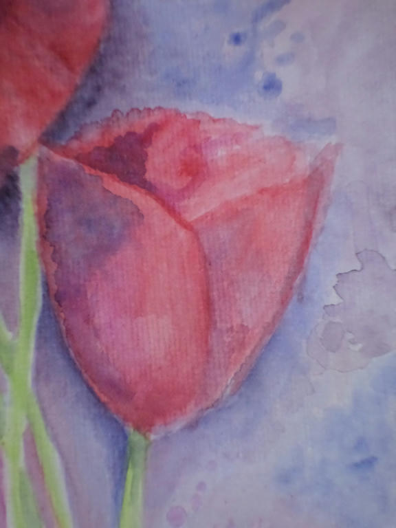
Smallest bloom


In the smallest flower, I kept the colour application in blocks, rather than going for gradients of shading. This was part of my loosening up strategy. The more I forced myself away from the details, the more I got to experiment with colour application.

What I learned was to mix some of the background colour (blue) into the red, in order to make purple shading for the petals. I could have selected a purple from my 72 piece set, but by choosing the same blue as I used in the background, it tied the flower to the background. If you notice in the lower left corner, I used some of the red in the blue of the background too.

It made a very warm purple, which I used to bring the stems of the flowers forward, into the picture.

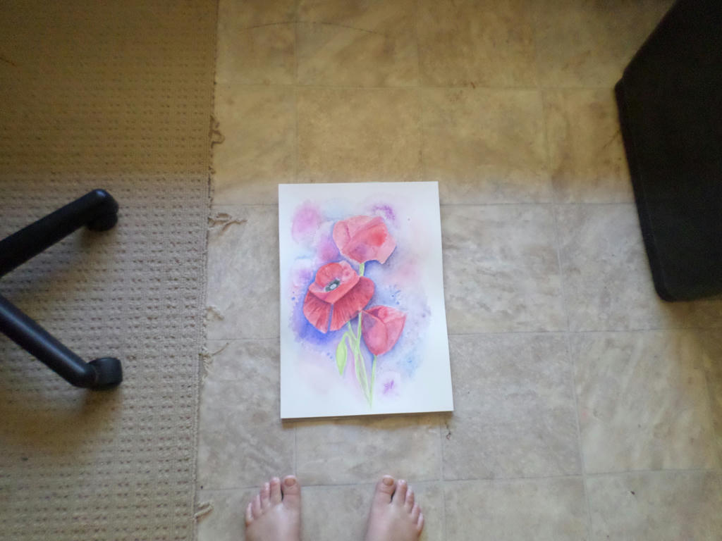
Distance


Forgive my fraying carpet, which I keep under the office chair, but I wanted to demonstrate what the picture looks like from a distance.

That gorgeous blue, really did lift out the red of the centre flower, which is what I wanted - but it does dominate the picture, so your eye doesn't naturally flow to the rest of the blooms.

There is probably more I could do to this picture, like adding that strong blue as background, to the top bloom. However, I don't want to appease my details-dominant style when I'm trying to break away from it. I will move onto something else. I think I will also use half the size paper, I am currently. This will be more economical on my resources, as I'm experimenting.


Monday, September 7, 2015

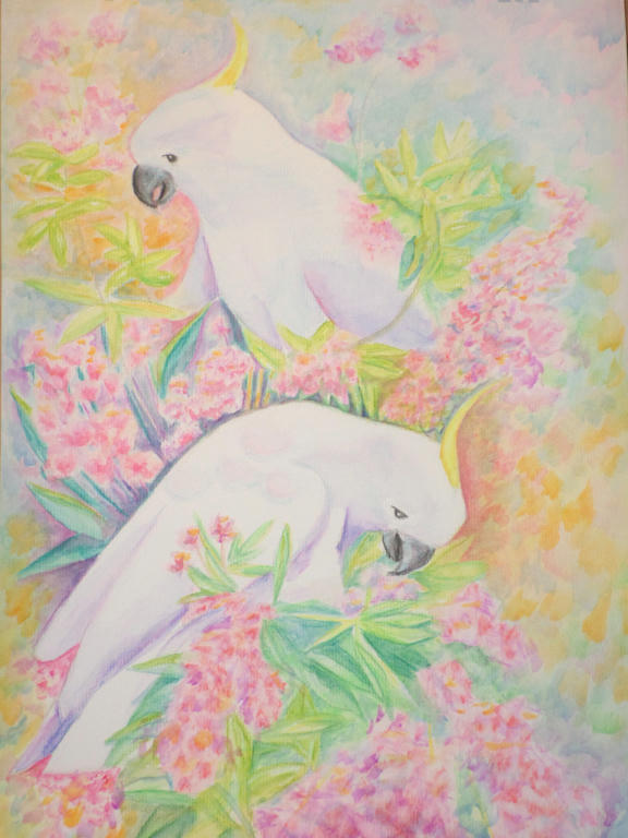
Cockatoo - new medium

I've been carefully working on an old piece, as I'm not entirely sure how to treat it. I'm not even using the reference photo any more. I figured I've got nothing to lose and everything to gain, by continuing to experiment.


This is the original Cockatoo picture, I worked in watercolour pencil. The white of the Cockatoo, was difficult to contrast colours with, to make them stand out. I wasn't happy with the yellow-orange, dominating the picture, with nothing to bring harmony.

When I received my new 72 piece, Inktense pencil set, however, I started to rework the picture and develop something different.


I haven't really altered much of the top half - that's still watercolour pencil (mostly), but the lower section I used the Inktense pencils. These are permanent, so unlike watercolour pencils, I cannot remove colour after it dries. It forces me to apply little changes, rather than big ones that could potentially ruin the piece.

I'm bringing more green/blue into the yellow and even in the blooms, for shadow effect. These were the harmonising colours I needed, to tie the piece together.

I'm using "Chilli Red" and "Mauve" as the primary, bloom colours, which contrasts vividly against the white of the Cockatoos.

The plan is to gradually work through the middle and up to the top. It may take me another year or two, to finish, lol. I like being able to put it down, completely forget about it and then revisit when I have the time again. I have it on display in a living area, so I can walk past and see what catches my eye - in a good way or bad.